

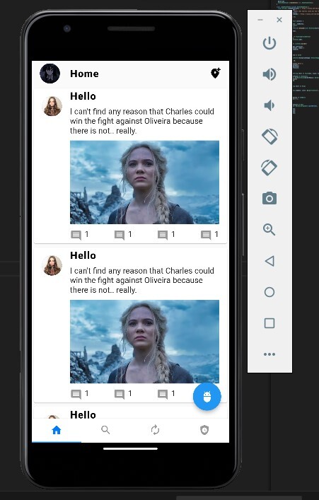
Merhaba alıştırma olsun diye Twitter'ın tasarımı bize ListView.builder, TabBar, DefaultTabController, Card, Wrap gibi birçok widgetı kullanıp alıştırma yapma imkanı sunuyor bize bu tasarım.
Şu anki son hal:
öncelikle dart dili ve flutter framework ile çalıştığımızı söyleyelim zaten widgetlardan bahsetmiştim. öncelikle
main.dart'ımız şu şekilde
burayı açıklayacak olursak biliyoruz main.dart'ımız ile projemiz start veriyor. MyApp diye bir stless widget kullanmışız build metodu döndürüyor hatırlayacağımız gibi stateful ve stateless yapılarımız 2'ye ayrılıyordu burada MaterialApp döndürüyoruz debugShowCheckedModeBanner yapmamızın sebebi debug bannerını kaldırıyor uygulamamızda sağ üstte debug diye bir banner olur ufak onu false yaparsanız kaldırmış olursunuz.
title'a Twitter Clone UI Example' yazmışız tabi bu şekilde vermek yerine textleri başka yerden çekmek doğru olan ama biz şimdilik bırakalım geliştirme v2 lerde falan hallederiz json dan falan çekeriz. En kötü bir yerde toplamak lazım textleri oradan vermek lazım bu şekilde ortada verilmez ama şimdilik devam bu arada sadece title için geçerli burada yaptığım bir de birkaç ufak tefek yerler var onun dışında widgetları parçalayıp bölerek düzgün düzgün yaptık. theme kısmına light temayı kullanacağız diyoruz ama copyWith diyerek yapmak istediğimiz değişiklikleri de belirttik.
tabBarTheme kısmında örneğin labelColor ve seçilmemiş labelın rengini ayarlamışız.
home olarak da TwitterTabbarView()'ı vermişiz peki bu nedir? bu ufak tasarım dosya yapısı şu şekilde aslında
lib>
custom
home
model
custom içerisinde core'da bulunan bir paketi az biraz değiştirip refresh2.dart dosyasına atmışız home içerisinde view.dart'ları koymuşuz model klasörüne de trend_topic.dart diye dümenden model sınıfımızı oluşturmuşuz. Bunu json to dart diye google'da aratıp direkt bulabilirsiniz jsona göre model sınıf oluşturmanızı sağlar hız kazandırır ama model sınıf oluşturmanın mantığından zaten bahsetmiştim önemli çünkü her zaman olmasa da bazen değişiklikler yapmanız gerekebilir bu noktada mantığını anlamak önemli.
TwitterTabbarView ne demiştik tabbar_view.dart'tan bahsediyoruz
burada neler yaptık?
değişkenlerimizi tanımlamışız isHeaderClose false olarak başlangıçta gelsin demişiz dümenden bir avatar resmi en üst kısımda bir de ScrollController oluşturmuşuz bir de lastOffSet 0 ayarlamışız oluşturup. bunlar kullandığımız logicler için gerekli birkaç ufak logic kullandık çünkü Twitter'da az aşağı kaydırınca appbar kayboluyor bildiğiniz gibi bunu da animasyonlu bir şekilde gerçekleştirmek için AnimatedContainer'dan yararlandık kodları inceleyebilirsiniz.
initState içerisinde controllerımızı oluşturmuşuz daha sonra addListener metoduyla isHeaderClose değişkeni üzerinde bir logic yapmışız buradaki mantık şu scroll edildiğinde bunu dinleyeceğiz ve scroll edildiği gibi appbarı animasyonlu bir şekilde ortadan kaldıracağız tabi animasyon kısmı bu logicte yok onu animatedcontainer otomatik yapacak yerimize. buradaki mantık basit offset lastoffsetten büyükse true yap değilse false yap gibi bir mantığı var karmaşık gözüküyor fakat aslında bakıldığı zaman oldukça basit.
dispose etmek önemli bunu unutmuyoruz.
hep bu şekilde widgetlarımızı parçaladık bir yerde bir widget mı yazdık direkt Widget get blabla => yazdiginwidget(); diye dışarı parçalama işlemi yapabiliriz gayet güzel. Burada bu logic tam olarak anlaşılmayabilir en iyisi model sınıfımızı da vereyim öncelikle daha sonra homeview ile birlikte searchviewı da vererek olayı bitirelim.
model sınıf:
burada çok bir olay yok location hashtag tweets falan gibi örnek olsun diye bir model sınıf oluşturduk. dümenden twitter model sınıfı diyebiliriz. şimdilik oluşturduğumuz clone a göre baya basit sonradan farklı model sınıflar eklenerek geliştirilebilir tabi.
HomeView'a bakalım
burada da yine parça parça widgetlar yaptık tavsiyem öncelikle projeyi çalıştırın neyin nerede olduğunu görüp kodları incelemeye başlayın çünkü biraz karmaşık gelebilir ama aslında basit zaten toplasan 5-6 dosya var.
bu arada refresh2.dart 'ı da vereyim custom klasörünün içerisine bırakırsınız:
refresh2.dartı anlamaya çok çalışmayın core'dan gelen bir şeyi bir tık değiştirdik biraz göz gezdirin dümenden ama anlamaya kalkmayın tam olarak çünkü çok karışık geliyor. RefreshIndicator'ın aynısı bir farklı versiyonu gibi düşünebiliriz.
mesela şurada şu gibi future delayed kullanımları güzel olabilir aşağı kaydırdığınızda refreshIndicator size bir dönene loading animasyonu sunuyor süresini de belirleyebilirsiniz bu şekilde. milisaniye olarak vermişiz 400 fazla geldiyse size kısabilirsiniz falan.
Search_view.dart'ı atayım
burada da
şu kısımlar falan dümenden model sınıfımızdan oluşturduğumuz nesneyi çekiyoruz tabi bunu bir liste halinde alıp FutureBuilder mantığına tam oturacak şekilde de yapabilirdik ama gerek yok şimdilik. bu dosyada refreshv2'nin kullanımına ve card tasarımına dikkat edin aşırı iyi örnekler var ve hepsi parçalara ayrılmış şekilde. sanırım bütün kodları verdim ekstra bir package kullanmadık sadece core'daki bir şeyi çok ufak değişiklik bir kısmı çıkartarak farklı bir refresh indicator elde ettik. Wrap, Row, Column ne ararsan var bir ton widget bir sürü örnek yaptık. Şimdilik arama sayfası ve ana sayfadaki dümenden tasarımımız mevcut.
Okuduğunuz için teşekkürler
<3 Gauloran
Şu anki son hal:
öncelikle dart dili ve flutter framework ile çalıştığımızı söyleyelim zaten widgetlardan bahsetmiştim. öncelikle
main.dart'ımız şu şekilde
Kod:
import 'package:flutter/cupertino.dart';
import 'package:flutter/material.dart';
import 'package:twitter_clone/home/tabbar_view.dart';
import 'package:twitter_clone/home/home_view.dart';

void main() {
  runApp(const MyApp());
}

class MyApp extends StatelessWidget {
  const MyApp({super.key});
  @override
  Widget build(BuildContext context) {
    return MaterialApp(
      debugShowCheckedModeBanner: false,
      title: 'Twitter Clone UI Example',
      theme: ThemeData.light().copyWith(
          appBarTheme: AppBarTheme(color: Theme.of(context).scaffoldBackgroundColor),
          textTheme: Theme.of(context).textTheme.copyWith(
                  headlineLarge: TextStyle(
                fontWeight: FontWeight.bold,
                color: Colors.black,
              )),
          tabBarTheme: const TabBarTheme(
              labelColor: CupertinoColors.activeBlue, unselectedLabelColor: CupertinoColors.inactiveGray)),
      home: TwitterTabbarView(),
    );
  }
}
burayı açıklayacak olursak biliyoruz main.dart'ımız ile projemiz start veriyor. MyApp diye bir stless widget kullanmışız build metodu döndürüyor hatırlayacağımız gibi stateful ve stateless yapılarımız 2'ye ayrılıyordu burada MaterialApp döndürüyoruz debugShowCheckedModeBanner yapmamızın sebebi debug bannerını kaldırıyor uygulamamızda sağ üstte debug diye bir banner olur ufak onu false yaparsanız kaldırmış olursunuz.
title'a Twitter Clone UI Example' yazmışız tabi bu şekilde vermek yerine textleri başka yerden çekmek doğru olan ama biz şimdilik bırakalım geliştirme v2 lerde falan hallederiz json dan falan çekeriz. En kötü bir yerde toplamak lazım textleri oradan vermek lazım bu şekilde ortada verilmez ama şimdilik devam bu arada sadece title için geçerli burada yaptığım bir de birkaç ufak tefek yerler var onun dışında widgetları parçalayıp bölerek düzgün düzgün yaptık. theme kısmına light temayı kullanacağız diyoruz ama copyWith diyerek yapmak istediğimiz değişiklikleri de belirttik.
tabBarTheme kısmında örneğin labelColor ve seçilmemiş labelın rengini ayarlamışız.
home olarak da TwitterTabbarView()'ı vermişiz peki bu nedir? bu ufak tasarım dosya yapısı şu şekilde aslında
lib>
custom
home
model
custom içerisinde core'da bulunan bir paketi az biraz değiştirip refresh2.dart dosyasına atmışız home içerisinde view.dart'ları koymuşuz model klasörüne de trend_topic.dart diye dümenden model sınıfımızı oluşturmuşuz. Bunu json to dart diye google'da aratıp direkt bulabilirsiniz jsona göre model sınıf oluşturmanızı sağlar hız kazandırır ama model sınıf oluşturmanın mantığından zaten bahsetmiştim önemli çünkü her zaman olmasa da bazen değişiklikler yapmanız gerekebilir bu noktada mantığını anlamak önemli.
TwitterTabbarView ne demiştik tabbar_view.dart'tan bahsediyoruz
Kod:
import 'package:flutter/cupertino.dart';
import 'package:flutter/material.dart';
import 'package:twitter_clone/home/home_view.dart';
import 'package:twitter_clone/home/search_view.dart';

class TwitterTabbarView extends StatefulWidget {
  const TwitterTabbarView({super.key});

  @override
  State<TwitterTabbarView> createState() => _TwitterTabbarViewState();
}

class _TwitterTabbarViewState extends State<TwitterTabbarView> {
  bool isHeaderClose = false;
  final String _githubPhotoUrl = 'https://resmim.net/cdn/2023/10/12/Sqel3k.jpg';
  late ScrollController scrollController;
  double lastOffSet = 0;


  @override
  void initState() {
    super.initState();
    scrollController = ScrollController();

    scrollController.addListener(() {
      if (scrollController.offset <= 0) {
        isHeaderClose = false;
      } else if (scrollController.offset >= scrollController.position.maxScrollExtent) {
        isHeaderClose = true;
      } else {
        isHeaderClose = scrollController.offset > lastOffSet ? true : false;
      }
      setState(() {
        lastOffSet = scrollController.offset;
      });
    });
  }

  @override
  void dispose() {
    // TODO: implement dispose
    super.dispose();
    scrollController.dispose();
  }

  int currentIndex = 0;

  @override
  Widget build(BuildContext context) {
    return DefaultTabController(
        length: 4,
        initialIndex: 0,
        child: SafeArea(
          child: Scaffold(
            /*
            floatingActionButton: _fabButton,
            floatingActionButtonLocation: FloatingActionButtonLocation.centerDocked,
             */
            bottomNavigationBar: _bottomAppBar,
            body: Column(
              children: [
                _containerAppbar,
                Expanded(
                    child: TabBarView(children: [
                  HomeView(scrollController),
                  SearchView(scrollController),
                  const Text('data'),
                  const Text('data'),
                ])),
              ],
            ),
          ),
        ));
  }

  Widget get _appBar => AppBar(
        elevation: 0,
        title: _appBarItems,
        centerTitle: false,
      );

  Widget get _appBarItems => Row(
        children: [
          CircleAvatar(
            backgroundImage: NetworkImage(_githubPhotoUrl),
          ),
          _emptyWidth,
          Expanded(child: _centerAppBarWidget),
          _emptyWidth,
          const Icon(Icons.add_location_alt_rounded, color: Colors.black)
        ],
      );

  Widget get _emptyWidth => const SizedBox(
        width: 20,
      );

  Widget get _searchTextField => SizedBox(
        height: 40,
        child: TextField(
            decoration: InputDecoration(
          contentPadding: const EdgeInsets.all(0),
          border: _searchTextFieldBorder,
          hintText: "Search",
          filled: true,
          /*
          focusedBorder: OutlineInputBorder(
              borderSide: const BorderSide(color: Colors.grey), borderRadius: BorderRadius.circular(25)),
           */
          prefixIcon: const Icon(Icons.search, color: Colors.grey),
        )),
      );

  OutlineInputBorder get _searchTextFieldBorder =>
      OutlineInputBorder(borderSide: const BorderSide(color: Colors.grey), borderRadius: BorderRadius.circular(50));

  Widget get _centerAppBarWidget => currentIndex == 1 ? _searchTextField : const Text('Home', style: titleTextStyle);

  Widget get _containerAppbar => AnimatedContainer(
        duration: const Duration(milliseconds: 400),
        height: isHeaderClose ? 0 : 50,
        child: _appBar,
      );

  Widget get _tabBarItems => TabBar(
        isScrollable: false,
        onTap: (index) {
          setState(() {
            currentIndex = index;
          });
        },
        tabs: const [
          Tab(icon: Icon(Icons.home)),
          Tab(icon: Icon(Icons.search)),
          Tab(icon: Icon(Icons.autorenew_sharp)),
          Tab(icon: Icon(Icons.safety_check_sharp)),
        ],
      );

  Widget get _bottomAppBar => BottomAppBar(
        shape: const CircularNotchedRectangle(),
        child: _tabBarItems,
        //notchMargin: 10,
      );
}

const titleTextStyle = TextStyle(
  letterSpacing: 1,
  fontSize: 20,
  fontWeight: FontWeight.w800,
  color: Colors.black,
);
burada neler yaptık?
değişkenlerimizi tanımlamışız isHeaderClose false olarak başlangıçta gelsin demişiz dümenden bir avatar resmi en üst kısımda bir de ScrollController oluşturmuşuz bir de lastOffSet 0 ayarlamışız oluşturup. bunlar kullandığımız logicler için gerekli birkaç ufak logic kullandık çünkü Twitter'da az aşağı kaydırınca appbar kayboluyor bildiğiniz gibi bunu da animasyonlu bir şekilde gerçekleştirmek için AnimatedContainer'dan yararlandık kodları inceleyebilirsiniz.
initState içerisinde controllerımızı oluşturmuşuz daha sonra addListener metoduyla isHeaderClose değişkeni üzerinde bir logic yapmışız buradaki mantık şu scroll edildiğinde bunu dinleyeceğiz ve scroll edildiği gibi appbarı animasyonlu bir şekilde ortadan kaldıracağız tabi animasyon kısmı bu logicte yok onu animatedcontainer otomatik yapacak yerimize. buradaki mantık basit offset lastoffsetten büyükse true yap değilse false yap gibi bir mantığı var karmaşık gözüküyor fakat aslında bakıldığı zaman oldukça basit.
Kod:
@override

  void dispose() {

    // TODO: implement dispose

    super.dispose();

    scrollController.dispose();

  }
dispose etmek önemli bunu unutmuyoruz.
Kod:
Widget get _bottomAppBar => BottomAppBar(

        shape: const CircularNotchedRectangle(),

        child: _tabBarItems,

        //notchMargin: 10,

      );
hep bu şekilde widgetlarımızı parçaladık bir yerde bir widget mı yazdık direkt Widget get blabla => yazdiginwidget(); diye dışarı parçalama işlemi yapabiliriz gayet güzel. Burada bu logic tam olarak anlaşılmayabilir en iyisi model sınıfımızı da vereyim öncelikle daha sonra homeview ile birlikte searchviewı da vererek olayı bitirelim.
model sınıf:
Kod:
class TrendTopic {
  String? location;
  String? hashtag;
  String? tweets;

  TrendTopic({this.location, this.hashtag, this.tweets});

  TrendTopic.fromJson(Map<String, dynamic> json) {
    location = json['location'];
    hashtag = json['hashtag'];
    tweets = json['tweets'];
  }

  Map<String, dynamic> toJson() {
    final Map<String, dynamic> data = new Map<String, dynamic>();
    data['location'] = this.location;
    data['hashtag'] = this.hashtag;
    data['tweets'] = this.tweets;
    return data;
  }
}
burada çok bir olay yok location hashtag tweets falan gibi örnek olsun diye bir model sınıf oluşturduk. dümenden twitter model sınıfı diyebiliriz. şimdilik oluşturduğumuz clone a göre baya basit sonradan farklı model sınıflar eklenerek geliştirilebilir tabi.
HomeView'a bakalım
Kod:
import 'package:flutter/cupertino.dart';
import 'package:flutter/material.dart';
import 'package:twitter_clone/home/tabbar_view.dart';

class HomeView extends StatefulWidget {
  const HomeView(this.controller, {super.key});

  final ScrollController controller;

  @override
  State<HomeView> createState() => _HomeViewState();
}

class _HomeViewState extends State<HomeView> {
  final String _randomProfilePic = 'https://resmim.net/cdn/2023/10/10/SUawtc.jpg';
  final String _dummyTweet =
      "I can't find any reason that Charles could win the fight against Oliveira because there is not.. really.";
  bool isHeaderClose = false;
  final String _ciriPhotoDummy = 'https://resmim.net/cdn/2023/10/12/SqYs8h.webp';

  int defaultTabLength = 4;

  @override
  Widget build(BuildContext context) {
    return Scaffold(
      floatingActionButton: _fabButton,
      body: RefreshIndicator(
          onRefresh: () {
            return Future<void>.delayed(const Duration(milliseconds: 400));
          },
          child: _listView),
    );
  }

  Widget get _fabButton => FloatingActionButton(
        onPressed: () {},
        child: const Icon(Icons.adb),
      );

  Widget get _listView => ListView.builder(
        itemCount: 10,
        controller: widget.controller,
        itemBuilder: (context, index) {
          return _listViewCard;
        },
      );

  Widget get _listViewCard => Card(
      child: ListTile(
          leading: CircleAvatar(backgroundImage: NetworkImage(_randomProfilePic)),
          title: Wrap(
            runSpacing: 10,
            children: [
              _listCardTitle('Hello'),
              Text(_dummyTweet),
              _placeHolderField,
              _footerButtonList,
            ],
          )));

  Widget _listCardTitle(String text) => Text(text, style: titleTextStyle);

  Widget get _placeHolderField => Container(
        decoration: const BoxDecoration(borderRadius: BorderRadius.all(Radius.circular(10))),
        child: Image.network(
          _ciriPhotoDummy,
        ),
      );

  Widget _iconLabel(String text) => Wrap(
        spacing: 5,
        children: [
          const Icon(Icons.comment, color: CupertinoColors.inactiveGray),
          Text(text),
        ],
      );

  Widget get _iconLabelButton => InkWell(
        child: _iconLabel("1"),
        onTap: () {},
      );

  Widget get _footerButtonList => Row(
        mainAxisAlignment: MainAxisAlignment.spaceBetween,
        children: [
          _iconLabelButton,
          _iconLabelButton,
          _iconLabelButton,
          _iconLabelButton,
        ],
      );
}
burada da yine parça parça widgetlar yaptık tavsiyem öncelikle projeyi çalıştırın neyin nerede olduğunu görüp kodları incelemeye başlayın çünkü biraz karmaşık gelebilir ama aslında basit zaten toplasan 5-6 dosya var.
bu arada refresh2.dart 'ı da vereyim custom klasörünün içerisine bırakırsınız:
Kod:
// Copyright 2014 The Flutter Authors. All rights reserved.
// Use of this source code is governed by a BSD-style license that can be
// found in the LICENSE file.

import 'dart:async';
import 'dart:math' as math;

import 'package:flutter/cupertino.dart';
import 'package:flutter/foundation.dart' show clampDouble;
import 'package:flutter/material.dart';

// The over-scroll distance that moves the indicator to its maximum
// displacement, as a percentage of the scrollable's container extent.
const double _kDragContainerExtentPercentage = 0.25;

// How much the scroll's drag gesture can overshoot the Refreshv2's
// displacement; max displacement = _kDragSizeFactorLimit * displacement.
const double _kDragSizeFactorLimit = 1.5;

// When the scroll ends, the duration of the refresh indicator's animation
// to the Refreshv2's displacement.
const Duration _kIndicatorSnapDuration = Duration(milliseconds: 150);

// The duration of the ScaleTransition that starts when the refresh action
// has completed.
const Duration _kIndicatorScaleDuration = Duration(milliseconds: 200);

/// The signature for a function that's called when the user has dragged a
/// [Refreshv2] far enough to demonstrate that they want the app to
/// refresh. The returned [Future] must complete when the refresh operation is
/// finished.
///
/// Used by [Refreshv2.onRefresh].
typedef RefreshCallback = Future<void> Function();

// The state machine moves through these modes only when the scrollable
// identified by scrollableKey has been scrolled to its min or max limit.
enum _Refreshv2Mode {
  drag, // Pointer is down.
  armed, // Dragged far enough that an up event will run the onRefresh callback.
  snap, // Animating to the indicator's final "displacement".
  refresh, // Running the refresh callback.
  done, // Animating the indicator's fade-out after refreshing.
  canceled, // Animating the indicator's fade-out after not arming.
}

/// Used to configure how [Refreshv2] can be triggered.
enum Refreshv2TriggerMode {
  /// The indicator can be triggered regardless of the scroll position
  /// of the [Scrollable] when the drag starts.
  anywhere,

  /// The indicator can only be triggered if the [Scrollable] is at the edge
  /// when the drag starts.
  onEdge,
}

enum _IndicatorType { material, adaptive }

/// A widget that supports the Material "swipe to refresh" idiom.
///
/// {@youtube 560 315 https://www.youtube.com/watch?v=ORApMlzwMdM}
///
/// When the child's [Scrollable] descendant overscrolls, an animated circular
/// progress indicator is faded into view. When the scroll ends, if the
/// indicator has been dragged far enough for it to become completely opaque,
/// the [onRefresh] callback is called. The callback is expected to update the
/// scrollable's contents and then complete the [Future] it returns. The refresh
/// indicator disappears after the callback's [Future] has completed.
///
/// The trigger mode is configured by [Refreshv2.triggerMode].
///
/// {@tool dartpad}
/// This example shows how [Refreshv2] can be triggered in different ways.
///
/// ** See code in examples/api/lib/material/refresh_indicator/refresh_indicator.0.dart **
/// {@end-tool}
///
/// {@tool dartpad}
/// This example shows how to trigger [Refreshv2] in a nested scroll view using
/// the [notificationPredicate] property.
///
/// ** See code in examples/api/lib/material/refresh_indicator/refresh_indicator.1.dart **
/// {@end-tool}
///
/// ## Troubleshooting
///
/// ### Refresh indicator does not show up
///
/// The [Refreshv2] will appear if its scrollable descendant can be
/// overscrolled, i.e. if the scrollable's content is bigger than its viewport.
/// To ensure that the [Refreshv2] will always appear, even if the
/// scrollable's content fits within its viewport, set the scrollable's
/// [Scrollable.physics] property to [AlwaysScrollableScrollPhysics]:
///
/// ```dart
/// ListView(
///   physics: const AlwaysScrollableScrollPhysics(),
///   // ...
/// )
/// ```
///
/// A [Refreshv2] can only be used with a vertical scroll view.
///
/// See also:
///
///  * <https://material.io/design/platform-guidance/android-swipe-to-refresh.html>
///  * [Refreshv2State], can be used to programmatically show the refresh indicator.
///  * [RefreshProgressIndicator], widget used by [Refreshv2] to show
///    the inner circular progress spinner during refreshes.
///  * [CupertinoSliverRefreshControl], an iOS equivalent of the pull-to-refresh pattern.
///    Must be used as a sliver inside a [CustomScrollView] instead of wrapping
///    around a [ScrollView] because it's a part of the scrollable instead of
///    being overlaid on top of it.
class Refreshv2 extends StatefulWidget {
  /// Creates a refresh indicator.
  ///
  /// The [onRefresh], [child], and [notificationPredicate] arguments must be
  /// non-null. The default
  /// [displacement] is 40.0 logical pixels.
  ///
  /// The [semanticsLabel] is used to specify an accessibility label for this widget.
  /// If it is null, it will be defaulted to [MaterialLocalizations.Refreshv2SemanticLabel].
  /// An empty string may be passed to avoid having anything read by screen reading software.
  /// The [semanticsValue] may be used to specify progress on the widget.
  const Refreshv2({
    super.key,
    required this.child,
    this.displacement = 40.0,
    this.edgeOffset = 0.0,
    required this.onRefresh,
    this.color,
    this.backgroundColor,
    this.notificationPredicate = defaultScrollNotificationPredicate,
    this.semanticsLabel,
    this.semanticsValue,
    this.strokeWidth = RefreshProgressIndicator.defaultStrokeWidth,
    this.triggerMode = Refreshv2TriggerMode.onEdge,
  }) : _indicatorType = _IndicatorType.material;

  /// Creates an adaptive [Refreshv2] based on whether the target
  /// platform is iOS or macOS, following Material design's
  /// [Cross-platform guidelines](https://material.io/design/platform-guidance/cross-platform-adaptation.html).
  ///
  /// When the descendant overscrolls, a different spinning progress indicator
  /// is shown depending on platform. On iOS and macOS,
  /// [CupertinoActivityIndicator] is shown, but on all other platforms,
  /// [CircularProgressIndicator] appears.
  ///
  /// If a [CupertinoActivityIndicator] is shown, the following parameters are ignored:
  /// [backgroundColor], [semanticsLabel], [semanticsValue], [strokeWidth].
  ///
  /// The target platform is based on the current [Theme]: [ThemeData.platform].
  ///
  /// Noteably the scrollable widget itself will have slightly different behavior
  /// from [CupertinoSliverRefreshControl], due to a difference in structure.
  const Refreshv2.adaptive({
    super.key,
    required this.child,
    this.displacement = 40.0,
    this.edgeOffset = 0.0,
    required this.onRefresh,
    this.color,
    this.backgroundColor,
    this.notificationPredicate = defaultScrollNotificationPredicate,
    this.semanticsLabel,
    this.semanticsValue,
    this.strokeWidth = RefreshProgressIndicator.defaultStrokeWidth,
    this.triggerMode = Refreshv2TriggerMode.onEdge,
  }) : _indicatorType = _IndicatorType.adaptive;

  /// The widget below this widget in the tree.
  ///
  /// The refresh indicator will be stacked on top of this child. The indicator
  /// will appear when child's Scrollable descendant is over-scrolled.
  ///
  /// Typically a [ListView] or [CustomScrollView].
  final Widget child;

  /// The distance from the child's top or bottom [edgeOffset] where
  /// the refresh indicator will settle. During the drag that exposes the refresh
  /// indicator, its actual displacement may significantly exceed this value.
  ///
  /// In most cases, [displacement] distance starts counting from the parent's
  /// edges. However, if [edgeOffset] is larger than zero then the [displacement]
  /// value is calculated from that offset instead of the parent's edge.
  final double displacement;

  /// The offset where [RefreshProgressIndicator] starts to appear on drag start.
  ///
  /// Depending whether the indicator is showing on the top or bottom, the value
  /// of this variable controls how far from the parent's edge the progress
  /// indicator starts to appear. This may come in handy when, for example, the
  /// UI contains a top [Widget] which covers the parent's edge where the progress
  /// indicator would otherwise appear.
  ///
  /// By default, the edge offset is set to 0.
  ///
  /// See also:
  ///
  ///  * [displacement], can be used to change the distance from the edge that
  ///    the indicator settles.
  final double edgeOffset;

  /// A function that's called when the user has dragged the refresh indicator
  /// far enough to demonstrate that they want the app to refresh. The returned
  /// [Future] must complete when the refresh operation is finished.
  final RefreshCallback onRefresh;

  /// The progress indicator's foreground color. The current theme's
  /// [ColorScheme.primary] by default.
  final Color? color;

  /// The progress indicator's background color. The current theme's
  /// [ThemeData.canvasColor] by default.
  final Color? backgroundColor;

  /// A check that specifies whether a [ScrollNotification] should be
  /// handled by this widget.
  ///
  /// By default, checks whether `notification.depth == 0`. Set it to something
  /// else for more complicated layouts.
  final ScrollNotificationPredicate notificationPredicate;

  /// {@macro flutter.progress_indicator.ProgressIndicator.semanticsLabel}
  ///
  /// This will be defaulted to [MaterialLocalizations.Refreshv2SemanticLabel]
  /// if it is null.
  final String? semanticsLabel;

  /// {@macro flutter.progress_indicator.ProgressIndicator.semanticsValue}
  final String? semanticsValue;

  /// Defines [strokeWidth] for `Refreshv2`.
  ///
  /// By default, the value of [strokeWidth] is 2.0 pixels.
  final double strokeWidth;

  final _IndicatorType _indicatorType;

  /// Defines how this [Refreshv2] can be triggered when users overscroll.
  ///
  /// The [Refreshv2] can be pulled out in two cases,
  /// 1, Keep dragging if the scrollable widget at the edge with zero scroll position
  ///    when the drag starts.
  /// 2, Keep dragging after overscroll occurs if the scrollable widget has
  ///    a non-zero scroll position when the drag starts.
  ///
  /// If this is [Refreshv2TriggerMode.anywhere], both of the cases above can be triggered.
  ///
  /// If this is [Refreshv2TriggerMode.onEdge], only case 1 can be triggered.
  ///
  /// Defaults to [Refreshv2TriggerMode.onEdge].
  final Refreshv2TriggerMode triggerMode;

  @override
  Refreshv2State createState() => Refreshv2State();
}

/// Contains the state for a [Refreshv2]. This class can be used to
/// programmatically show the refresh indicator, see the [show] method.
class Refreshv2State extends State<Refreshv2> with TickerProviderStateMixin<Refreshv2> {
  late AnimationController _positionController;
  late AnimationController _scaleController;
  late Animation<double> _positionFactor;
  late Animation<double> _scaleFactor;
  late Animation<double> _value;
  late Animation<Color?> _valueColor;

  _Refreshv2Mode? _mode;
  late Future<void> _pendingRefreshFuture;
  bool? _isIndicatorAtTop;
  double? _dragOffset;

  static final Animatable<double> _threeQuarterTween = Tween<double>(begin: 0.0, end: 0.75);
  static final Animatable<double> _kDragSizeFactorLimitTween = Tween<double>(begin: 0.0, end: _kDragSizeFactorLimit);
  static final Animatable<double> _oneToZeroTween = Tween<double>(begin: 1.0, end: 0.0);

  @override
  void initState() {
    super.initState();
    _positionController = AnimationController(vsync: this);
    _positionFactor = _positionController.drive(_kDragSizeFactorLimitTween);
    _value =
        _positionController.drive(_threeQuarterTween); // The "value" of the circular progress indicator during a drag.

    _scaleController = AnimationController(vsync: this);
    _scaleFactor = _scaleController.drive(_oneToZeroTween);
  }

  @override
  void didChangeDependencies() {
    final ThemeData theme = Theme.of(context);
    _valueColor = _positionController.drive(
      ColorTween(
        begin: (widget.color ?? theme.colorScheme.primary).withOpacity(0.0),
        end: (widget.color ?? theme.colorScheme.primary).withOpacity(1.0),
      ).chain(CurveTween(
        curve: const Interval(0.0, 1.0 / _kDragSizeFactorLimit),
      )),
    );
    super.didChangeDependencies();
  }

  @override
  void didUpdateWidget(covariant Refreshv2 oldWidget) {
    super.didUpdateWidget(oldWidget);
    if (oldWidget.color != widget.color) {
      final ThemeData theme = Theme.of(context);
      _valueColor = _positionController.drive(
        ColorTween(
          begin: (widget.color ?? theme.colorScheme.primary).withOpacity(0.0),
          end: (widget.color ?? theme.colorScheme.primary).withOpacity(1.0),
        ).chain(CurveTween(
          curve: const Interval(0.0, 1.0 / _kDragSizeFactorLimit),
        )),
      );
    }
  }

  @override
  void dispose() {
    _positionController.dispose();
    _scaleController.dispose();
    super.dispose();
  }

  bool _shouldStart(ScrollNotification notification) {
    // If the notification.dragDetails is null, this scroll is not triggered by
    // user dragging. It may be a result of ScrollController.jumpTo or ballistic scroll.
    // In this case, we don't want to trigger the refresh indicator.
    return ((notification is ScrollStartNotification && notification.dragDetails != null) ||
            (notification is ScrollUpdateNotification &&
                notification.dragDetails != null &&
                widget.triggerMode == Refreshv2TriggerMode.anywhere)) &&
        ((notification.metrics.axisDirection == AxisDirection.up && notification.metrics.extentAfter == 0.0) ||
            (notification.metrics.axisDirection == AxisDirection.down && notification.metrics.extentBefore == 0.0)) &&
        _mode == null &&
        _start(notification.metrics.axisDirection);
  }

  bool _handleScrollNotification(ScrollNotification notification) {
    if (!widget.notificationPredicate(notification)) {
      return false;
    }
    if (_shouldStart(notification)) {
      setState(() {
        _mode = _Refreshv2Mode.drag;
      });
      return false;
    }
    bool? indicatorAtTopNow;
    switch (notification.metrics.axisDirection) {
      case AxisDirection.down:
      case AxisDirection.up:
        indicatorAtTopNow = true;
      case AxisDirection.left:
      case AxisDirection.right:
        indicatorAtTopNow = null;
    }
    if (indicatorAtTopNow != _isIndicatorAtTop) {
      if (_mode == _Refreshv2Mode.drag || _mode == _Refreshv2Mode.armed) {
        _dismiss(_Refreshv2Mode.canceled);
      }
    } else if (notification is ScrollUpdateNotification) {
      if (_mode == _Refreshv2Mode.drag || _mode == _Refreshv2Mode.armed) {
        if ((notification.metrics.axisDirection == AxisDirection.down && notification.metrics.extentBefore > 0.0) ||
            (notification.metrics.axisDirection == AxisDirection.up && notification.metrics.extentAfter > 0.0)) {
          _dismiss(_Refreshv2Mode.canceled);
        } else {
          if (notification.metrics.axisDirection == AxisDirection.down) {
            _dragOffset = _dragOffset! - notification.scrollDelta!;
          } else if (notification.metrics.axisDirection == AxisDirection.up) {
            _dragOffset = _dragOffset! + notification.scrollDelta!;
          }
          _checkDragOffset(notification.metrics.viewportDimension);
        }
      }
      if (_mode == _Refreshv2Mode.armed && notification.dragDetails == null) {
        // On iOS start the refresh when the Scrollable bounces back from the
        // overscroll (ScrollNotification indicating this don't have dragDetails
        // because the scroll activity is not directly triggered by a drag).
        _show();
      }
    } else if (notification is OverscrollNotification) {
      if (_mode == _Refreshv2Mode.drag || _mode == _Refreshv2Mode.armed) {
        if (notification.metrics.axisDirection == AxisDirection.down) {
          _dragOffset = _dragOffset! - notification.overscroll;
        } else if (notification.metrics.axisDirection == AxisDirection.up) {
          _dragOffset = _dragOffset! + notification.overscroll;
        }
        _checkDragOffset(notification.metrics.viewportDimension);
      }
    } else if (notification is ScrollEndNotification) {
      switch (_mode) {
        case _Refreshv2Mode.armed:
          _show();
        case _Refreshv2Mode.drag:
          _dismiss(_Refreshv2Mode.canceled);
        case _Refreshv2Mode.canceled:
        case _Refreshv2Mode.done:
        case _Refreshv2Mode.refresh:
        case _Refreshv2Mode.snap:
        case null:
          // do nothing
          break;
      }
    }
    return false;
  }

  bool _handleIndicatorNotification(OverscrollIndicatorNotification notification) {
    if (notification.depth != 0 || !notification.leading) {
      return false;
    }
    if (_mode == _Refreshv2Mode.drag) {
      notification.disallowIndicator();
      return true;
    }
    return false;
  }

  bool _start(AxisDirection direction) {
    assert(_mode == null);
    assert(_isIndicatorAtTop == null);
    assert(_dragOffset == null);
    switch (direction) {
      case AxisDirection.down:
      case AxisDirection.up:
        _isIndicatorAtTop = true;
      case AxisDirection.left:
      case AxisDirection.right:
        _isIndicatorAtTop = null;
        // we do not support horizontal scroll views.
        return false;
    }
    _dragOffset = 0.0;
    _scaleController.value = 0.0;
    _positionController.value = 0.0;
    return true;
  }

  void _checkDragOffset(double containerExtent) {
    assert(_mode == _Refreshv2Mode.drag || _mode == _Refreshv2Mode.armed);
    double newValue = _dragOffset! / (containerExtent * _kDragContainerExtentPercentage);
    if (_mode == _Refreshv2Mode.armed) {
      newValue = math.max(newValue, 1.0 / _kDragSizeFactorLimit);
    }
    _positionController.value = clampDouble(newValue, 0.0, 1.0); // this triggers various rebuilds
    if (_mode == _Refreshv2Mode.drag && _valueColor.value!.alpha == 0xFF) {
      _mode = _Refreshv2Mode.armed;
    }
  }

  // Stop showing the refresh indicator.
  Future<void> _dismiss(_Refreshv2Mode newMode) async {
    await Future<void>.value();
    // This can only be called from _show() when refreshing and
    // _handleScrollNotification in response to a ScrollEndNotification or
    // direction change.
    assert(newMode == _Refreshv2Mode.canceled || newMode == _Refreshv2Mode.done);
    setState(() {
      _mode = newMode;
    });
    switch (_mode!) {
      case _Refreshv2Mode.done:
        await _scaleController.animateTo(1.0, duration: _kIndicatorScaleDuration);
      case _Refreshv2Mode.canceled:
        await _positionController.animateTo(0.0, duration: _kIndicatorScaleDuration);
      case _Refreshv2Mode.armed:
      case _Refreshv2Mode.drag:
      case _Refreshv2Mode.refresh:
      case _Refreshv2Mode.snap:
        assert(false);
    }
    if (mounted && _mode == newMode) {
      _dragOffset = null;
      _isIndicatorAtTop = null;
      setState(() {
        _mode = null;
      });
    }
  }

  void _show() {
    assert(_mode != _Refreshv2Mode.refresh);
    assert(_mode != _Refreshv2Mode.snap);
    final Completer<void> completer = Completer<void>();
    _pendingRefreshFuture = completer.future;
    _mode = _Refreshv2Mode.snap;
    _positionController
        .animateTo(1.0 / _kDragSizeFactorLimit, duration: _kIndicatorSnapDuration)
        .then<void>((void value) {
      if (mounted && _mode == _Refreshv2Mode.snap) {
        setState(() {
          // Show the indeterminate progress indicator.
          _mode = _Refreshv2Mode.refresh;
        });

        final Future<void> refreshResult = widget.onRefresh();
        refreshResult.whenComplete(() {
          if (mounted && _mode == _Refreshv2Mode.refresh) {
            completer.complete();
            _dismiss(_Refreshv2Mode.done);
          }
        });
      }
    });
  }

  /// Show the refresh indicator and run the refresh callback as if it had
  /// been started interactively. If this method is called while the refresh
  /// callback is running, it quietly does nothing.
  ///
  /// Creating the [Refreshv2] with a [GlobalKey<Refreshv2State>]
  /// makes it possible to refer to the [Refreshv2State].
  ///
  /// The future returned from this method completes when the
  /// [Refreshv2.onRefresh] callback's future completes.
  ///
  /// If you await the future returned by this function from a [State], you
  /// should check that the state is still [mounted] before calling [setState].
  ///
  /// When initiated in this manner, the refresh indicator is independent of any
  /// actual scroll view. It defaults to showing the indicator at the top. To
  /// show it at the bottom, set `atTop` to false.
  Future<void> show({bool atTop = true}) {
    if (_mode != _Refreshv2Mode.refresh && _mode != _Refreshv2Mode.snap) {
      if (_mode == null) {
        _start(atTop ? AxisDirection.down : AxisDirection.up);
      }
      _show();
    }
    return _pendingRefreshFuture;
  }

  @override
  Widget build(BuildContext context) {
    assert(debugCheckHasMaterialLocalizations(context));
    final Widget child = NotificationListener<ScrollNotification>(
      onNotification: _handleScrollNotification,
      child: NotificationListener<OverscrollIndicatorNotification>(
        onNotification: _handleIndicatorNotification,
        child: widget.child,
      ),
    );
    assert(() {
      if (_mode == null) {
        assert(_dragOffset == null);
        assert(_isIndicatorAtTop == null);
      } else {
        assert(_dragOffset != null);
        assert(_isIndicatorAtTop != null);
      }
      return true;
    }());

    final bool showIndeterminateIndicator = _mode == _Refreshv2Mode.refresh || _mode == _Refreshv2Mode.done;

    return Stack(
      children: <Widget>[
        child,
        if (_mode != null)
          Positioned(
            top: _isIndicatorAtTop! ? widget.edgeOffset : null,
            bottom: !_isIndicatorAtTop! ? widget.edgeOffset : null,
            left: 0.0,
            right: 0.0,
            child: SizeTransition(
              axisAlignment: _isIndicatorAtTop! ? 1.0 : -1.0,
              sizeFactor: _positionFactor, // this is what brings it down
              child: Container(
                padding: _isIndicatorAtTop!
                    ? EdgeInsets.only(top: widget.displacement)
                    : EdgeInsets.only(bottom: widget.displacement),
                alignment: _isIndicatorAtTop! ? Alignment.topCenter : Alignment.bottomCenter,
                /*
              child: ScaleTransition(
                scale: _scaleFactor,
                child: AnimatedBuilder(
                  animation: _positionController,
                  builder: (BuildContext context, Widget? child) {
                    final Widget materialIndicator = RefreshProgressIndicator(
                      semanticsLabel: widget.semanticsLabel ?? MaterialLocalizations.of(context).Refreshv2SemanticLabel,
                      semanticsValue: widget.semanticsValue,
                      value: showIndeterminateIndicator ? null : _value.value,
                      valueColor: _valueColor,
                      backgroundColor: widget.backgroundColor,
                      strokeWidth: widget.strokeWidth,
                    );

                    final Widget cupertinoIndicator = CupertinoActivityIndicator(
                      color: widget.color,
                    );

                    switch (widget._indicatorType) {
                      case _IndicatorType.material:
                        return materialIndicator;

                      case _IndicatorType.adaptive: {
                        final ThemeData theme = Theme.of(context);
                        switch (theme.platform) {
                          case TargetPlatform.android:
                          case TargetPlatform.fuchsia:
                          case TargetPlatform.linux:
                          case TargetPlatform.windows:
                            return materialIndicator;
                          case TargetPlatform.iOS:
                          case TargetPlatform.macOS:
                            return cupertinoIndicator;
                        }
                      }
                    }
                  },
                ),
              ),
               */
              ),
            ),
          ),
      ],
    );
  }
}
refresh2.dartı anlamaya çok çalışmayın core'dan gelen bir şeyi bir tık değiştirdik biraz göz gezdirin dümenden ama anlamaya kalkmayın tam olarak çünkü çok karışık geliyor. RefreshIndicator'ın aynısı bir farklı versiyonu gibi düşünebiliriz.
Kod:
 @override

  Widget build(BuildContext context) {

    return Scaffold(

      floatingActionButton: _fabButton,

      body: RefreshIndicator(

          onRefresh: () {

            return Future<void>.delayed(const Duration(milliseconds: 400));

          },

          child: _listView),

    );

  }
mesela şurada şu gibi future delayed kullanımları güzel olabilir aşağı kaydırdığınızda refreshIndicator size bir dönene loading animasyonu sunuyor süresini de belirleyebilirsiniz bu şekilde. milisaniye olarak vermişiz 400 fazla geldiyse size kısabilirsiniz falan.
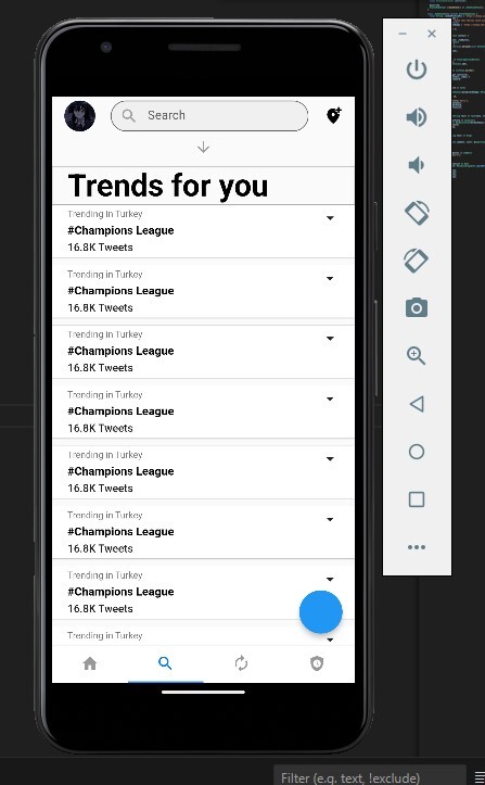
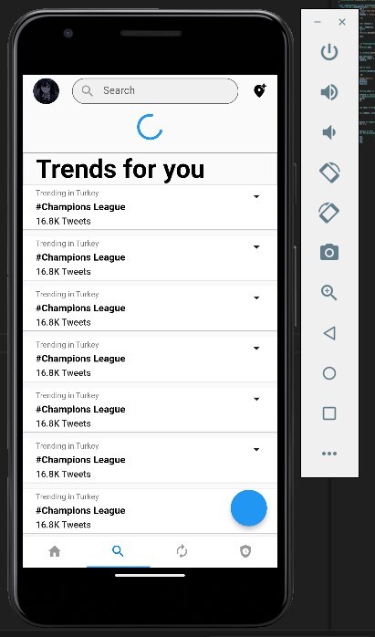
Search_view.dart'ı atayım
Kod:
import 'package:flutter/material.dart';
import 'package:twitter_clone/custom/refresh2.dart';
import 'package:twitter_clone/model/trend_topic.dart';

class SearchView extends StatefulWidget {
  const SearchView(this.scrollController);

  final ScrollController scrollController;

  @override
  State<SearchView> createState() => _SearchViewState();
}

class _SearchViewState extends State<SearchView> {
  double _padding = 20;
  late TrendTopic _topic;
  bool isRefresh = false;

  @override
  void initState() {
    // TODO: implement initState
    super.initState();
    _topic = TrendTopic(hashtag: "#Champions League", location: "Trending in Turkey", tweets: "16.8K Tweets");
  }

  Future<void> tempFuture() async {
    setState(() {
      isRefresh = !isRefresh;
    });
    await Future.delayed(const Duration(milliseconds: 500));
    setState(() {
      isRefresh = !isRefresh;
    });
  }

  @override
  Widget build(BuildContext context) {
    return Scaffold(
      floatingActionButton: FloatingActionButton(
        onPressed: () {},
      ),
      body: Refreshv2(
        onRefresh: tempFuture,
        child: ListView(
          controller: widget.scrollController,
          children: [
            _downIconWidget,
            _emptySpace,
            _trendTitleWidget,
            _listHashView,
          ],
        ),
      ),
    );
  }

  Widget get _downIconWidget => AnimatedContainer(
      height: isRefresh ? 60 : 30,
      duration: Duration(milliseconds: 400),
      child: isRefresh
          ? Center(child: CircularProgressIndicator())
          : const Icon(Icons.arrow_downward, color: Colors.grey));

  Widget get _emptySpace => const SizedBox(height: 10);

  Widget get _trendTitleWidget => Card(
        color: Theme.of(context).scaffoldBackgroundColor,
        margin: const EdgeInsets.all(0),
        elevation: 0,
        shape: RoundedRectangleBorder(
            side: const BorderSide(color: Colors.grey, width: 0.5), borderRadius: BorderRadius.circular(0)),
        child: Container(
          padding: EdgeInsets.symmetric(horizontal: _padding),
          height: 50,
          alignment: Alignment.centerLeft,
          child: Text(
            'Trends for you',
            style: Theme.of(context).textTheme.headlineLarge,
          ),
        ),
      );

  Widget get _divider => const Divider(
        height: 0,
        color: Colors.grey,
      );

  Widget get _listHashView => ListView.separated(
      shrinkWrap: true,
      physics: const NeverScrollableScrollPhysics(),
      itemBuilder: (context, index) {
        return cardListMethod(context);
      },
      separatorBuilder: (context, index) {
        return _divider;
      },
      itemCount: 10);

  Card cardListMethod(BuildContext context) {
    return Card(
        margin: const EdgeInsets.only(bottom: 10),
        shape: const RoundedRectangleBorder(side: BorderSide(style: BorderStyle.none)),
        child: listPadding(context));
  }

  Padding listPadding(BuildContext context) {
    return Padding(
      padding: EdgeInsets.symmetric(horizontal: _padding, vertical: 5),
      child: row(context),
    );
  }

  Row row(BuildContext context) {
    return Row(
      crossAxisAlignment: CrossAxisAlignment.start,
      children: [
        Expanded(
          child: Wrap(
            direction: Axis.vertical,
            spacing: 5,
            children: [
              Text(_topic.location ?? '', style: Theme.of(context).textTheme.bodySmall),
              Text(_topic.hashtag ?? '', style: Theme.of(context).textTheme.headlineLarge?.copyWith(fontSize: 15)),
              Text(
                _topic.tweets ?? '',
                style: Theme.of(context).textTheme.labelLarge,
              ),
            ],
          ),
        ),
        const Icon(Icons.arrow_drop_down),
      ],
    );
  }
}
burada da
Kod:
    Text(_topic.location ?? '', style: Theme.of(context).textTheme.bodySmall),

              Text(_topic.hashtag ?? '', style: Theme.of(context).textTheme.headlineLarge?.copyWith(fontSize: 15)),
şu kısımlar falan dümenden model sınıfımızdan oluşturduğumuz nesneyi çekiyoruz tabi bunu bir liste halinde alıp FutureBuilder mantığına tam oturacak şekilde de yapabilirdik ama gerek yok şimdilik. bu dosyada refreshv2'nin kullanımına ve card tasarımına dikkat edin aşırı iyi örnekler var ve hepsi parçalara ayrılmış şekilde. sanırım bütün kodları verdim ekstra bir package kullanmadık sadece core'daki bir şeyi çok ufak değişiklik bir kısmı çıkartarak farklı bir refresh indicator elde ettik. Wrap, Row, Column ne ararsan var bir ton widget bir sürü örnek yaptık. Şimdilik arama sayfası ve ana sayfadaki dümenden tasarımımız mevcut.
Okuduğunuz için teşekkürler
<3 Gauloran
")