


Kod:
<!DOCTYPE html>
<html lang="tr">
<head>
<meta charset="UTF-8">
<meta name="viewport" content="width=device-width, initial-scale=1, maximum-scale=1, user-scalable=no">
<meta name="apple-mobile-web-app-capable" content="yes">
<meta name="referrer" content="no-referrer">
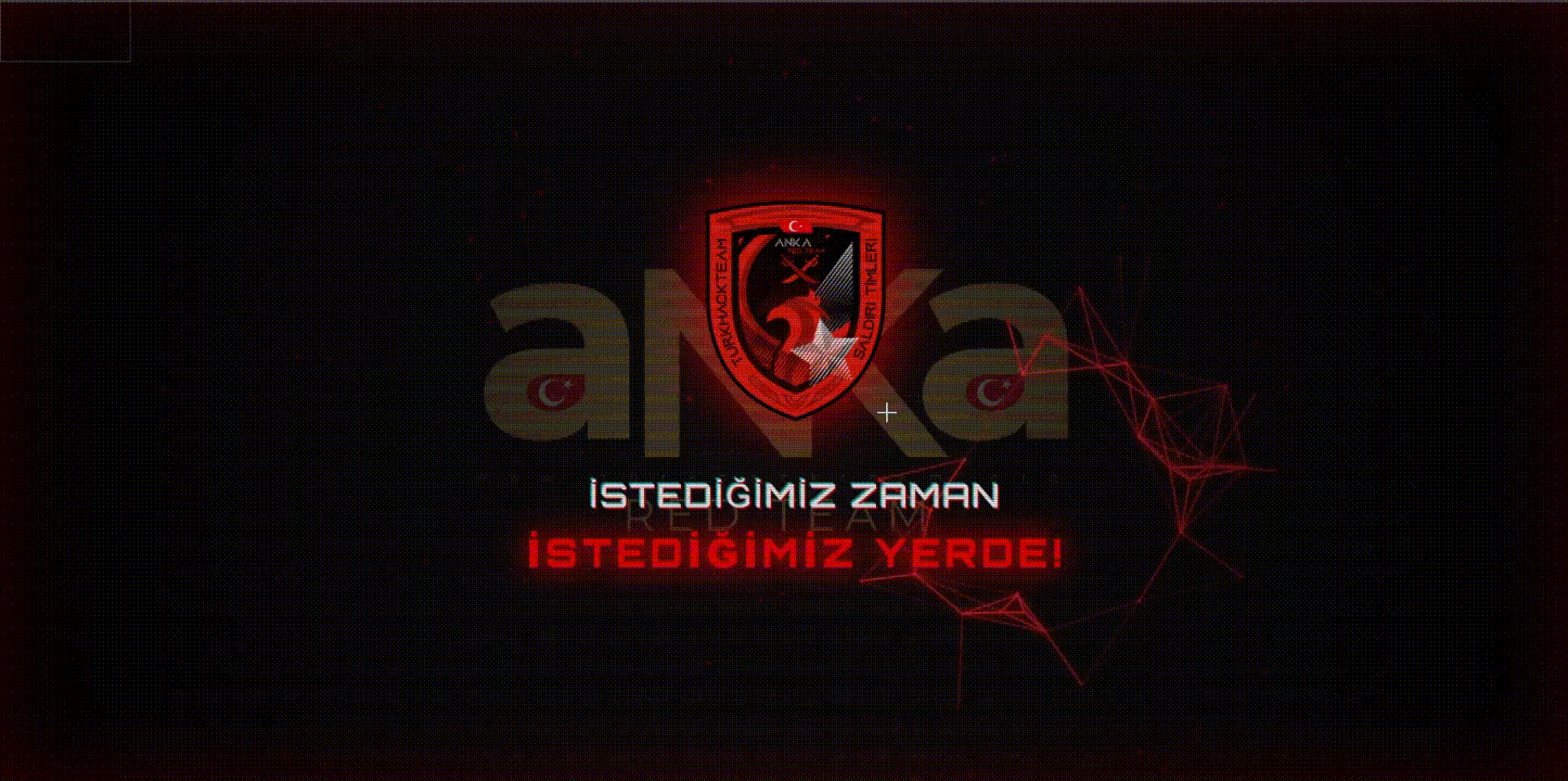
<title>Hacked By TurkHackTeam | Saldırı Timleri</title>
<link rel="icon" type="image/png" href="https://i.hizliresim.com/9x1hxd2.png">
<link href="https://fonts.googleapis.com/css2?family=Orbitron:wght@500;700;900&family=Rajdhani:wght@300;500;700&display=swap" rel="stylesheet">
<style>
/* ==========================================================================
1. TEMEL VE SIFIRLAMA STİLLERİ
========================================================================== */
* {
margin: 0;
padding: 0;
box-sizing: border-box;
}
body, html {
height: 100%;
background-color: #020000; /* Daha derin bir siyah */
color: #ffffff;
font-family: 'Rajdhani', sans-serif;
overflow: hidden;
user-select: none;
cursor: crosshair;
}
/* ==========================================================================
2. CRT MONİTÖR & SCANLINE EFEKTİ (YENİ)
========================================================================== */
.scanlines {
position: absolute;
top: 0; left: 0; width: 100%; height: 100%;
background: linear-gradient(rgba(18, 16, 16, 0) 50%, rgba(0, 0, 0, 0.25) 50%),
linear-gradient(90deg, rgba(255, 0, 0, 0.06), rgba(0, 255, 0, 0.02), rgba(0, 0, 255, 0.06));
background-size: 100% 3px, 3px 100%;
z-index: 10;
pointer-events: none;
animation: flicker 0.15s infinite;
}
@keyframes flicker {
0% { opacity: 0.95; }
50% { opacity: 0.85; }
100% { opacity: 0.95; }
}
/* ==========================================================================
3. ARKA PLAN KATMANLARI VE PARALAKS
========================================================================== */
.bg-layer {
position: absolute;
top: 0; left: 0; width: 100%; height: 100%;
background-size: cover;
background-position: center;
z-index: 1;
opacity: 0;
transform: scale(1.1);
transition: transform 0.1s linear;
filter: contrast(1.2) brightness(0.6) sepia(0.5) hue-rotate(-30deg);
}
.bg-1 { background-image: url('https://i.hizliresim.com/hzquks5.png'); animation: fadeBg 32s infinite 0s; }
.bg-2 { background-image: url('https://i.imgur.com/GeIWsSg.png'); animation: fadeBg 32s infinite 8s; }
.bg-3 { background-image: url('https://i.hizliresim.com/segn1lt.png'); animation: fadeBg 32s infinite 16s; }
.bg-4 { background-image: url('https://i.hizliresim.com/32f7w9r.png'); animation: fadeBg 32s infinite 24s; }
@keyframes fadeBg {
0%, 20% { opacity: 0; filter: blur(5px); }
25%, 45% { opacity: 0.35; filter: blur(0px); }
50%, 100% { opacity: 0; filter: blur(5px); }
}
#networkCanvas {
position: absolute;
top: 0; left: 0; width: 100%; height: 100%;
z-index: 2;
}
.vignette-overlay {
position: absolute;
top: 0; left: 0; width: 100%; height: 100%;
background: radial-gradient(circle at center, transparent 10%, #000000 90%);
z-index: 3;
pointer-events: none;
box-shadow: inset 0 0 100px rgba(255,0,0,0.2);
}
/* ==========================================================================
4. ANA DÜZEN
========================================================================== */
.container {
display: flex;
flex-direction: column;
align-items: center;
justify-content: center;
height: 100vh;
text-align: center;
position: relative;
padding: 20px;
pointer-events: none;
z-index: 5;
transition: transform 0.1s linear;
}
/* ==========================================================================
5. LOGO & LİNKLER
========================================================================== */
.logos-container {
display: flex;
justify-content: center;
align-items: center;
margin-bottom: 50px;
pointer-events: auto;
text-decoration: none;
cursor: pointer;
transition: all 0.3s ease;
}
.logos-container:hover {
transform: scale(1.1) translateY(-5px);
}
.logos-container img {
width: 220px;
height: auto;
object-fit: contain;
border-radius: 8px;
filter: drop-shadow(0 0 20px rgba(255, 0, 0, 0.8));
animation: breathe 3s ease-in-out infinite alternate, glitch-skew 4s infinite linear alternate-reverse;
}
/* ==========================================================================
6. YAZI SLİDER & GLITCH EFEKTİ
========================================================================== */
.slider-container {
position: relative;
width: 100%;
max-width: 1000px;
height: 160px;
display: flex;
justify-content: center;
align-items: center;
}
.slide {
position: absolute;
opacity: 0;
transform: scale(1.2) translateY(20px) skewX(10deg);
transition: all 0.8s cubic-bezier(0.25, 1, 0.5, 1);
filter: blur(10px);
font-family: 'Orbitron', sans-serif;
font-size: 2.5rem;
color: #fff;
text-transform: uppercase;
letter-spacing: 3px;
pointer-events: none;
text-shadow: 2px 2px 0px rgba(255, 0, 0, 0.7), -2px -2px 0px rgba(0, 255, 255, 0.5);
}
.slide.active {
opacity: 1;
transform: scale(1) translateY(0) skewX(0);
filter: blur(0);
animation: textGlitch 0.3s cubic-bezier(.25, .46, .45, .94) both infinite;
}
.slide span {
color: #ff0000;
font-weight: 900;
font-size: 3rem;
text-shadow: 0 0 30px rgba(255, 0, 0, 1), 0 0 60px rgba(255, 0, 0, 0.6);
letter-spacing: 5px;
display: inline-block;
margin-top: 10px;
}
/* ==========================================================================
7. CSS KEYFRAMES
========================================================================== */
@keyframes breathe {
0% { transform: scale(0.98); filter: drop-shadow(0 0 15px rgba(255,0,0,0.6)); }
100% { transform: scale(1.02); filter: drop-shadow(0 0 40px rgba(255,0,0,1)); }
}
@keyframes textGlitch {
0% { transform: translate(0); }
20% { transform: translate(-2px, 2px); text-shadow: 2px 2px #ff0000, -2px -2px #0affff; }
40% { transform: translate(-2px, -2px); text-shadow: 3px -1px #ff0000, -1px 2px #0affff; }
60% { transform: translate(2px, 2px); text-shadow: -2px 2px #ff0000, 2px -2px #0affff; }
80% { transform: translate(2px, -2px); text-shadow: 2px -2px #ff0000, -2px 2px #0affff; }
100% { transform: translate(0); }
}
@keyframes glitch-skew {
0%, 95% { transform: skew(0deg); }
96% { transform: skew(3deg) translate(-5px); }
98% { transform: skew(-3deg) translate(5px); }
100% { transform: skew(0deg); }
}
@media (max-width: 768px) {
.slide { font-size: 1.5rem; }
.slide span { font-size: 1.8rem; }
.logos-container img { width: 150px; }
}
</style>
</head>
<body>
<div class="scanlines"></div> <div class="bg-layer bg-1"></div>
<div class="bg-layer bg-2"></div>
<div class="bg-layer bg-3"></div>
<div class="bg-layer bg-4"></div>
<canvas id="networkCanvas"></canvas>
<div class="vignette-overlay"></div>
<div class="container">
<a href="https://www.turkhackteam.org/" target="_blank" class="logos-container" title="TurkHackTeam Forumuna Git">
<img src="https://i.hizliresim.com/9x1hxd2.png" alt="TurkHackTeam Logo 1">
</a>
<div class="slider-container">
<div class="slide active">SİSTEM ELE GEÇİRİLDİ<br><span>TURKHACKTEAM</span></div>
<div class="slide">VETERAN7 - ZORROKİN - B0YNER<br><span>HACKED!</span></div>
<div class="slide">İSTEDİĞİMİZ ZAMAN<br><span>İSTEDİĞİMİZ YERDE!</span></div>
</div>
</div>
<script>
/**
* 1. PARALLAX EFEKTİ
*/
let mouse = { x: null, y: null, radius: 220 }; // Mouse etki alanı büyütüldü
window.addEventListener('mousemove', function(event) {
mouse.x = event.clientX;
mouse.y = event.clientY;
let xAxis = (window.innerWidth / 2 - event.clientX) / 20;
let yAxis = (window.innerHeight / 2 - event.clientY) / 20;
document.querySelectorAll('.bg-layer').forEach(bg => {
bg.style.transform = `scale(1.15) translate(${xAxis}px, ${yAxis}px)`;
});
document.querySelector('.container').style.transform = `translate(${-xAxis * 0.8}px, ${-yAxis * 0.8}px)`;
});
window.addEventListener('mouseout', function() {
mouse.x = undefined;
mouse.y = undefined;
document.querySelectorAll('.bg-layer').forEach(bg => {
bg.style.transform = `scale(1.1) translate(0px, 0px)`;
});
document.querySelector('.container').style.transform = `translate(0px, 0px)`;
});
/**
* 2. GELİŞTİRİLMİŞ CANVAS AĞ ANİMASYONU
*/
const canvas = document.getElementById('networkCanvas');
const ctx = canvas.getContext('2d');
canvas.width = window.innerWidth;
canvas.height = window.innerHeight;
let particlesArray = [];
class Particle {
constructor(x, y, directionX, directionY, size) {
this.x = x;
this.y = y;
this.directionX = directionX;
this.directionY = directionY;
this.size = size;
}
draw() {
ctx.beginPath();
ctx.arc(this.x, this.y, this.size, 0, Math.PI * 2, false);
let dx = mouse.x - this.x;
let dy = mouse.y - this.y;
let distance = Math.sqrt(dx * dx + dy * dy);
if (distance < mouse.radius) {
ctx.fillStyle = '#ff3333'; // Daha parlak kırmızı
ctx.shadowBlur = 20;
ctx.shadowColor = '#ff0000';
} else {
ctx.fillStyle = 'rgba(150, 0, 0, 0.6)';
ctx.shadowBlur = 5;
ctx.shadowColor = '#aa0000';
}
ctx.fill();
}
update() {
if (this.x > canvas.width || this.x < 0) this.directionX = -this.directionX;
if (this.y > canvas.height || this.y < 0) this.directionY = -this.directionY;
this.x += this.directionX;
this.y += this.directionY;
this.draw();
}
}
function initCanvas() {
particlesArray = [];
// Parçacık sayısı biraz artırıldı
let numberOfParticles = Math.floor((canvas.height * canvas.width) / 9000);
if (numberOfParticles > 200) numberOfParticles = 200;
for (let i = 0; i < numberOfParticles; i++) {
let size = (Math.random() * 2) + 1; // Daha büyük parçacıklar
let x = (Math.random() * ((innerWidth - size * 2) - (size * 2)) + size * 2);
let y = (Math.random() * ((innerHeight - size * 2) - (size * 2)) + size * 2);
let directionX = (Math.random() * 1) - 0.5; // Hız artırıldı
let directionY = (Math.random() * 1) - 0.5;
particlesArray.push(new Particle(x, y, directionX, directionY, size));
}
}
function connectParticles() {
for (let a = 0; a < particlesArray.length; a++) {
for (let b = a; b < particlesArray.length; b++) {
let distance = ((particlesArray[a].x - particlesArray[b].x) * (particlesArray[a].x - particlesArray[b].x))
+ ((particlesArray[a].y - particlesArray[b].y) * (particlesArray[a].y - particlesArray[b].y));
if (distance < (canvas.width / 7) * (canvas.height / 7)) { // Bağlantı mesafesi artırıldı
let opacityValue = 1 - (distance / 20000);
let dx = mouse.x - particlesArray[a].x;
let dy = mouse.y - particlesArray[a].y;
let mouseDistance = Math.sqrt(dx * dx + dy * dy);
if (mouseDistance < mouse.radius) {
ctx.strokeStyle = 'rgba(255, 50, 50,' + opacityValue + ')';
ctx.lineWidth = 2.5; // Kalın çizgiler
ctx.shadowBlur = 10;
ctx.shadowColor = 'red';
} else {
ctx.strokeStyle = 'rgba(150, 0, 0,' + (opacityValue * 0.2) + ')';
ctx.lineWidth = 0.8;
ctx.shadowBlur = 0;
}
ctx.beginPath();
ctx.moveTo(particlesArray[a].x, particlesArray[a].y);
ctx.lineTo(particlesArray[b].x, particlesArray[b].y);
ctx.stroke();
}
}
}
}
function animateCanvas() {
requestAnimationFrame(animateCanvas);
ctx.clearRect(0, 0, innerWidth, innerHeight);
for (let i = 0; i < particlesArray.length; i++) {
particlesArray[i].update();
}
connectParticles();
}
window.addEventListener('resize', () => {
canvas.width = innerWidth;
canvas.height = innerHeight;
initCanvas();
});
initCanvas();
animateCanvas();
/**
* 3. YAZI SLİDER MANTIĞI
*/
const slides = document.querySelectorAll('.slide');
let currentSlide = 0;
function nextSlide() {
if(slides.length > 0) {
slides[currentSlide].classList.remove('active');
currentSlide = (currentSlide + 1) % slides.length;
slides[currentSlide].classList.add('active');
}
}
setInterval(nextSlide, 4000); // Daha hızlı, dinamik geçiş
/**
* 4. GÜVENLİK (Sağ Tık & Dev Tools Engeli)
*/
document.addEventListener('contextmenu', event => {
event.preventDefault();
alert('SYSTEM SECURED | Erişim Reddedildi.');
});
document.addEventListener('keydown', event => {
if (event.keyCode === 123 ||
(event.ctrlKey && event.shiftKey && (event.keyCode === 73 || event.keyCode === 74)) ||
(event.ctrlKey && event.keyCode === 85)) {
event.preventDefault();
return false;
}
});
document.addEventListener('dragstart', event => event.preventDefault());
</script>
</body>
</html>
")