


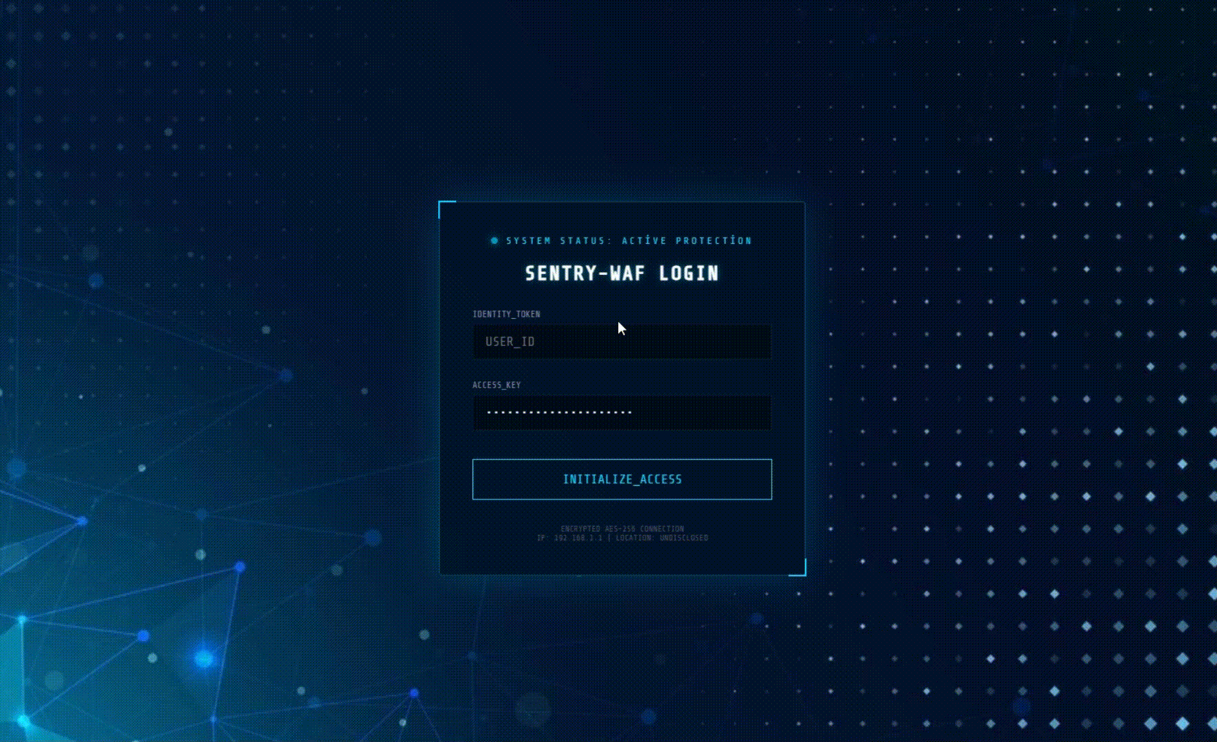
Giriş ve Şifre kısmına Veri Süzülmesi Efekti ekledim.Çok fazla kullanılan bir şey değil.
Kod içersindeki bu bölüm her tuşa bastığında input olayı imlecin olduğu yeri hesaplar ve ışık çizgileri çıkar.
Kod:
const inputs = document.querySelectorAll('input');

inputs.forEach(input => {
    input.addEventListener('input', function(e) {
        // 1. Kutuyu anlık parlatma (flash efekti)
        this.classList.add('glow-flash');
        setTimeout(() => this.classList.remove('glow-flash'), 100);

        // 2. Işık parçacıkları saçma fonksiyonunu çağır
        createDataFlow(this);
    });
});

function createDataFlow(el) {
    const rect = el.getBoundingClientRect();
    for (let i = 0; i < 5; i++) { // Her harfte 5 ışık çizgisi oluştur
        const particle = document.createElement('div');
        particle.className = 'data-particle';

        // Işığın çıkış noktasını (yazının sonu) hesapla
        const startX = rect.left + (el.value.length * 10);
        const startY = rect.top + (rect.height / 2);

        particle.style.left = startX + 'px';
        particle.style.top = startY + 'px';

        //NOT THT :  Rastgele fırlama mesafesi ve yönü (CSS değişkenlerine aktarılır)
        const tx = 50 + Math.random() * 100;
        const ty = (Math.random() - 0.5) * 60;
        particle.style.setProperty('--tx', `${tx}px`);
        particle.style.setProperty('--ty', `${ty}px`);

        document.body.appendChild(particle);
        setTimeout(() => particle.remove(), 500); // 0.5 saniye sonra yok et
    }
}
Bu bölüm, JavaScript ile oluşturulan o küçük divlerin nasıl bir "lazer ışığı" gibi görüneceğini ve nasıl hareket edeceğini belirler.
Kod:
 Veri Süzülmesi Efekti
.data-particle {
    position: absolute;
    height: 1px; /* Çizgi inceliği */
    background: linear-gradient(90deg, transparent, #fff, #00d2ff); /* Neon geçişi */
    pointer-events: none;
    z-index: 100;
    /* shoot animasyonunu kullan */
    animation: shoot 0.5s ease-out forwards;
}

@keyframes shoot {
    0% {
        transform: scaleX(0);
        opacity: 1;
    }
    100% {
        /* JavaScript'ten gelen rastgele koordinatlara fırla */
        transform: translate(var(--tx), var(--ty)) scaleX(1);
        opacity: 0; /* Giderken sönerek yok ol */
    }
}
html Tamamı
Kod:
<!DOCTYPE html>
<html lang="tr">
<head>
    <meta charset="UTF-8">
    <meta name="viewport" content="width=device-width, initial-scale=1.0">
    <title>WAF Protection Layer - UX Hub</title>
    <link href="https://fonts.googleapis.com/css2?family=Share+Tech+Mono&family=Poppins:wght@300;600&display=swap" rel="stylesheet">
    <style>
        :root {
            --primary-glow: #00d2ff;
            --secondary-glow: #3a7bd5;
            --security-red: #ff4b2b;
            --glass-bg: rgba(0, 20, 40, 0.75);
            --glass-border: rgba(0, 210, 255, 0.3);
        }

        * {
            box-sizing: border-box;
            margin: 0;
            padding: 0;
        }

        body {
            /* Verdiğin arka plan linki */
            background: url('https://static.vecteezy.com/system/resources/previews/002/859/697/non_2x/abstract-blue-polygon-technology-background-abstract-technology-network-background-with-blue-lines-and-dots-technology-pattern-background-3d-rendering-background-vector.jpg') no-repeat center center fixed;
            background-size: cover;
            height: 100vh;
            display: flex;
            justify-content: center;
            align-items: center;
            overflow: hidden;
            font-family: 'Poppins', sans-serif;
            color: #fff;
        }

        /* WAF Koruma Kartı */
        .waf-container {
            position: relative;
            width: 450px;
            padding: 40px;
            background: var(--glass-bg);
            backdrop-filter: blur(15px);
            border: 1px solid var(--glass-border);
            border-radius: 4px; /* WAF ekranları genelde daha köşeli olur */
            box-shadow: 0 0 50px rgba(0, 210, 255, 0.2);
            text-align: center;
            z-index: 10;
        }

        /* Köşe Süslemeleri (Siber Güvenlik Havası için) */
        .waf-container::before, .waf-container::after {
            content: "";
            position: absolute;
            width: 20px;
            height: 20px;
            border: 2px solid var(--primary-glow);
        }
        .waf-container::before { top: -2px; left: -2px; border-right: 0; border-bottom: 0; }
        .waf-container::after { bottom: -2px; right: -2px; border-left: 0; border-top: 0; }

        .status-header {
            font-family: 'Share Tech Mono', monospace;
            font-size: 12px;
            color: var(--primary-glow);
            text-transform: uppercase;
            letter-spacing: 3px;
            margin-bottom: 20px;
            display: flex;
            justify-content: center;
            align-items: center;
            gap: 10px;
        }

        .status-dot {
            width: 8px;
            height: 8px;
            background: var(--primary-glow);
            border-radius: 50%;
            box-shadow: 0 0 10px var(--primary-glow);
            animation: pulse 1.5s infinite;
        }

        @keyframes pulse {
            0% { opacity: 1; }
            50% { opacity: 0.3; }
            100% { opacity: 1; }
        }

        h2 {
            font-family: 'Share Tech Mono', monospace;
            font-size: 24px;
            margin-bottom: 30px;
            letter-spacing: 2px;
            text-shadow: 0 0 10px rgba(0, 210, 255, 0.5);
        }

        .input-group {
            position: relative;
            margin-bottom: 25px;
            text-align: left;
        }

        .input-group label {
            font-family: 'Share Tech Mono', monospace;
            font-size: 11px;
            color: #88a;
            display: block;
            margin-bottom: 5px;
        }

        .input-group input {
            width: 100%;
            background: rgba(0, 0, 0, 0.4);
            border: 1px solid rgba(0, 210, 255, 0.1);
            padding: 12px 15px;
            color: #fff;
            font-family: 'Share Tech Mono', monospace;
            font-size: 16px;
            outline: none;
            transition: 0.3s;
        }

        .input-group input:focus {
            border-color: var(--primary-glow);
            background: rgba(0, 210, 255, 0.05);
        }

        /* Yazı Yazıldığında Oluşan Işık Patlaması */
        .glow-flash {
            box-shadow: 0 0 30px var(--primary-glow) !important;
            border-color: #fff !important;
        }

        .btn-access {
            width: 100%;
            padding: 15px;
            background: transparent;
            border: 1px solid var(--primary-glow);
            color: var(--primary-glow);
            font-family: 'Share Tech Mono', monospace;
            font-size: 16px;
            cursor: pointer;
            transition: 0.4s;
            margin-top: 10px;
            position: relative;
            overflow: hidden;
        }

        .btn-access:hover {
            background: var(--primary-glow);
            color: #000;
            box-shadow: 0 0 20px var(--primary-glow);
        }

        Veri Süzülmesi Efekti
        .data-particle {
            position: absolute;
            height: 1px;
            background: linear-gradient(90deg, transparent, #fff, var(--primary-glow));
            pointer-events: none;
            z-index: 100;
            animation: shoot 0.5s ease-out forwards;
        }

        @keyframes shoot {
            0% { transform: scaleX(0); opacity: 1; }
            100% { transform: translate(var(--tx), var(--ty)) scaleX(1); opacity: 0; }
        }

        .security-footer {
            margin-top: 30px;
            font-size: 10px;
            color: #556;
            font-family: 'Share Tech Mono', monospace;
        }
    </style>
</head>
<body>

    <div class="waf-container">
        <div class="status-header">
            <div class="status-dot"></div>
            System Status: Active Protection
        </div>

        <h2>SENTRY-WAF LOGIN</h2>

        <div class="input-group">
            <label>IDENTITY_TOKEN</label>
            <input type="text" id="user" placeholder="USER_ID" autocomplete="off">
        </div>

        <div class="input-group">
            <label>ACCESS_KEY</label>
            <input type="password" id="pass" placeholder="••••••••" autocomplete="off">
        </div>

        <button class="btn-access">INITIALIZE_ACCESS</button>

        <div class="security-footer">
            ENCRYPTED AES-256 CONNECTION <br>
            IP: 192.168.1.1 | LOCATION: UNDISCLOSED
        </div>
    </div>

    <script>
        const inputs = document.querySelectorAll('input');

        inputs.forEach(input => {
            input.addEventListener('input', function(e) {
                // Input kutusunu anlık parlat
                this.classList.add('glow-flash');
                setTimeout(() => this.classList.remove('glow-flash'), 100);

                // Işık parçacıkları saç
                createDataFlow(this);
            });
        });

        function createDataFlow(el) {
            const rect = el.getBoundingClientRect();
            // Kaç adet ışık çizgisi çıksın?
            for (let i = 0; i < 5; i++) {
                const particle = document.createElement('div');
                particle.className = 'data-particle';

                // Başlangıç noktası (Yazının olduğu yer civarı)
                const startX = rect.left + (el.value.length * 10);
                const startY = rect.top + (rect.height / 2);

                particle.style.left = startX + 'px';
                particle.style.top = startY + 'px';
                particle.style.width = (20 + Math.random() * 50) + 'px';

                // Rastgele saçılma yönü (Sağa doğru yatay)
                const tx = 50 + Math.random() * 100;
                const ty = (Math.random() - 0.5) * 60;

                particle.style.setProperty('--tx', `${tx}px`);
                particle.style.setProperty('--ty', `${ty}px`);

                document.body.appendChild(particle);

                setTimeout(() => particle.remove(), 500);
            }
        }
    </script>
</body>
</html>
