

- 31 Mar 2023
- 79
- 38
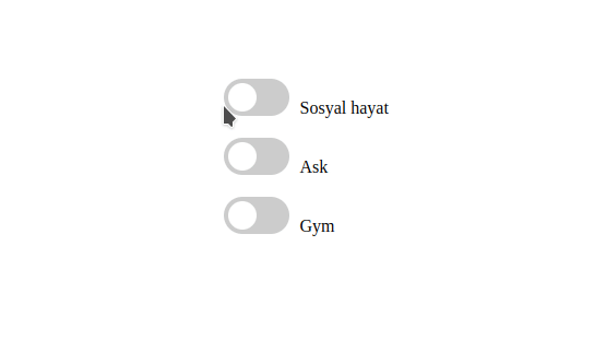
React ile hayat ")
App.js
JavaScript:
import CheckBoxButton from "./Components/CheckBoxButton";
import styles from "./style.module.css";
import React, { useState } from "react";

function App() {
  const [checkedItems, setCheckedItems] = useState({
    checkbox1: false,
    checkbox2: false,
    checkbox3: false,
  });

  function checkBoxStatus(event) {
    if (checkedItems.checkbox1 & checkedItems.checkbox2 & checkedItems.checkbox3) {
      if (event.target.id === "checkbox1") {
        setCheckedItems((prevState) => ({
          ...prevState,
          checkbox2: false,
        }));

      }
      else if(event.target.id==="checkbox2") {
        setCheckedItems((prevState) => ({
          ...prevState,
          checkbox3: false,
        }));
      }
      else {
        setCheckedItems((prevState) => ({
          ...prevState,
          checkbox1: false,
        }));
      }
    }
  }

  return (
    <div className={styles.center}>
      <CheckBoxButton
        style={styles}
        id="checkbox1"
        name="Sosyal hayat"
        isChecked={checkedItems.checkbox1}
        setIsChecked={(newValue) =>
          setCheckedItems((prev) => ({ ...prev, checkbox1: newValue }))
        }
        checkBoxStatus={checkBoxStatus}
        color={{backgroundColor:"green"}}
      />
      <CheckBoxButton
        style={styles}
        id="checkbox2"
        name="Ask"
        isChecked={checkedItems.checkbox2}
        setIsChecked={(newValue) =>
          setCheckedItems((prev) => ({ ...prev, checkbox2: newValue }))
        }
        checkBoxStatus={checkBoxStatus}
        color={{backgroundColor:"purple"}}
      />
      <CheckBoxButton
        style={styles}
        id="checkbox3"
        name="Gym"
        isChecked={checkedItems.checkbox3}
        setIsChecked={(newValue) =>
          setCheckedItems((prev) => ({ ...prev, checkbox3: newValue }))
        }
        checkBoxStatus={checkBoxStatus}
        color={{backgroundColor:"red"}}
      />
    </div>
  );
}

export default React.memo(App);
CheckBoxButton.js
JavaScript:
import React, { Component } from "react";

export default class CheckBoxButton extends Component {
    color = {}
    handleChange = (event) => {
        this.props.setIsChecked(event.target.checked);
        setTimeout(() => {
          this.props.checkBoxStatus(event);
        }, 0);
      };
  render() {
    this.color = this.props.isChecked ? this.props.color : {};

    return (
      <>
        <label className={this.props.style.switch}>
          <input
            type="checkbox"
            checked={this.props.isChecked}
            onChange={this.handleChange}
            id={this.props.id}
          />
          <div
            className={`${this.props.style.slider} ${this.props.style.round}`}  style={this.color}
          ></div>
          <div className={this.props.style.labelText}>{this.props.name}</div>
        </label>
      </>
    );
  }
}
style.module.css
CSS:
.labelText {
  margin-left: 70px;
  width: 150px;
  display: flex;
  align-items: center;
}
.center {
  display: flex;
  justify-content: center;
  align-items: center;
  height: 100vh;
  flex-direction: column;
}

label {
  display: flex;
  align-items: center;
  margin: 10px;
}

input[type="checkbox"] {
  margin-right: 10px;
}
.switch {
  position: relative;
  display: inline-block;
  width: 60px;
  height: 34px;
}

.switch input {
  opacity: 0;
  width: 0;
  height: 0;
}

.slider {
  position: absolute;
  cursor: pointer;
  top: 0;
  left: 0;
  right: 0;
  bottom: 0;
  background-color: #ccc;
  -webkit-transition: .4s;
  transition: .4s;
}

.slider:before {
  position: absolute;
  content: "";
  height: 26px;
  width: 26px;
  left: 4px;
  bottom: 4px;
  background-color: white;
  -webkit-transition: .4s;
  transition: .4s;
}


input:focus + .slider {
  box-shadow: 0 0 1px #2196F3;
}

input:checked + .slider:before {
  -webkit-transform: translateX(26px);
  -ms-transform: translateX(26px);
  transform: translateX(26px);
}

/* Rounded sliders */
.slider.round {
  border-radius: 34px;
}

.slider.round:before {
  border-radius: 50%;
}