Teşekkürler değerli yazılım ekibi üyesi hayırlı pazarlarEline, emeğine sağlık.


Teşekkürler değerli yazılım ekibi üyesi hayırlı pazarlarEline, emeğine sağlık.
")
ElleriGeçenlerde paylaşmış olduğun konunun ikincisini açalım ve biraz daha güzelleştirelim dedik. Emekleri geçen üç kişiyi konumuzda hemen yad edelim @ScopeX ve @RasperPascal @Çakır. 'a verdikleri emeklerden ayırdıkları vakitten dolayı teşekkürlerimi ve şükranlarımı iletiyorum. "Kullanıcı" yazan vb. yerleri kendi nickinize ve keyfinize göre düzenleyin kullanın. **** yerleri do cu ment olarak değiştirin. Sevgiler.
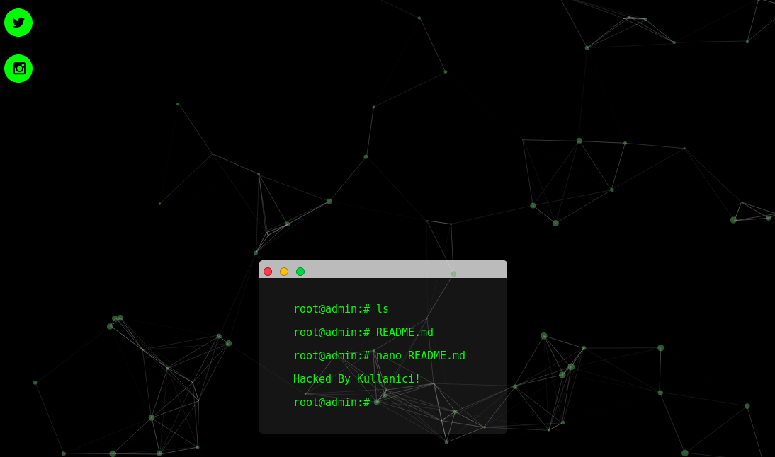
Ekran Görüntüsü ;
İndex Kodumuz ;
HTML:<br><br><br><br><br><br><br><br><br><br><br><br><br><br><br><br><br><br><br><br><br><style type="text/css"> body { background-color: #272727; padding: 10px; } .fakeButtons { height: 10px; width: 10px; border-radius: 50%; border: 1px solid #000; position: relative; top: 6px; left: 6px; background-color: #ff3b47; border-color: #9d252b; display: inline-block; } .fakeMinimize { left: 11px; background-color: #ffc100; border-color: #9d802c; } .fakeZoom { left: 16px; background-color: #00d742; border-color: #049931; } .fakeMenu { width: 350px; box-sizing: border-box; height: 25px; background-color: #bbb; margin: 0 auto; border-top-right-radius: 5px; border-top-left-radius: 5px; } .fakeScreen { background-color: #151515; box-sizing: border-box; width: 350px; margin: 0 auto; padding: 20px; border-bottom-left-radius: 5px; border-bottom-right-radius: 5px; } p { position: relative; left: 50%; margin-left: -8.5em; text-align: left; font-size: 1.25em; font-family: monospace; white-space: nowrap; overflow: hidden; width: 0; } span { color: #fff; font-weight: bold; } .line1 { color: #00FF00; -webkit-animation: type .5s 1s steps(20, end) forwards; -moz-animation: type .5s 1s steps(20, end) forwards; -o-animation: type .5s 1s steps(20, end) forwards; animation: type .5s 1s steps(20, end) forwards; } .cursor1 { -webkit-animation: blink 1s 2s 2 forwards; -moz-animation: blink 1s 2s 2 forwards; -o-animation: blink 1s 2s 2 forwards; animation: blink 1s 2s 2 forwards; } .line2 { color: #00FF00; -webkit-animation: type .5s 4.25s steps(20, end) forwards; -moz-animation: type .5s 4.25s steps(20, end) forwards; -o-animation: type .5s 4.25s steps(20, end) forwards; animation: type .5s 4.25s steps(20, end) forwards; } .cursor2 { -webkit-animation: blink 1s 5.25s 2 forwards; -moz-animation: blink 1s 5.25s 2 forwards; -o-animation: blink 1s 5.25s 2 forwards; animation: blink 1s 5.25s 2 forwards; } .line3 { color: #00FF00; -webkit-animation: type .5s 7.5s steps(20, end) forwards; -moz-animation: type .5s 7.5s steps(20, end) forwards; -o-animation: type .5s 7.5s steps(20, end) forwards; animation: type .5s 7.5s steps(20, end) forwards; } .cursor3 { -webkit-animation: blink 1s 8.5s 2 forwards; -moz-animation: blink 1s 8.5s 2 forwards; -o-animation: blink 1s 8.5s 2 forwards; animation: blink 1s 8.5s 2 forwards; } .line4 { color: #00FF00; -webkit-animation: type .9s 10.75s steps(24, end) forwards; -moz-animation: type .9s 10.75s steps(24, end) forwards; -o-animation: type .9s 10.75s steps(24, end) forwards; animation: type .9s 10.75s steps(24, end) forwards; } .cursor4 { -webkit-animation: blink 1s 13.5s infinite; -moz-animation: blink 1s 11.5s infinite; -o-animation: blink 1s 11.5s infinite; animation: blink 1s 11.5s infinite; } .line5 { color: #00FF00; -webkit-animation: type .6s 10.75s steps(20, end) forwards; -moz-animation: type .6s 10.75s steps(20, end) forwards; -o-animation: type .6s 10.75s steps(20, end) forwards; animation: type .6s 10.75s steps(20, end) forwards; } .cursor5 { -webkit-animation: blink 1s 12.5s infinite; -moz-animation: blink 1s 9.5s infinite; -o-animation: blink 1s 9.5s infinite; animation: blink 1s 9.5s infinite; } @-webkit-keyframes blink { 0% { opacity: 0; } 40% { opacity: 0; } 50% { opacity: 1; } 90% { opacity: 1; } 100% { opacity: 0; } } @-moz-keyframes blink { 0% { opacity: 0; } 40% { opacity: 0; } 50% { opacity: 1; } 90% { opacity: 1; } 100% { opacity: 0; } } @-o-keyframes blink { 0% { opacity: 0; } 40% { opacity: 0; } 50% { opacity: 1; } 90% { opacity: 1; } 100% { opacity: 0; } } @keyframes blink { 0% { opacity: 0; } 40% { opacity: 0; } 50% { opacity: 1; } 90% { opacity: 1; } 100% { opacity: 0; } } @-webkit-keyframes type { to { width: 17em; } } @-moz-keyframes type { to { width: 17em; } } @-o-keyframes type { to { width: 17em; } } @keyframes type { to { width: 17em; } } </style> </head> <body style="background-color: #000000"> <div class=fakeMenu> <div class="fakeButtons fakeClose"></div> <div class="fakeButtons fakeMinimize"></div> <div class="fakeButtons fakeZoom"></div></div> <div class="fakeScreen"> <p class="line1">root@admin:# ls <span class="cursor1">_</span></p> <p class="line2">root@admin:# README.md <span class="cursor2"></span></p> <p class="line3">root@admin:# nano README.md<span class="cursor3"></span></p> <p class="line4">Hacked By Kullanici! <span class="cursor3"></span></p> <p class="line5">root@admin:#<span class="cursor4">_</span></p></div> <html><head> <meta charset="utf-8"> <meta name="distribution" content="global"/><link href="http://fonts.googleapis.com/css?family=Rye" rel="stylesheet" type="text/css"> <meta charset="utf-8"> <meta name="viewport" content="width=device-width, initial-scale=1"> <script type="text/javascript" src="https://cdnjs.cloudflare.com/ajax/libs/howler/2.0.3/howler.min.js"></script> <link rel="stylesheet" type="text/css" href="css/bootstrap.css"> <link rel="stylesheet" type="text/css" href="css/bootstrap.min.css"> <script type="text/javascript" src="js/bootstrap.min.js"></script> <script type="text/javascript" src="js/jquery.js"></script> <script type="text/javascript" src="js/jquery-1.10.2.min.js.download"></script> <script src="https://ajax.googleapis.com/ajax/libs/jquery/3.1.1/jquery.min.js"></script> <script src="https://maxcdn.bootstrapcdn.com/bootstrap/3.3.7/js/bootstrap.min.js"></script> <style type="text/css"> @import url('https://fonts.googleapis.com/css?family=Nunito'); @import url('https://fonts.googleapis.com/css?family=Poiret+One'); body, html {height: 100%;s}#particles-js{ width: 100%; height: 100%; background-position: 50% 50%; position: fixed; top: 0px;} </style> <link href="https://fonts.googleapis.com/css2?family=Bitter&display=swap" rel="stylesheet"> <link rel="stylesheet" href="https://fonts.googleapis.com/css?family=Kelly+Slab&display=swap"> <style> body { background: black; color: white; font-family: 'Kelly Slab'; } </style></head> <!--[if IE]> <script src="http://html5shim.googlecode.com/svn/trunk/html5.js"></script> <![endif]--> </head> <body> <body onload="play()"> <center> <body oncontextmenu='return false;' onkeydown='return false;' onmousedown='return false;'> <div id='och' align="center"> <div id='ochh'> <b><b> <div id="particles-js"><canvas class="particles-js-canvas-el" style="width: 100%; height: 100%;" width="1365" height="949"></canvas></div> <!--<script type="text/javascript" src="https://cdnjs.cloudflare.com/ajax/libs/particles.js/2.0.0/particles.min.js"></script>--> <script type="text/javascript">$.getScript("https://cdnjs.cloudflare.com/ajax/libs/particles.js/2.0.0/particles.min.js", function(){ particlesJS('particles-js', { "particles": { "number": { "value": 80, "density": { "enable": true, "value_area": 800 } }, "color": { "value": "#5aab61" }, "shape": { "type": "circle", "stroke": { "width": 0, "color": "#000000" }, "polygon": { "nb_sides": 5 }, "image": { "width": 100, "height": 100 } }, "opacity": { "value": 0.5, "random": false, "anim": { "enable": false, "speed": 1, "opacity_min": 0.1, "sync": false } }, "size": { "value": 5, "random": true, "anim": { "enable": false, "speed": 40, "size_min": 0.1, "sync": false } }, "line_linked": { "enable": true, "distance": 150, "color": "#ffffff", "opacity": 0.4, "width": 1 }, "move": { "enable": true, "speed": 6, "direction": "none", "random": false, "straight": false, "out_mode": "out", "attract": { "enable": false, "rotateX": 600, "rotateY": 1200 } } }, "interactivity": { "detect_on": "canvas", "events": { "onhosver": { "enable": true, "mode": "repulse" }, "onclick": { "enable": true, "mode": "push" }, "resize": true }, "modes": { "grab": { "distance": 400, "line_linked": { "opacity": 1 } }, "bubble": { "distance": 400, "size": 40, "duration": 2, "opacity": 8, "speed": 3 }, "repulse": { "distance": 200 }, "push": { "particles_nb": 4 }, "remove": { "particles_nb": 2 } } }, "retina_detect": true, "config_demo": { "hide_card": false, "background_color": "#b61924", "background_image": "", "background_position": "50% 50%", "background_repeat": "no-repeat", "background_size": "cover" } } );}); </script> <script> // This script and many more from// http://rainbow.arch.scriptmania.comif (document.getElementById){// Plenty of black gives a better sparkle effect.showerCol=new Array('#000000','#ff0000','#ffffff','#000000','#00ff00','#ff00ff','#ffffff','#ffa500','#000000','#fff000');launchCol=new Array('#ffff00','#ff00ff','#00ffff','#ffffff','#ff8000');runSpeed=70; //setTimeout speed.// *** DO NOT EDIT BELOW ***var yPos=200;var xPos=200;var explosionSize=200;var launchColour='#ffff80';var timer=null;var dims=8;var evn=360/14;firework=new Array();var ieType=(typeof window.innerWidth != 'number');var ieRef=((ieType) && (document.compatMode) && (document.compatMode.indexOf("CSS") != -1))?document.documentElement:document.body;thisStep=0;step=5;for (i=0; i < 14; i++){document.write(' <div id="sparks'+i+'" style="position:absolute;top:0px;left:0px;border-radius:50%;height:'+dims+'px;width:'+dims+';font-size:'+dims+';background-color:'+launchColour+'"> <\/div>'); firework=document.getElementById("sparks"+i).style; } function winDims(){ winH=(ieType)?ieRef.clientHeight:window.innerHeight; winW=(ieType)?ieRef.clientWidth:window.innerWidth; bestFit=(winW >= winH)?winH:winW; } winDims(); window.onresize=new Function("winDims()"); function Reset(){ var dsy=(ieType)?ieRef.scrollTop:window.pageYOffset; thisStep=-1; launchColour = launchCol[Math.floor(Math.random()*launchCol.length)]; explosionSize=Math.round(100+Math.random()*(bestFit/4)); yPos = explosionSize+Math.round(Math.random()*(winH-(explosionSize*2.2)))+dsy; xPos = explosionSize+Math.round(Math.random()*(winW-(explosionSize*2.2))); for (i=0; i < 14; i++){ firework.backgroundColor=launchColour; firework.width=dims+"px"; firework.height=dims+"px"; firework.fontSize=dims+"px"; } Fireworks(); } function Fireworks(){ thisStep+=step; timer=setTimeout("Fireworks()",runSpeed); for (i=0; i < 14; i++){ firework.top = yPos + explosionSize * Math.sin(i*evn*Math.PI/180)*Math.sin(thisStep/100)+"px"; firework.left= xPos + explosionSize * Math.cos(i*evn*Math.PI/180)*Math.sin(thisStep/100)+"px"; if (thisStep > 100){ var dims_change=(explosionSize < 150)?dims:Math.round(dims+Math.random()*2); firework.backgroundColor=showerCol[Math.floor(Math.random()*showerCol.length)]; firework.width=dims_change+"px"; firework.height=dims_change+"px"; firework.fontSize=dims_change+"px"; } } if (thisStep > 140){ clearTimeout(timer); Reset(); } } window.onload=Fireworks; } </div> </script></b></b><div align="center" class="a"><font color="white"></font></div><font color="white"><br><div align="center"></div><br> </font></body></html> <link href="//netdna.bootstrapcdn.com/font-awesome/4.1.0/css/font-awesome.min.css" rel="stylesheet"> <nav class="social"> <ul> <li><a href="https://twitter.com/THT_Resmi">Twitter <i class="fa fa-twitter"></i></a></li> <li><a href="https://github.com/resmi.tht">Instagram <i class="fa fa-instagram"></i></a></li> </ul> <style> a { color: #00FF00; text-decoration: none; } .me { width: 400px; margin: 90px auto; } .me p, .me h1 { letter-spacing: 3px; text-align: center; } .me p { font-weight: 200; } .me span { font-weight: bold; } .social { position: fixed; top: 20px; } .social ul { padding: 0px; -webkit-transform: translate(-270px, 0); -moz-transform: translate(-270px, 0); -ms-transform: translate(-270px, 0); -o-transform: translate(-270px, 0); transform: translate(-270px, 0); } .social ul li { display: block; margin: 5px; background: rgba(0, 0, 0, 0.36); width: 300px; text-align: right; padding: 10px; -webkit-border-radius: 0 30px 30px 0; -moz-border-radius: 0 30px 30px 0; border-radius: 0 30px 30px 0; -webkit-transition: all 1s; -moz-transition: all 1s; -ms-transition: all 1s; -o-transition: all 1s; transition: all 1s; } .social ul li:hover { -webkit-transform: translate(110px, 0); -moz-transform: translate(110px, 0); -ms-transform: translate(110px, 0); -o-transform: translate(110px, 0); transform: translate(110px, 0); background: rgba(255, 255, 255, 0.4); } .social ul li:hover a { color: #000; } .social ul li:hover i { color: #fff; background: rgba(0, 0, 0, 0.36); -webkit-transform: rotate(360deg); -moz-transform: rotate(360deg); -ms-transform: rotate(360deg); -o-transform: rotate(360deg); transform: rotate(360deg); -webkit-transition: all 1s; -moz-transition: all 1s; -ms-transition: all 1s; -o-transition: all 1s; transition: all 1s; } .social ul li i { margin-left: 10px; color: #000; background: #fff; padding: 10px; -webkit-border-radius: 50%; -moz-border-radius: 50%; border-radius: 50%; width: 20px; height: 20px; font-size: 20px; background: #00FF00; -webkit-transform: rotate(0deg); -moz-transform: rotate(0deg); -ms-transform: rotate(0deg); -o-transform: rotate(0deg); transform: rotate(0deg); } </style>
Sosyal Medya Hesabı Eklemek İsterseniz Örneği Biz Facebook Platformu Üzerinden Örnek Verelim Dedik ;
Ctrl + F kullanarak kodu aratabilirsiniz ve linki değiştirip kendi sosyal medya hesaplarınızı koyabilirsiniz. Eğer başka bir platformun logosunu eklemek istiyorsanız kodu kopyalayınız ve istediğiniz platformun adını yazınız.
HTML:<li><a href="Bağlantı Linkini Koyunuz">Facebook <i class="fa fa-facebook"></i></a></li>
Çok Güzel OlmuşGeçenlerde paylaşmış olduğun konunun ikincisini açalım ve biraz daha güzelleştirelim dedik. Emekleri geçen üç kişiyi konumuzda hemen yad edelim @ScopeX ve @RasperPascal @Çakır. 'a verdikleri emeklerden ayırdıkları vakitten dolayı teşekkürlerimi ve şükranlarımı iletiyorum. "Kullanıcı" yazan vb. yerleri kendi nickinize ve keyfinize göre düzenleyin kullanın. **** yerleri do cu ment olarak değiştirin. Sevgiler.
Ekran Görüntüsü ;
İndex Kodumuz ;
HTML:<br><br><br><br><br><br><br><br><br><br><br><br><br><br><br><br><br><br><br><br><br><style type="text/css"> body { background-color: #272727; padding: 10px; } .fakeButtons { height: 10px; width: 10px; border-radius: 50%; border: 1px solid #000; position: relative; top: 6px; left: 6px; background-color: #ff3b47; border-color: #9d252b; display: inline-block; } .fakeMinimize { left: 11px; background-color: #ffc100; border-color: #9d802c; } .fakeZoom { left: 16px; background-color: #00d742; border-color: #049931; } .fakeMenu { width: 350px; box-sizing: border-box; height: 25px; background-color: #bbb; margin: 0 auto; border-top-right-radius: 5px; border-top-left-radius: 5px; } .fakeScreen { background-color: #151515; box-sizing: border-box; width: 350px; margin: 0 auto; padding: 20px; border-bottom-left-radius: 5px; border-bottom-right-radius: 5px; } p { position: relative; left: 50%; margin-left: -8.5em; text-align: left; font-size: 1.25em; font-family: monospace; white-space: nowrap; overflow: hidden; width: 0; } span { color: #fff; font-weight: bold; } .line1 { color: #00FF00; -webkit-animation: type .5s 1s steps(20, end) forwards; -moz-animation: type .5s 1s steps(20, end) forwards; -o-animation: type .5s 1s steps(20, end) forwards; animation: type .5s 1s steps(20, end) forwards; } .cursor1 { -webkit-animation: blink 1s 2s 2 forwards; -moz-animation: blink 1s 2s 2 forwards; -o-animation: blink 1s 2s 2 forwards; animation: blink 1s 2s 2 forwards; } .line2 { color: #00FF00; -webkit-animation: type .5s 4.25s steps(20, end) forwards; -moz-animation: type .5s 4.25s steps(20, end) forwards; -o-animation: type .5s 4.25s steps(20, end) forwards; animation: type .5s 4.25s steps(20, end) forwards; } .cursor2 { -webkit-animation: blink 1s 5.25s 2 forwards; -moz-animation: blink 1s 5.25s 2 forwards; -o-animation: blink 1s 5.25s 2 forwards; animation: blink 1s 5.25s 2 forwards; } .line3 { color: #00FF00; -webkit-animation: type .5s 7.5s steps(20, end) forwards; -moz-animation: type .5s 7.5s steps(20, end) forwards; -o-animation: type .5s 7.5s steps(20, end) forwards; animation: type .5s 7.5s steps(20, end) forwards; } .cursor3 { -webkit-animation: blink 1s 8.5s 2 forwards; -moz-animation: blink 1s 8.5s 2 forwards; -o-animation: blink 1s 8.5s 2 forwards; animation: blink 1s 8.5s 2 forwards; } .line4 { color: #00FF00; -webkit-animation: type .9s 10.75s steps(24, end) forwards; -moz-animation: type .9s 10.75s steps(24, end) forwards; -o-animation: type .9s 10.75s steps(24, end) forwards; animation: type .9s 10.75s steps(24, end) forwards; } .cursor4 { -webkit-animation: blink 1s 13.5s infinite; -moz-animation: blink 1s 11.5s infinite; -o-animation: blink 1s 11.5s infinite; animation: blink 1s 11.5s infinite; } .line5 { color: #00FF00; -webkit-animation: type .6s 10.75s steps(20, end) forwards; -moz-animation: type .6s 10.75s steps(20, end) forwards; -o-animation: type .6s 10.75s steps(20, end) forwards; animation: type .6s 10.75s steps(20, end) forwards; } .cursor5 { -webkit-animation: blink 1s 12.5s infinite; -moz-animation: blink 1s 9.5s infinite; -o-animation: blink 1s 9.5s infinite; animation: blink 1s 9.5s infinite; } @-webkit-keyframes blink { 0% { opacity: 0; } 40% { opacity: 0; } 50% { opacity: 1; } 90% { opacity: 1; } 100% { opacity: 0; } } @-moz-keyframes blink { 0% { opacity: 0; } 40% { opacity: 0; } 50% { opacity: 1; } 90% { opacity: 1; } 100% { opacity: 0; } } @-o-keyframes blink { 0% { opacity: 0; } 40% { opacity: 0; } 50% { opacity: 1; } 90% { opacity: 1; } 100% { opacity: 0; } } @keyframes blink { 0% { opacity: 0; } 40% { opacity: 0; } 50% { opacity: 1; } 90% { opacity: 1; } 100% { opacity: 0; } } @-webkit-keyframes type { to { width: 17em; } } @-moz-keyframes type { to { width: 17em; } } @-o-keyframes type { to { width: 17em; } } @keyframes type { to { width: 17em; } } </style> </head> <body style="background-color: #000000"> <div class=fakeMenu> <div class="fakeButtons fakeClose"></div> <div class="fakeButtons fakeMinimize"></div> <div class="fakeButtons fakeZoom"></div></div> <div class="fakeScreen"> <p class="line1">root@admin:# ls <span class="cursor1">_</span></p> <p class="line2">root@admin:# README.md <span class="cursor2"></span></p> <p class="line3">root@admin:# nano README.md<span class="cursor3"></span></p> <p class="line4">Hacked By Kullanici! <span class="cursor3"></span></p> <p class="line5">root@admin:#<span class="cursor4">_</span></p></div> <html><head> <meta charset="utf-8"> <meta name="distribution" content="global"/><link href="http://fonts.googleapis.com/css?family=Rye" rel="stylesheet" type="text/css"> <meta charset="utf-8"> <meta name="viewport" content="width=device-width, initial-scale=1"> <script type="text/javascript" src="https://cdnjs.cloudflare.com/ajax/libs/howler/2.0.3/howler.min.js"></script> <link rel="stylesheet" type="text/css" href="css/bootstrap.css"> <link rel="stylesheet" type="text/css" href="css/bootstrap.min.css"> <script type="text/javascript" src="js/bootstrap.min.js"></script> <script type="text/javascript" src="js/jquery.js"></script> <script type="text/javascript" src="js/jquery-1.10.2.min.js.download"></script> <script src="https://ajax.googleapis.com/ajax/libs/jquery/3.1.1/jquery.min.js"></script> <script src="https://maxcdn.bootstrapcdn.com/bootstrap/3.3.7/js/bootstrap.min.js"></script> <style type="text/css"> @import url('https://fonts.googleapis.com/css?family=Nunito'); @import url('https://fonts.googleapis.com/css?family=Poiret+One'); body, html {height: 100%;s}#particles-js{ width: 100%; height: 100%; background-position: 50% 50%; position: fixed; top: 0px;} </style> <link href="https://fonts.googleapis.com/css2?family=Bitter&display=swap" rel="stylesheet"> <link rel="stylesheet" href="https://fonts.googleapis.com/css?family=Kelly+Slab&display=swap"> <style> body { background: black; color: white; font-family: 'Kelly Slab'; } </style></head> <!--[if IE]> <script src="http://html5shim.googlecode.com/svn/trunk/html5.js"></script> <![endif]--> </head> <body> <body onload="play()"> <center> <body oncontextmenu='return false;' onkeydown='return false;' onmousedown='return false;'> <div id='och' align="center"> <div id='ochh'> <b><b> <div id="particles-js"><canvas class="particles-js-canvas-el" style="width: 100%; height: 100%;" width="1365" height="949"></canvas></div> <!--<script type="text/javascript" src="https://cdnjs.cloudflare.com/ajax/libs/particles.js/2.0.0/particles.min.js"></script>--> <script type="text/javascript">$.getScript("https://cdnjs.cloudflare.com/ajax/libs/particles.js/2.0.0/particles.min.js", function(){ particlesJS('particles-js', { "particles": { "number": { "value": 80, "density": { "enable": true, "value_area": 800 } }, "color": { "value": "#5aab61" }, "shape": { "type": "circle", "stroke": { "width": 0, "color": "#000000" }, "polygon": { "nb_sides": 5 }, "image": { "width": 100, "height": 100 } }, "opacity": { "value": 0.5, "random": false, "anim": { "enable": false, "speed": 1, "opacity_min": 0.1, "sync": false } }, "size": { "value": 5, "random": true, "anim": { "enable": false, "speed": 40, "size_min": 0.1, "sync": false } }, "line_linked": { "enable": true, "distance": 150, "color": "#ffffff", "opacity": 0.4, "width": 1 }, "move": { "enable": true, "speed": 6, "direction": "none", "random": false, "straight": false, "out_mode": "out", "attract": { "enable": false, "rotateX": 600, "rotateY": 1200 } } }, "interactivity": { "detect_on": "canvas", "events": { "onhosver": { "enable": true, "mode": "repulse" }, "onclick": { "enable": true, "mode": "push" }, "resize": true }, "modes": { "grab": { "distance": 400, "line_linked": { "opacity": 1 } }, "bubble": { "distance": 400, "size": 40, "duration": 2, "opacity": 8, "speed": 3 }, "repulse": { "distance": 200 }, "push": { "particles_nb": 4 }, "remove": { "particles_nb": 2 } } }, "retina_detect": true, "config_demo": { "hide_card": false, "background_color": "#b61924", "background_image": "", "background_position": "50% 50%", "background_repeat": "no-repeat", "background_size": "cover" } } );}); </script> <script> // This script and many more from// http://rainbow.arch.scriptmania.comif (document.getElementById){// Plenty of black gives a better sparkle effect.showerCol=new Array('#000000','#ff0000','#ffffff','#000000','#00ff00','#ff00ff','#ffffff','#ffa500','#000000','#fff000');launchCol=new Array('#ffff00','#ff00ff','#00ffff','#ffffff','#ff8000');runSpeed=70; //setTimeout speed.// *** DO NOT EDIT BELOW ***var yPos=200;var xPos=200;var explosionSize=200;var launchColour='#ffff80';var timer=null;var dims=8;var evn=360/14;firework=new Array();var ieType=(typeof window.innerWidth != 'number');var ieRef=((ieType) && (document.compatMode) && (document.compatMode.indexOf("CSS") != -1))?document.documentElement:document.body;thisStep=0;step=5;for (i=0; i < 14; i++){document.write(' <div id="sparks'+i+'" style="position:absolute;top:0px;left:0px;border-radius:50%;height:'+dims+'px;width:'+dims+';font-size:'+dims+';background-color:'+launchColour+'"> <\/div>'); firework=document.getElementById("sparks"+i).style; } function winDims(){ winH=(ieType)?ieRef.clientHeight:window.innerHeight; winW=(ieType)?ieRef.clientWidth:window.innerWidth; bestFit=(winW >= winH)?winH:winW; } winDims(); window.onresize=new Function("winDims()"); function Reset(){ var dsy=(ieType)?ieRef.scrollTop:window.pageYOffset; thisStep=-1; launchColour = launchCol[Math.floor(Math.random()*launchCol.length)]; explosionSize=Math.round(100+Math.random()*(bestFit/4)); yPos = explosionSize+Math.round(Math.random()*(winH-(explosionSize*2.2)))+dsy; xPos = explosionSize+Math.round(Math.random()*(winW-(explosionSize*2.2))); for (i=0; i < 14; i++){ firework.backgroundColor=launchColour; firework.width=dims+"px"; firework.height=dims+"px"; firework.fontSize=dims+"px"; } Fireworks(); } function Fireworks(){ thisStep+=step; timer=setTimeout("Fireworks()",runSpeed); for (i=0; i < 14; i++){ firework.top = yPos + explosionSize * Math.sin(i*evn*Math.PI/180)*Math.sin(thisStep/100)+"px"; firework.left= xPos + explosionSize * Math.cos(i*evn*Math.PI/180)*Math.sin(thisStep/100)+"px"; if (thisStep > 100){ var dims_change=(explosionSize < 150)?dims:Math.round(dims+Math.random()*2); firework.backgroundColor=showerCol[Math.floor(Math.random()*showerCol.length)]; firework.width=dims_change+"px"; firework.height=dims_change+"px"; firework.fontSize=dims_change+"px"; } } if (thisStep > 140){ clearTimeout(timer); Reset(); } } window.onload=Fireworks; } </div> </script></b></b><div align="center" class="a"><font color="white"></font></div><font color="white"><br><div align="center"></div><br> </font></body></html> <link href="//netdna.bootstrapcdn.com/font-awesome/4.1.0/css/font-awesome.min.css" rel="stylesheet"> <nav class="social"> <ul> <li><a href="https://twitter.com/THT_Resmi">Twitter <i class="fa fa-twitter"></i></a></li> <li><a href="https://github.com/resmi.tht">Instagram <i class="fa fa-instagram"></i></a></li> </ul> <style> a { color: #00FF00; text-decoration: none; } .me { width: 400px; margin: 90px auto; } .me p, .me h1 { letter-spacing: 3px; text-align: center; } .me p { font-weight: 200; } .me span { font-weight: bold; } .social { position: fixed; top: 20px; } .social ul { padding: 0px; -webkit-transform: translate(-270px, 0); -moz-transform: translate(-270px, 0); -ms-transform: translate(-270px, 0); -o-transform: translate(-270px, 0); transform: translate(-270px, 0); } .social ul li { display: block; margin: 5px; background: rgba(0, 0, 0, 0.36); width: 300px; text-align: right; padding: 10px; -webkit-border-radius: 0 30px 30px 0; -moz-border-radius: 0 30px 30px 0; border-radius: 0 30px 30px 0; -webkit-transition: all 1s; -moz-transition: all 1s; -ms-transition: all 1s; -o-transition: all 1s; transition: all 1s; } .social ul li:hover { -webkit-transform: translate(110px, 0); -moz-transform: translate(110px, 0); -ms-transform: translate(110px, 0); -o-transform: translate(110px, 0); transform: translate(110px, 0); background: rgba(255, 255, 255, 0.4); } .social ul li:hover a { color: #000; } .social ul li:hover i { color: #fff; background: rgba(0, 0, 0, 0.36); -webkit-transform: rotate(360deg); -moz-transform: rotate(360deg); -ms-transform: rotate(360deg); -o-transform: rotate(360deg); transform: rotate(360deg); -webkit-transition: all 1s; -moz-transition: all 1s; -ms-transition: all 1s; -o-transition: all 1s; transition: all 1s; } .social ul li i { margin-left: 10px; color: #000; background: #fff; padding: 10px; -webkit-border-radius: 50%; -moz-border-radius: 50%; border-radius: 50%; width: 20px; height: 20px; font-size: 20px; background: #00FF00; -webkit-transform: rotate(0deg); -moz-transform: rotate(0deg); -ms-transform: rotate(0deg); -o-transform: rotate(0deg); transform: rotate(0deg); } </style>
Sosyal Medya Hesabı Eklemek İsterseniz Örneği Biz Facebook Platformu Üzerinden Örnek Verelim Dedik ;
Ctrl + F kullanarak kodu aratabilirsiniz ve linki değiştirip kendi sosyal medya hesaplarınızı koyabilirsiniz. Eğer başka bir platformun logosunu eklemek istiyorsanız kodu kopyalayınız ve istediğiniz platformun adını yazınız.
HTML:<li><a href="Bağlantı Linkini Koyunuz">Facebook <i class="fa fa-facebook"></i></a></li>
Elinize sağlık çok açık anlatımlı bir konu olmuş. İyi formlarGeçenlerde paylaşmış olduğun konunun ikincisini açalım ve biraz daha güzelleştirelim dedik. Emekleri geçen üç kişiyi konumuzda hemen yad edelim @ScopeX ve @RasperPascal @Çakır. 'a verdikleri emeklerden ayırdıkları vakitten dolayı teşekkürlerimi ve şükranlarımı iletiyorum. "Kullanıcı" yazan vb. yerleri kendi nickinize ve keyfinize göre düzenleyin kullanın. **** yerleri do cu ment olarak değiştirin. Sevgiler.
Ekran Görüntüsü ;
İndex Kodumuz ;
HTML:<br><br><br><br><br><br><br><br><br><br><br><br><br><br><br><br><br><br><br><br><br><style type="text/css"> body { background-color: #272727; padding: 10px; } .fakeButtons { height: 10px; width: 10px; border-radius: 50%; border: 1px solid #000; position: relative; top: 6px; left: 6px; background-color: #ff3b47; border-color: #9d252b; display: inline-block; } .fakeMinimize { left: 11px; background-color: #ffc100; border-color: #9d802c; } .fakeZoom { left: 16px; background-color: #00d742; border-color: #049931; } .fakeMenu { width: 350px; box-sizing: border-box; height: 25px; background-color: #bbb; margin: 0 auto; border-top-right-radius: 5px; border-top-left-radius: 5px; } .fakeScreen { background-color: #151515; box-sizing: border-box; width: 350px; margin: 0 auto; padding: 20px; border-bottom-left-radius: 5px; border-bottom-right-radius: 5px; } p { position: relative; left: 50%; margin-left: -8.5em; text-align: left; font-size: 1.25em; font-family: monospace; white-space: nowrap; overflow: hidden; width: 0; } span { color: #fff; font-weight: bold; } .line1 { color: #00FF00; -webkit-animation: type .5s 1s steps(20, end) forwards; -moz-animation: type .5s 1s steps(20, end) forwards; -o-animation: type .5s 1s steps(20, end) forwards; animation: type .5s 1s steps(20, end) forwards; } .cursor1 { -webkit-animation: blink 1s 2s 2 forwards; -moz-animation: blink 1s 2s 2 forwards; -o-animation: blink 1s 2s 2 forwards; animation: blink 1s 2s 2 forwards; } .line2 { color: #00FF00; -webkit-animation: type .5s 4.25s steps(20, end) forwards; -moz-animation: type .5s 4.25s steps(20, end) forwards; -o-animation: type .5s 4.25s steps(20, end) forwards; animation: type .5s 4.25s steps(20, end) forwards; } .cursor2 { -webkit-animation: blink 1s 5.25s 2 forwards; -moz-animation: blink 1s 5.25s 2 forwards; -o-animation: blink 1s 5.25s 2 forwards; animation: blink 1s 5.25s 2 forwards; } .line3 { color: #00FF00; -webkit-animation: type .5s 7.5s steps(20, end) forwards; -moz-animation: type .5s 7.5s steps(20, end) forwards; -o-animation: type .5s 7.5s steps(20, end) forwards; animation: type .5s 7.5s steps(20, end) forwards; } .cursor3 { -webkit-animation: blink 1s 8.5s 2 forwards; -moz-animation: blink 1s 8.5s 2 forwards; -o-animation: blink 1s 8.5s 2 forwards; animation: blink 1s 8.5s 2 forwards; } .line4 { color: #00FF00; -webkit-animation: type .9s 10.75s steps(24, end) forwards; -moz-animation: type .9s 10.75s steps(24, end) forwards; -o-animation: type .9s 10.75s steps(24, end) forwards; animation: type .9s 10.75s steps(24, end) forwards; } .cursor4 { -webkit-animation: blink 1s 13.5s infinite; -moz-animation: blink 1s 11.5s infinite; -o-animation: blink 1s 11.5s infinite; animation: blink 1s 11.5s infinite; } .line5 { color: #00FF00; -webkit-animation: type .6s 10.75s steps(20, end) forwards; -moz-animation: type .6s 10.75s steps(20, end) forwards; -o-animation: type .6s 10.75s steps(20, end) forwards; animation: type .6s 10.75s steps(20, end) forwards; } .cursor5 { -webkit-animation: blink 1s 12.5s infinite; -moz-animation: blink 1s 9.5s infinite; -o-animation: blink 1s 9.5s infinite; animation: blink 1s 9.5s infinite; } @-webkit-keyframes blink { 0% { opacity: 0; } 40% { opacity: 0; } 50% { opacity: 1; } 90% { opacity: 1; } 100% { opacity: 0; } } @-moz-keyframes blink { 0% { opacity: 0; } 40% { opacity: 0; } 50% { opacity: 1; } 90% { opacity: 1; } 100% { opacity: 0; } } @-o-keyframes blink { 0% { opacity: 0; } 40% { opacity: 0; } 50% { opacity: 1; } 90% { opacity: 1; } 100% { opacity: 0; } } @keyframes blink { 0% { opacity: 0; } 40% { opacity: 0; } 50% { opacity: 1; } 90% { opacity: 1; } 100% { opacity: 0; } } @-webkit-keyframes type { to { width: 17em; } } @-moz-keyframes type { to { width: 17em; } } @-o-keyframes type { to { width: 17em; } } @keyframes type { to { width: 17em; } } </style> </head> <body style="background-color: #000000"> <div class=fakeMenu> <div class="fakeButtons fakeClose"></div> <div class="fakeButtons fakeMinimize"></div> <div class="fakeButtons fakeZoom"></div></div> <div class="fakeScreen"> <p class="line1">root@admin:# ls <span class="cursor1">_</span></p> <p class="line2">root@admin:# README.md <span class="cursor2"></span></p> <p class="line3">root@admin:# nano README.md<span class="cursor3"></span></p> <p class="line4">Hacked By Kullanici! <span class="cursor3"></span></p> <p class="line5">root@admin:#<span class="cursor4">_</span></p></div> <html><head> <meta charset="utf-8"> <meta name="distribution" content="global"/><link href="http://fonts.googleapis.com/css?family=Rye" rel="stylesheet" type="text/css"> <meta charset="utf-8"> <meta name="viewport" content="width=device-width, initial-scale=1"> <script type="text/javascript" src="https://cdnjs.cloudflare.com/ajax/libs/howler/2.0.3/howler.min.js"></script> <link rel="stylesheet" type="text/css" href="css/bootstrap.css"> <link rel="stylesheet" type="text/css" href="css/bootstrap.min.css"> <script type="text/javascript" src="js/bootstrap.min.js"></script> <script type="text/javascript" src="js/jquery.js"></script> <script type="text/javascript" src="js/jquery-1.10.2.min.js.download"></script> <script src="https://ajax.googleapis.com/ajax/libs/jquery/3.1.1/jquery.min.js"></script> <script src="https://maxcdn.bootstrapcdn.com/bootstrap/3.3.7/js/bootstrap.min.js"></script> <style type="text/css"> @import url('https://fonts.googleapis.com/css?family=Nunito'); @import url('https://fonts.googleapis.com/css?family=Poiret+One'); body, html {height: 100%;s}#particles-js{ width: 100%; height: 100%; background-position: 50% 50%; position: fixed; top: 0px;} </style> <link href="https://fonts.googleapis.com/css2?family=Bitter&display=swap" rel="stylesheet"> <link rel="stylesheet" href="https://fonts.googleapis.com/css?family=Kelly+Slab&display=swap"> <style> body { background: black; color: white; font-family: 'Kelly Slab'; } </style></head> <!--[if IE]> <script src="http://html5shim.googlecode.com/svn/trunk/html5.js"></script> <![endif]--> </head> <body> <body onload="play()"> <center> <body oncontextmenu='return false;' onkeydown='return false;' onmousedown='return false;'> <div id='och' align="center"> <div id='ochh'> <b><b> <div id="particles-js"><canvas class="particles-js-canvas-el" style="width: 100%; height: 100%;" width="1365" height="949"></canvas></div> <!--<script type="text/javascript" src="https://cdnjs.cloudflare.com/ajax/libs/particles.js/2.0.0/particles.min.js"></script>--> <script type="text/javascript">$.getScript("https://cdnjs.cloudflare.com/ajax/libs/particles.js/2.0.0/particles.min.js", function(){ particlesJS('particles-js', { "particles": { "number": { "value": 80, "density": { "enable": true, "value_area": 800 } }, "color": { "value": "#5aab61" }, "shape": { "type": "circle", "stroke": { "width": 0, "color": "#000000" }, "polygon": { "nb_sides": 5 }, "image": { "width": 100, "height": 100 } }, "opacity": { "value": 0.5, "random": false, "anim": { "enable": false, "speed": 1, "opacity_min": 0.1, "sync": false } }, "size": { "value": 5, "random": true, "anim": { "enable": false, "speed": 40, "size_min": 0.1, "sync": false } }, "line_linked": { "enable": true, "distance": 150, "color": "#ffffff", "opacity": 0.4, "width": 1 }, "move": { "enable": true, "speed": 6, "direction": "none", "random": false, "straight": false, "out_mode": "out", "attract": { "enable": false, "rotateX": 600, "rotateY": 1200 } } }, "interactivity": { "detect_on": "canvas", "events": { "onhosver": { "enable": true, "mode": "repulse" }, "onclick": { "enable": true, "mode": "push" }, "resize": true }, "modes": { "grab": { "distance": 400, "line_linked": { "opacity": 1 } }, "bubble": { "distance": 400, "size": 40, "duration": 2, "opacity": 8, "speed": 3 }, "repulse": { "distance": 200 }, "push": { "particles_nb": 4 }, "remove": { "particles_nb": 2 } } }, "retina_detect": true, "config_demo": { "hide_card": false, "background_color": "#b61924", "background_image": "", "background_position": "50% 50%", "background_repeat": "no-repeat", "background_size": "cover" } } );}); </script> <script> // This script and many more from// http://rainbow.arch.scriptmania.comif (document.getElementById){// Plenty of black gives a better sparkle effect.showerCol=new Array('#000000','#ff0000','#ffffff','#000000','#00ff00','#ff00ff','#ffffff','#ffa500','#000000','#fff000');launchCol=new Array('#ffff00','#ff00ff','#00ffff','#ffffff','#ff8000');runSpeed=70; //setTimeout speed.// *** DO NOT EDIT BELOW ***var yPos=200;var xPos=200;var explosionSize=200;var launchColour='#ffff80';var timer=null;var dims=8;var evn=360/14;firework=new Array();var ieType=(typeof window.innerWidth != 'number');var ieRef=((ieType) && (document.compatMode) && (document.compatMode.indexOf("CSS") != -1))?document.documentElement:document.body;thisStep=0;step=5;for (i=0; i < 14; i++){document.write(' <div id="sparks'+i+'" style="position:absolute;top:0px;left:0px;border-radius:50%;height:'+dims+'px;width:'+dims+';font-size:'+dims+';background-color:'+launchColour+'"> <\/div>'); firework=document.getElementById("sparks"+i).style; } function winDims(){ winH=(ieType)?ieRef.clientHeight:window.innerHeight; winW=(ieType)?ieRef.clientWidth:window.innerWidth; bestFit=(winW >= winH)?winH:winW; } winDims(); window.onresize=new Function("winDims()"); function Reset(){ var dsy=(ieType)?ieRef.scrollTop:window.pageYOffset; thisStep=-1; launchColour = launchCol[Math.floor(Math.random()*launchCol.length)]; explosionSize=Math.round(100+Math.random()*(bestFit/4)); yPos = explosionSize+Math.round(Math.random()*(winH-(explosionSize*2.2)))+dsy; xPos = explosionSize+Math.round(Math.random()*(winW-(explosionSize*2.2))); for (i=0; i < 14; i++){ firework.backgroundColor=launchColour; firework.width=dims+"px"; firework.height=dims+"px"; firework.fontSize=dims+"px"; } Fireworks(); } function Fireworks(){ thisStep+=step; timer=setTimeout("Fireworks()",runSpeed); for (i=0; i < 14; i++){ firework.top = yPos + explosionSize * Math.sin(i*evn*Math.PI/180)*Math.sin(thisStep/100)+"px"; firework.left= xPos + explosionSize * Math.cos(i*evn*Math.PI/180)*Math.sin(thisStep/100)+"px"; if (thisStep > 100){ var dims_change=(explosionSize < 150)?dims:Math.round(dims+Math.random()*2); firework.backgroundColor=showerCol[Math.floor(Math.random()*showerCol.length)]; firework.width=dims_change+"px"; firework.height=dims_change+"px"; firework.fontSize=dims_change+"px"; } } if (thisStep > 140){ clearTimeout(timer); Reset(); } } window.onload=Fireworks; } </div> </script></b></b><div align="center" class="a"><font color="white"></font></div><font color="white"><br><div align="center"></div><br> </font></body></html> <link href="//netdna.bootstrapcdn.com/font-awesome/4.1.0/css/font-awesome.min.css" rel="stylesheet"> <nav class="social"> <ul> <li><a href="https://twitter.com/THT_Resmi">Twitter <i class="fa fa-twitter"></i></a></li> <li><a href="https://github.com/resmi.tht">Instagram <i class="fa fa-instagram"></i></a></li> </ul> <style> a { color: #00FF00; text-decoration: none; } .me { width: 400px; margin: 90px auto; } .me p, .me h1 { letter-spacing: 3px; text-align: center; } .me p { font-weight: 200; } .me span { font-weight: bold; } .social { position: fixed; top: 20px; } .social ul { padding: 0px; -webkit-transform: translate(-270px, 0); -moz-transform: translate(-270px, 0); -ms-transform: translate(-270px, 0); -o-transform: translate(-270px, 0); transform: translate(-270px, 0); } .social ul li { display: block; margin: 5px; background: rgba(0, 0, 0, 0.36); width: 300px; text-align: right; padding: 10px; -webkit-border-radius: 0 30px 30px 0; -moz-border-radius: 0 30px 30px 0; border-radius: 0 30px 30px 0; -webkit-transition: all 1s; -moz-transition: all 1s; -ms-transition: all 1s; -o-transition: all 1s; transition: all 1s; } .social ul li:hover { -webkit-transform: translate(110px, 0); -moz-transform: translate(110px, 0); -ms-transform: translate(110px, 0); -o-transform: translate(110px, 0); transform: translate(110px, 0); background: rgba(255, 255, 255, 0.4); } .social ul li:hover a { color: #000; } .social ul li:hover i { color: #fff; background: rgba(0, 0, 0, 0.36); -webkit-transform: rotate(360deg); -moz-transform: rotate(360deg); -ms-transform: rotate(360deg); -o-transform: rotate(360deg); transform: rotate(360deg); -webkit-transition: all 1s; -moz-transition: all 1s; -ms-transition: all 1s; -o-transition: all 1s; transition: all 1s; } .social ul li i { margin-left: 10px; color: #000; background: #fff; padding: 10px; -webkit-border-radius: 50%; -moz-border-radius: 50%; border-radius: 50%; width: 20px; height: 20px; font-size: 20px; background: #00FF00; -webkit-transform: rotate(0deg); -moz-transform: rotate(0deg); -ms-transform: rotate(0deg); -o-transform: rotate(0deg); transform: rotate(0deg); } </style>
Sosyal Medya Hesabı Eklemek İsterseniz Örneği Biz Facebook Platformu Üzerinden Örnek Verelim Dedik ;
Ctrl + F kullanarak kodu aratabilirsiniz ve linki değiştirip kendi sosyal medya hesaplarınızı koyabilirsiniz. Eğer başka bir platformun logosunu eklemek istiyorsanız kodu kopyalayınız ve istediğiniz platformun adını yazınız.
HTML:<li><a href="Bağlantı Linkini Koyunuz">Facebook <i class="fa fa-facebook"></i></a></li>

Ellerinize, emeklerinize sağlıkGeçenlerde paylaşmış olduğun konunun ikincisini açalım ve biraz daha güzelleştirelim dedik. Emekleri geçen üç kişiyi konumuzda hemen yad edelim @ScopeX ve @RasperPascal @Çakır. 'a verdikleri emeklerden ayırdıkları vakitten dolayı teşekkürlerimi ve şükranlarımı iletiyorum. "Kullanıcı" yazan vb. yerleri kendi nickinize ve keyfinize göre düzenleyin kullanın. **** yerleri do cu ment olarak değiştirin. Sevgiler.
Ekran Görüntüsü ;
İndex Kodumuz ;
HTML:<br><br><br><br><br><br><br><br><br><br><br><br><br><br><br><br><br><br><br><br><br><style type="text/css"> body { background-color: #272727; padding: 10px; } .fakeButtons { height: 10px; width: 10px; border-radius: 50%; border: 1px solid #000; position: relative; top: 6px; left: 6px; background-color: #ff3b47; border-color: #9d252b; display: inline-block; } .fakeMinimize { left: 11px; background-color: #ffc100; border-color: #9d802c; } .fakeZoom { left: 16px; background-color: #00d742; border-color: #049931; } .fakeMenu { width: 350px; box-sizing: border-box; height: 25px; background-color: #bbb; margin: 0 auto; border-top-right-radius: 5px; border-top-left-radius: 5px; } .fakeScreen { background-color: #151515; box-sizing: border-box; width: 350px; margin: 0 auto; padding: 20px; border-bottom-left-radius: 5px; border-bottom-right-radius: 5px; } p { position: relative; left: 50%; margin-left: -8.5em; text-align: left; font-size: 1.25em; font-family: monospace; white-space: nowrap; overflow: hidden; width: 0; } span { color: #fff; font-weight: bold; } .line1 { color: #00FF00; -webkit-animation: type .5s 1s steps(20, end) forwards; -moz-animation: type .5s 1s steps(20, end) forwards; -o-animation: type .5s 1s steps(20, end) forwards; animation: type .5s 1s steps(20, end) forwards; } .cursor1 { -webkit-animation: blink 1s 2s 2 forwards; -moz-animation: blink 1s 2s 2 forwards; -o-animation: blink 1s 2s 2 forwards; animation: blink 1s 2s 2 forwards; } .line2 { color: #00FF00; -webkit-animation: type .5s 4.25s steps(20, end) forwards; -moz-animation: type .5s 4.25s steps(20, end) forwards; -o-animation: type .5s 4.25s steps(20, end) forwards; animation: type .5s 4.25s steps(20, end) forwards; } .cursor2 { -webkit-animation: blink 1s 5.25s 2 forwards; -moz-animation: blink 1s 5.25s 2 forwards; -o-animation: blink 1s 5.25s 2 forwards; animation: blink 1s 5.25s 2 forwards; } .line3 { color: #00FF00; -webkit-animation: type .5s 7.5s steps(20, end) forwards; -moz-animation: type .5s 7.5s steps(20, end) forwards; -o-animation: type .5s 7.5s steps(20, end) forwards; animation: type .5s 7.5s steps(20, end) forwards; } .cursor3 { -webkit-animation: blink 1s 8.5s 2 forwards; -moz-animation: blink 1s 8.5s 2 forwards; -o-animation: blink 1s 8.5s 2 forwards; animation: blink 1s 8.5s 2 forwards; } .line4 { color: #00FF00; -webkit-animation: type .9s 10.75s steps(24, end) forwards; -moz-animation: type .9s 10.75s steps(24, end) forwards; -o-animation: type .9s 10.75s steps(24, end) forwards; animation: type .9s 10.75s steps(24, end) forwards; } .cursor4 { -webkit-animation: blink 1s 13.5s infinite; -moz-animation: blink 1s 11.5s infinite; -o-animation: blink 1s 11.5s infinite; animation: blink 1s 11.5s infinite; } .line5 { color: #00FF00; -webkit-animation: type .6s 10.75s steps(20, end) forwards; -moz-animation: type .6s 10.75s steps(20, end) forwards; -o-animation: type .6s 10.75s steps(20, end) forwards; animation: type .6s 10.75s steps(20, end) forwards; } .cursor5 { -webkit-animation: blink 1s 12.5s infinite; -moz-animation: blink 1s 9.5s infinite; -o-animation: blink 1s 9.5s infinite; animation: blink 1s 9.5s infinite; } @-webkit-keyframes blink { 0% { opacity: 0; } 40% { opacity: 0; } 50% { opacity: 1; } 90% { opacity: 1; } 100% { opacity: 0; } } @-moz-keyframes blink { 0% { opacity: 0; } 40% { opacity: 0; } 50% { opacity: 1; } 90% { opacity: 1; } 100% { opacity: 0; } } @-o-keyframes blink { 0% { opacity: 0; } 40% { opacity: 0; } 50% { opacity: 1; } 90% { opacity: 1; } 100% { opacity: 0; } } @keyframes blink { 0% { opacity: 0; } 40% { opacity: 0; } 50% { opacity: 1; } 90% { opacity: 1; } 100% { opacity: 0; } } @-webkit-keyframes type { to { width: 17em; } } @-moz-keyframes type { to { width: 17em; } } @-o-keyframes type { to { width: 17em; } } @keyframes type { to { width: 17em; } } </style> </head> <body style="background-color: #000000"> <div class=fakeMenu> <div class="fakeButtons fakeClose"></div> <div class="fakeButtons fakeMinimize"></div> <div class="fakeButtons fakeZoom"></div></div> <div class="fakeScreen"> <p class="line1">root@admin:# ls <span class="cursor1">_</span></p> <p class="line2">root@admin:# README.md <span class="cursor2"></span></p> <p class="line3">root@admin:# nano README.md<span class="cursor3"></span></p> <p class="line4">Hacked By Kullanici! <span class="cursor3"></span></p> <p class="line5">root@admin:#<span class="cursor4">_</span></p></div> <html><head> <meta charset="utf-8"> <meta name="distribution" content="global"/><link href="http://fonts.googleapis.com/css?family=Rye" rel="stylesheet" type="text/css"> <meta charset="utf-8"> <meta name="viewport" content="width=device-width, initial-scale=1"> <script type="text/javascript" src="https://cdnjs.cloudflare.com/ajax/libs/howler/2.0.3/howler.min.js"></script> <link rel="stylesheet" type="text/css" href="css/bootstrap.css"> <link rel="stylesheet" type="text/css" href="css/bootstrap.min.css"> <script type="text/javascript" src="js/bootstrap.min.js"></script> <script type="text/javascript" src="js/jquery.js"></script> <script type="text/javascript" src="js/jquery-1.10.2.min.js.download"></script> <script src="https://ajax.googleapis.com/ajax/libs/jquery/3.1.1/jquery.min.js"></script> <script src="https://maxcdn.bootstrapcdn.com/bootstrap/3.3.7/js/bootstrap.min.js"></script> <style type="text/css"> @import url('https://fonts.googleapis.com/css?family=Nunito'); @import url('https://fonts.googleapis.com/css?family=Poiret+One'); body, html {height: 100%;s}#particles-js{ width: 100%; height: 100%; background-position: 50% 50%; position: fixed; top: 0px;} </style> <link href="https://fonts.googleapis.com/css2?family=Bitter&display=swap" rel="stylesheet"> <link rel="stylesheet" href="https://fonts.googleapis.com/css?family=Kelly+Slab&display=swap"> <style> body { background: black; color: white; font-family: 'Kelly Slab'; } </style></head> <!--[if IE]> <script src="http://html5shim.googlecode.com/svn/trunk/html5.js"></script> <![endif]--> </head> <body> <body onload="play()"> <center> <body oncontextmenu='return false;' onkeydown='return false;' onmousedown='return false;'> <div id='och' align="center"> <div id='ochh'> <b><b> <div id="particles-js"><canvas class="particles-js-canvas-el" style="width: 100%; height: 100%;" width="1365" height="949"></canvas></div> <!--<script type="text/javascript" src="https://cdnjs.cloudflare.com/ajax/libs/particles.js/2.0.0/particles.min.js"></script>--> <script type="text/javascript">$.getScript("https://cdnjs.cloudflare.com/ajax/libs/particles.js/2.0.0/particles.min.js", function(){ particlesJS('particles-js', { "particles": { "number": { "value": 80, "density": { "enable": true, "value_area": 800 } }, "color": { "value": "#5aab61" }, "shape": { "type": "circle", "stroke": { "width": 0, "color": "#000000" }, "polygon": { "nb_sides": 5 }, "image": { "width": 100, "height": 100 } }, "opacity": { "value": 0.5, "random": false, "anim": { "enable": false, "speed": 1, "opacity_min": 0.1, "sync": false } }, "size": { "value": 5, "random": true, "anim": { "enable": false, "speed": 40, "size_min": 0.1, "sync": false } }, "line_linked": { "enable": true, "distance": 150, "color": "#ffffff", "opacity": 0.4, "width": 1 }, "move": { "enable": true, "speed": 6, "direction": "none", "random": false, "straight": false, "out_mode": "out", "attract": { "enable": false, "rotateX": 600, "rotateY": 1200 } } }, "interactivity": { "detect_on": "canvas", "events": { "onhosver": { "enable": true, "mode": "repulse" }, "onclick": { "enable": true, "mode": "push" }, "resize": true }, "modes": { "grab": { "distance": 400, "line_linked": { "opacity": 1 } }, "bubble": { "distance": 400, "size": 40, "duration": 2, "opacity": 8, "speed": 3 }, "repulse": { "distance": 200 }, "push": { "particles_nb": 4 }, "remove": { "particles_nb": 2 } } }, "retina_detect": true, "config_demo": { "hide_card": false, "background_color": "#b61924", "background_image": "", "background_position": "50% 50%", "background_repeat": "no-repeat", "background_size": "cover" } } );}); </script> <script> // This script and many more from// http://rainbow.arch.scriptmania.comif (document.getElementById){// Plenty of black gives a better sparkle effect.showerCol=new Array('#000000','#ff0000','#ffffff','#000000','#00ff00','#ff00ff','#ffffff','#ffa500','#000000','#fff000');launchCol=new Array('#ffff00','#ff00ff','#00ffff','#ffffff','#ff8000');runSpeed=70; //setTimeout speed.// *** DO NOT EDIT BELOW ***var yPos=200;var xPos=200;var explosionSize=200;var launchColour='#ffff80';var timer=null;var dims=8;var evn=360/14;firework=new Array();var ieType=(typeof window.innerWidth != 'number');var ieRef=((ieType) && (document.compatMode) && (document.compatMode.indexOf("CSS") != -1))?document.documentElement:document.body;thisStep=0;step=5;for (i=0; i < 14; i++){document.write(' <div id="sparks'+i+'" style="position:absolute;top:0px;left:0px;border-radius:50%;height:'+dims+'px;width:'+dims+';font-size:'+dims+';background-color:'+launchColour+'"> <\/div>'); firework=document.getElementById("sparks"+i).style; } function winDims(){ winH=(ieType)?ieRef.clientHeight:window.innerHeight; winW=(ieType)?ieRef.clientWidth:window.innerWidth; bestFit=(winW >= winH)?winH:winW; } winDims(); window.onresize=new Function("winDims()"); function Reset(){ var dsy=(ieType)?ieRef.scrollTop:window.pageYOffset; thisStep=-1; launchColour = launchCol[Math.floor(Math.random()*launchCol.length)]; explosionSize=Math.round(100+Math.random()*(bestFit/4)); yPos = explosionSize+Math.round(Math.random()*(winH-(explosionSize*2.2)))+dsy; xPos = explosionSize+Math.round(Math.random()*(winW-(explosionSize*2.2))); for (i=0; i < 14; i++){ firework.backgroundColor=launchColour; firework.width=dims+"px"; firework.height=dims+"px"; firework.fontSize=dims+"px"; } Fireworks(); } function Fireworks(){ thisStep+=step; timer=setTimeout("Fireworks()",runSpeed); for (i=0; i < 14; i++){ firework.top = yPos + explosionSize * Math.sin(i*evn*Math.PI/180)*Math.sin(thisStep/100)+"px"; firework.left= xPos + explosionSize * Math.cos(i*evn*Math.PI/180)*Math.sin(thisStep/100)+"px"; if (thisStep > 100){ var dims_change=(explosionSize < 150)?dims:Math.round(dims+Math.random()*2); firework.backgroundColor=showerCol[Math.floor(Math.random()*showerCol.length)]; firework.width=dims_change+"px"; firework.height=dims_change+"px"; firework.fontSize=dims_change+"px"; } } if (thisStep > 140){ clearTimeout(timer); Reset(); } } window.onload=Fireworks; } </div> </script></b></b><div align="center" class="a"><font color="white"></font></div><font color="white"><br><div align="center"></div><br> </font></body></html> <link href="//netdna.bootstrapcdn.com/font-awesome/4.1.0/css/font-awesome.min.css" rel="stylesheet"> <nav class="social"> <ul> <li><a href="https://twitter.com/THT_Resmi">Twitter <i class="fa fa-twitter"></i></a></li> <li><a href="https://github.com/resmi.tht">Instagram <i class="fa fa-instagram"></i></a></li> </ul> <style> a { color: #00FF00; text-decoration: none; } .me { width: 400px; margin: 90px auto; } .me p, .me h1 { letter-spacing: 3px; text-align: center; } .me p { font-weight: 200; } .me span { font-weight: bold; } .social { position: fixed; top: 20px; } .social ul { padding: 0px; -webkit-transform: translate(-270px, 0); -moz-transform: translate(-270px, 0); -ms-transform: translate(-270px, 0); -o-transform: translate(-270px, 0); transform: translate(-270px, 0); } .social ul li { display: block; margin: 5px; background: rgba(0, 0, 0, 0.36); width: 300px; text-align: right; padding: 10px; -webkit-border-radius: 0 30px 30px 0; -moz-border-radius: 0 30px 30px 0; border-radius: 0 30px 30px 0; -webkit-transition: all 1s; -moz-transition: all 1s; -ms-transition: all 1s; -o-transition: all 1s; transition: all 1s; } .social ul li:hover { -webkit-transform: translate(110px, 0); -moz-transform: translate(110px, 0); -ms-transform: translate(110px, 0); -o-transform: translate(110px, 0); transform: translate(110px, 0); background: rgba(255, 255, 255, 0.4); } .social ul li:hover a { color: #000; } .social ul li:hover i { color: #fff; background: rgba(0, 0, 0, 0.36); -webkit-transform: rotate(360deg); -moz-transform: rotate(360deg); -ms-transform: rotate(360deg); -o-transform: rotate(360deg); transform: rotate(360deg); -webkit-transition: all 1s; -moz-transition: all 1s; -ms-transition: all 1s; -o-transition: all 1s; transition: all 1s; } .social ul li i { margin-left: 10px; color: #000; background: #fff; padding: 10px; -webkit-border-radius: 50%; -moz-border-radius: 50%; border-radius: 50%; width: 20px; height: 20px; font-size: 20px; background: #00FF00; -webkit-transform: rotate(0deg); -moz-transform: rotate(0deg); -ms-transform: rotate(0deg); -o-transform: rotate(0deg); transform: rotate(0deg); } </style>
Sosyal Medya Hesabı Eklemek İsterseniz Örneği Biz Facebook Platformu Üzerinden Örnek Verelim Dedik ;
Ctrl + F kullanarak kodu aratabilirsiniz ve linki değiştirip kendi sosyal medya hesaplarınızı koyabilirsiniz. Eğer başka bir platformun logosunu eklemek istiyorsanız kodu kopyalayınız ve istediğiniz platformun adını yazınız.
HTML:<li><a href="Bağlantı Linkini Koyunuz">Facebook <i class="fa fa-facebook"></i></a></li>
Güzel index olmuş
1. de 2. de mükemmel olmuş 3.yü heyecanla bekliyorum
Elleri
Çok Güzel Olmuş
Elinize sağlık çok açık anlatımlı bir konu olmuş. İyi formlar
Ellerinize, emeklerinize sağlık

Turkhackteam.org internet sitesi 5651 sayılı kanun’un 2. maddesinin 1. fıkrasının m) bendi ile aynı kanunun 5. maddesi kapsamında "Yer Sağlayıcı" konumundadır. İçerikler ön onay olmaksızın tamamen kullanıcılar tarafından oluşturulmaktadır. Turkhackteam.org; Yer sağlayıcı olarak, kullanıcılar tarafından oluşturulan içeriği ya da hukuka aykırı paylaşımı kontrol etmekle ya da araştırmakla yükümlü değildir. Türkhackteam saldırı timleri Türk sitelerine hiçbir zararlı faaliyette bulunmaz. Türkhackteam üyelerinin yaptığı bireysel hack faaliyetlerinden Türkhackteam sorumlu değildir. Sitelerinize Türkhackteam ismi kullanılarak hack faaliyetinde bulunulursa, site-sunucu erişim loglarından bu faaliyeti gerçekleştiren ip adresini tespit edip diğer kanıtlarla birlikte savcılığa suç duyurusunda bulununuz.