


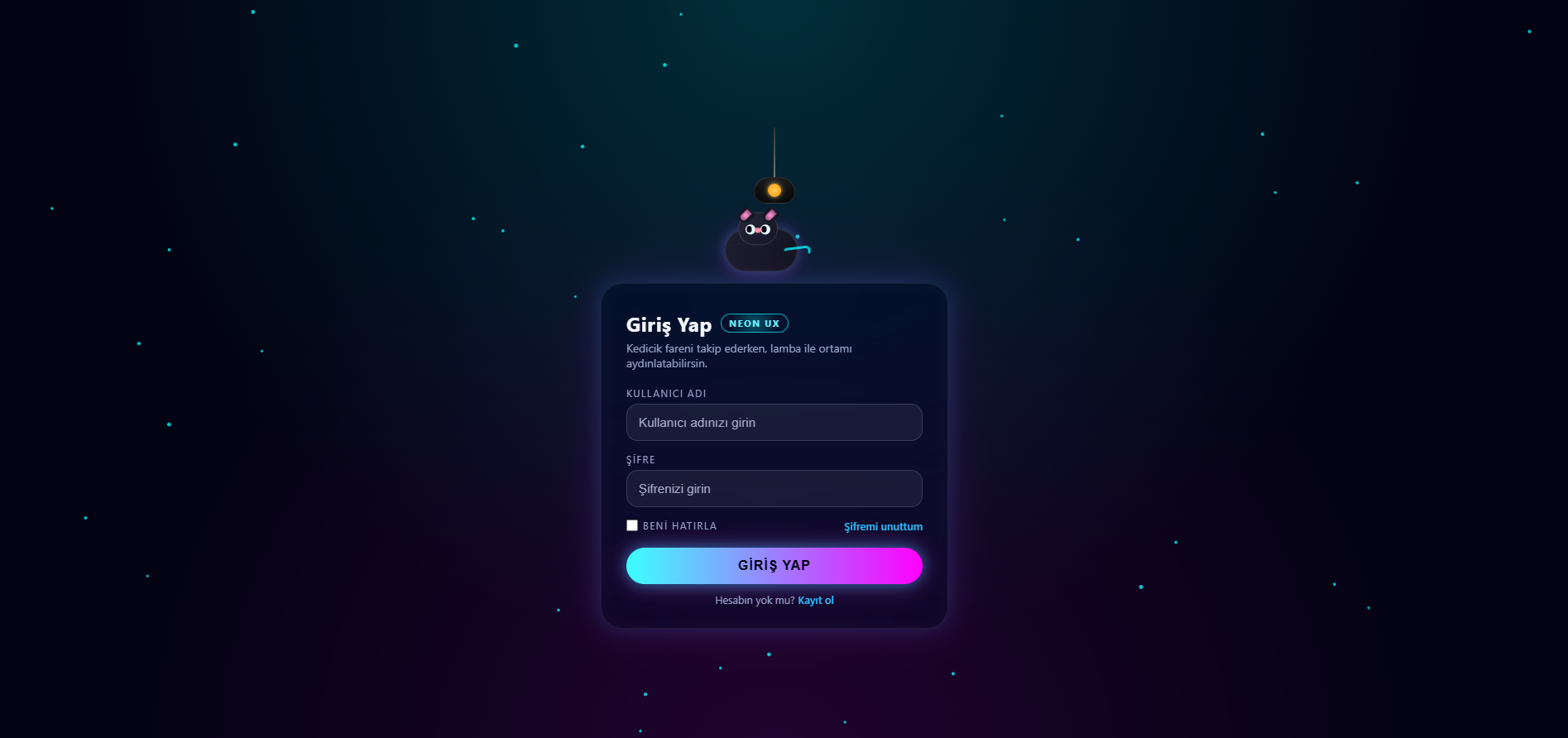
Ekranın üst kısmında sizi karşılayan sevimli kedicik,farenizin hareketlerini takip ediyor.
Arayüzü daha canlı ve dinamik göstermesi için tüm hareketler yumuşak animasyonlar var.
Lambaya tıklayınca ortam aydınlanıyor.
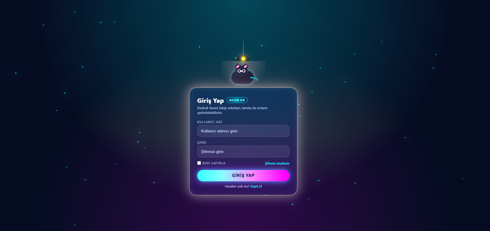
Arayüzü daha canlı ve dinamik göstermesi için tüm hareketler yumuşak animasyonlar var.
Lambaya tıklayınca ortam aydınlanıyor.
Kod:
<!DOCTYPE html>
<html lang="tr">
<head>
<meta charset="UTF-8" />
<title>Neon Kedili Login</title>
<meta name="viewport" content="width=device-width, initial-scale=1.0" />
<style>
:root {
--bg-dark: #020312;
--bg-card: rgba(7, 10, 30, 0.6);
--bg-card-light: rgba(14, 18, 50, 0.7);
--accent: #00f5ff;
--accent2: #ff00ff;
--text-main: #f5f7ff;
--text-muted: #9aa3c8;
}
* { margin: 0; padding: 0; box-sizing: border-box; }
body {
font-family: system-ui, -apple-system, BlinkMacSystemFont, "Segoe UI",
sans-serif;
background: var(--bg-dark);
color: var(--text-main);
overflow: hidden;
transition: filter 0.45s ease, background 0.45s ease;
}
body.lights-on {
filter: brightness(1.35) saturate(1.2);
background: #050c22;
}
body, html { width: 100%; height: 100%; }
/* ARKA PLAN NETWORK */
.bg-layer {
position: fixed;
inset: 0;
z-index: 0;
}
#networkCanvas {
width: 100%;
height: 100%;
display: block;
transition: 0.4s ease;
}
body.lights-on #networkCanvas {
filter:
drop-shadow(0 0 14px rgba(0,255,255,0.85))
drop-shadow(0 0 24px rgba(255,0,255,0.7));
}
.bg-overlay {
position: fixed;
inset: 0;
background:
radial-gradient(circle at top, rgba(0, 245, 255, 0.25), transparent 60%),
radial-gradient(circle at bottom, rgba(255, 0, 255, 0.18), transparent 60%);
mix-blend-mode: screen;
pointer-events: none;
z-index: 1;
opacity: 0.7;
transition: opacity 0.4s ease, filter 0.4s ease;
}
body.lights-on .bg-overlay {
opacity: 1;
filter: brightness(1.6) blur(1px);
}
/* ORTA KISIM */
.wrapper {
position: relative;
z-index: 2;
width: 100%;
height: 100%;
display: flex;
align-items: center;
justify-content: center;
padding: 24px;
}
.login-shell {
position: relative;
width: 100%;
max-width: 420px;
display: flex;
flex-direction: column;
align-items: stretch;
}
.skyline {
position: relative;
width: 100%;
height: 160px;
display: flex;
flex-direction: column;
align-items: center;
justify-content: flex-end;
margin-bottom: 12px;
}
/* LAMBA */
.lamp {
position: relative;
cursor: pointer;
display: flex;
flex-direction: column;
align-items: center;
margin-bottom: 4px;
}
.lamp-string {
width: 2px;
height: 60px;
background: linear-gradient(to bottom, #333, #777);
}
.lamp-head {
width: 50px;
height: 32px;
border-radius: 24px 24px 18px 18px;
background: radial-gradient(circle at top, #222, #050608);
border: 1px solid rgba(255, 255, 255, 0.12);
position: relative;
display: flex;
align-items: center;
justify-content: center;
}
.lamp-bulb {
width: 16px;
height: 16px;
border-radius: 50%;
background: radial-gradient(circle, #ffd15c, #ff9100);
box-shadow: 0 0 6px rgba(255, 220, 120, 0.9);
transition: 0.25s ease;
}
.lamp-glow {
position: absolute;
top: 100%;
left: 50%;
transform: translate(-50%, -6px);
width: 170px;
height: 120px;
background: radial-gradient(circle at top,
rgba(255, 230, 150, 0.24),
transparent 70%);
opacity: 0;
pointer-events: none;
transition: opacity 0.25s ease, filter 0.25s ease;
}
body.lights-on .lamp-bulb {
filter: brightness(1.4);
box-shadow:
0 0 18px rgba(255, 230, 150, 1),
0 0 40px rgba(255, 200, 120, 0.8);
}
body.lights-on .lamp-glow {
opacity: 1;
filter: brightness(1.3);
}
/* KEDİCİK (İLK TATLI HALİ) */
.cat-orbit {
position: relative;
width: 200px;
height: 120px;
display: flex;
align-items: flex-end;
justify-content: center;
}
.cat {
position: relative;
width: 104px;
height: 80px;
transition: transform 0.18s ease-out;
}
.cat-body {
position: absolute;
bottom: 0;
left: 8px;
width: 88px;
height: 52px;
border-radius: 26px;
background: linear-gradient(135deg, #1e2030, #10121f);
border: 1px solid rgba(255, 255, 255, 0.1);
box-shadow:
0 0 12px rgba(0, 245, 255, 0.25),
0 0 22px rgba(255, 0, 255, 0.3);
}
.cat-head {
position: absolute;
bottom: 32px;
left: 24px;
width: 48px;
height: 40px;
border-radius: 20px;
background: radial-gradient(circle at top left, #26283b, #141625);
border: 1px solid rgba(255, 255, 255, 0.12);
}
.cat-ear {
position: absolute;
width: 16px;
height: 18px;
background: #141625;
border-radius: 4px 4px 16px 16px;
transform: rotate(45deg);
top: -6px;
}
.cat-ear.left { left: 0; }
.cat-ear.right { right: 0; }
.cat-ear-inner {
position: absolute;
inset: 2px 4px;
border-radius: inherit;
background: radial-gradient(circle, #ff99d6, #8d4470);
}
.cat-face {
position: absolute;
inset: 10px 8px 8px;
display: flex;
align-items: center;
justify-content: space-between;
}
.eye {
width: 12px;
height: 12px;
border-radius: 999px;
background: radial-gradient(circle at 30% 30%, #ffffff, #d3faff);
display: flex;
align-items: center;
justify-content: center;
overflow: hidden;
}
.pupil {
width: 6px;
height: 8px;
border-radius: 999px;
background: #020312;
transition: transform 0.12s ease-out;
}
.cat-nose {
position: absolute;
bottom: 6px;
left: 50%;
transform: translateX(-50%);
width: 8px;
height: 6px;
border-radius: 4px;
background: #ff8ea6;
}
.cat-tail {
position: absolute;
right: -8px;
bottom: 16px;
width: 34px;
height: 12px;
border-radius: 16px;
border: 3px solid rgba(0, 245, 255, 0.8);
border-left-color: transparent;
border-bottom-color: transparent;
transform-origin: left center;
animation: tail-wiggle 2.2s ease-in-out infinite;
}
@keyframes tail-wiggle {
0%, 100% { transform: rotate(16deg); }
50% { transform: rotate(-8deg); }
}
/* LOGIN KARTI – MODERN NEON GLASS */
.login-card {
position: relative;
padding: 32px 30px 26px;
border-radius: 26px;
background: var(--bg-card);
backdrop-filter: blur(22px) saturate(170%);
-webkit-backdrop-filter: blur(22px) saturate(170%);
border: 1px solid rgba(255, 255, 255, 0.08);
box-shadow:
0 0 25px rgba(0, 200, 255, 0.18),
0 0 45px rgba(255, 0, 255, 0.15),
inset 0 0 18px rgba(255, 255, 255, 0.02);
}
body.lights-on .login-card {
background: var(--bg-card-light);
box-shadow:
0 0 35px rgba(255, 230, 150, 0.35),
0 0 60px rgba(255, 150, 220, 0.25),
inset 0 0 22px rgba(255, 255, 200, 0.06);
border-color: rgba(255, 240, 190, 0.55);
}
.login-header {
margin-bottom: 20px;
}
.login-title {
font-size: 1.5rem;
font-weight: 700;
letter-spacing: 0.03em;
display: flex;
align-items: center;
gap: 10px;
color: var(--text-main); /* BURASI BEYAZ */
}
.login-pill {
font-size: 0.7rem;
text-transform: uppercase;
letter-spacing: 0.14em;
padding: 3px 9px;
border-radius: 999px;
border: 1px solid rgba(0, 245, 255, 0.7);
background: radial-gradient(circle at center,
rgba(0, 245, 255, 0.28),
transparent 70%);
color: #6af1ff;
}
.login-subtitle {
margin-top: 4px;
font-size: 0.86rem;
color: var(--text-muted); /* AÇIK GRİ, SİYAH DEĞİL */
}
.form-group {
display: flex;
flex-direction: column;
gap: 5px;
margin-bottom: 14px;
}
label {
font-size: 0.75rem;
text-transform: uppercase;
letter-spacing: 0.11em;
color: #9aa3c8;
}
.field-wrapper { position: relative; }
input[type="text"],
input[type="password"] {
width: 100%;
padding: 13px 14px;
border-radius: 14px;
border: 1px solid rgba(255, 255, 255, 0.14);
background: rgba(255, 255, 255, 0.06);
color: var(--text-main);
font-size: 0.95rem;
outline: none;
transition: border-color 0.2s ease, box-shadow 0.2s ease, background 0.2s ease;
}
input::placeholder {
color: rgba(180, 186, 220, 0.9);
}
input:focus {
border-color: rgba(0, 245, 255, 0.9);
box-shadow:
0 0 8px rgba(0, 245, 255, 0.4),
0 0 16px rgba(255, 0, 255, 0.25);
background: rgba(255, 255, 255, 0.12);
}
.form-row {
display: flex;
align-items: center;
justify-content: space-between;
gap: 8px;
font-size: 0.8rem;
margin: 6px 0 18px;
color: var(--text-muted);
}
.checkbox {
display: inline-flex;
align-items: center;
gap: 6px;
cursor: pointer;
}
.checkbox input {
width: 14px;
height: 14px;
accent-color: var(--accent);
}
.link {
color: #2bc2ff;
text-decoration: none;
font-weight: 500;
position: relative;
}
.link::after {
content: "";
position: absolute;
left: 0;
bottom: -1px;
width: 0;
height: 1px;
background: currentColor;
transition: width 0.18s ease;
}
.link:hover::after {
width: 100%;
}
.login-btn {
width: 100%;
padding: 13px 0;
border-radius: 999px;
border: none;
cursor: pointer;
font-size: 1rem;
font-weight: 700;
letter-spacing: 0.06em;
text-transform: uppercase;
margin-bottom: 10px;
background: linear-gradient(90deg, #3bffff, #ff00ff);
color: #020312; /* SADECE BUTON YAZISI KOYU, ARKASI AÇIK */
box-shadow:
0 0 18px rgba(0, 255, 255, 0.45),
0 0 28px rgba(255, 0, 255, 0.35);
transition: transform 0.15s ease, filter 0.15s ease, box-shadow 0.15s ease;
}
.login-btn:hover {
transform: translateY(-2px);
filter: brightness(1.06);
}
.login-footer-text {
font-size: 0.8rem;
color: var(--text-muted);
text-align: center;
}
@media (max-width: 480px) {
.login-shell { max-width: 100%; }
.login-card { padding: 24px 18px 20px; }
}
</style>
</head>
<body>
<div class="bg-layer">
<canvas id="networkCanvas"></canvas>
</div>
<div class="bg-overlay"></div>
<div class="wrapper">
<div class="login-shell">
<div class="skyline">
<!-- LAMBA -->
<div class="lamp" id="lampToggle" title="Lambayı aç/kapat">
<div class="lamp-string"></div>
<div class="lamp-head">
<div class="lamp-bulb"></div>
<div class="lamp-glow"></div>
</div>
</div>
<!-- KEDİCİK -->
<div class="cat-orbit">
<div class="cat" id="cat">
<div class="cat-body"></div>
<div class="cat-head">
<div class="cat-ear left">
<div class="cat-ear-inner"></div>
</div>
<div class="cat-ear right">
<div class="cat-ear-inner"></div>
</div>
<div class="cat-face">
<div class="eye">
<div class="pupil" id="pupilLeft"></div>
</div>
<div class="eye">
<div class="pupil" id="pupilRight"></div>
</div>
<div class="cat-nose"></div>
</div>
</div>
<div class="cat-tail"></div>
</div>
</div>
</div>
<!-- LOGIN KARTI -->
<div class="login-card">
<div class="login-header">
<div class="login-title">
Giriş Yap
<span class="login-pill">NEON UX</span>
</div>
<p class="login-subtitle">
Kedicik fareni takip ederken, lamba ile ortamı aydınlatabilirsin.
</p>
</div>
<form>
<div class="form-group">
<label for="username">Kullanıcı Adı</label>
<div class="field-wrapper">
<input id="username" type="text" placeholder="Kullanıcı adınızı girin" />
</div>
</div>
<div class="form-group">
<label for="password">Şifre</label>
<div class="field-wrapper">
<input id="password" type="password" placeholder="Şifrenizi girin" />
</div>
</div>
<div class="form-row">
<label class="checkbox">
<input type="checkbox" />
<span>Beni hatırla</span>
</label>
<a href="#" class="link">Şifremi unuttum</a>
</div>
<button type="submit" class="login-btn">Giriş Yap</button>
<p class="login-footer-text">
Hesabın yok mu?
<a href="#" class="link">Kayıt ol</a>
</p>
</form>
</div>
</div>
</div>
<script>
// Lamba aç/kapa
document.getElementById("lampToggle").addEventListener("click", () => {
document.body.classList.toggle("lights-on");
});
// Kedicik fareni takip etsin
const cat = document.getElementById("cat");
const pupilLeft = document.getElementById("pupilLeft");
const pupilRight = document.getElementById("pupilRight");
document.addEventListener("mousemove", (e) => {
const w = window.innerWidth;
const h = window.innerHeight;
const relX = (e.clientX / w - 0.5) * 2;
const relY = (e.clientY / h - 0.5) * 2;
const catX = relX * 32;
const catY = relY * 16;
cat.style.transform = `translate(${catX}px, ${catY}px)`;
const pupilX = relX * 3;
const pupilY = relY * 3;
const t = `translate(${pupilX}px, ${pupilY}px)`;
pupilLeft.style.transform = t;
pupilRight.style.transform = t;
});
// Neon network efekt
(function () {
const canvas = document.getElementById("networkCanvas");
const ctx = canvas.getContext("2d");
let width, height;
function resize() {
width = canvas.width = window.innerWidth;
height = canvas.height = window.innerHeight;
}
window.addEventListener("resize", resize);
resize();
const NODE_COUNT = 45;
const nodes = [];
function rand(min, max) { return Math.random() * (max - min) + min; }
for (let i = 0; i < NODE_COUNT; i++) {
nodes.push({
x: Math.random() * width,
y: Math.random() * height,
vx: rand(-0.25, 0.25),
vy: rand(-0.25, 0.25),
r: rand(1.3, 2.4),
});
}
function step() {
ctx.clearRect(0, 0, width, height);
for (const n of nodes) {
n.x += n.vx;
n.y += n.vy;
if (n.x < 0 || n.x > width) n.vx *= -1;
if (n.y < 0 || n.y > height) n.vy *= -1;
ctx.beginPath();
ctx.arc(n.x, n.y, n.r, 0, Math.PI * 2);
ctx.fillStyle = "rgba(0,245,255,0.8)";
ctx.fill();
}
for (let i = 0; i < NODE_COUNT; i++) {
for (let j = i + 1; j < NODE_COUNT; j++) {
const a = nodes[i];
const b = nodes[j];
const dx = a.x - b.x;
const dy = a.y - b.y;
const dist = Math.sqrt(dx * dx + dy * dy);
const maxDist = 150;
if (dist < maxDist) {
const t = 1 - dist / maxDist;
const alpha = t * 0.6;
const colorMix = t;
const r1 = 0, g1 = 245, b1c = 255;
const r2 = 255, g2 = 0, b2 = 255;
const r = Math.round(r1 * (1 - colorMix) + r2 * colorMix);
const g = Math.round(g1 * (1 - colorMix) + g2 * colorMix);
const b = Math.round(b1c * (1 - colorMix) + b2 * colorMix);
ctx.beginPath();
ctx.moveTo(a.x, a.y);
ctx.lineTo(b.x, b.y);
ctx.strokeStyle = `rgba(${r},${g},${b},${alpha})`;
ctx.lineWidth = 1;
ctx.stroke();
}
}
}
requestAnimationFrame(step);
}
requestAnimationFrame(step);
})();
</script>
</body>
</html>
")