


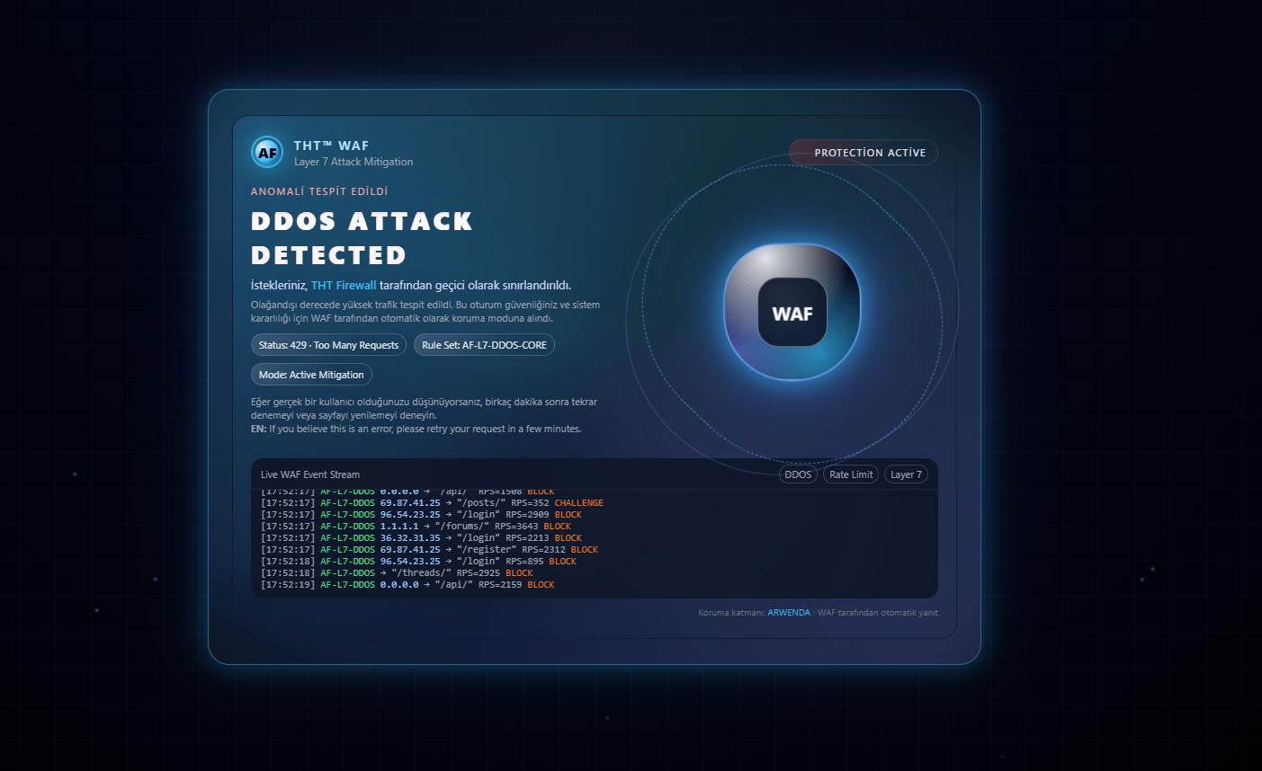
Birçok hosting şireketlerinin Waf Korunma ekranları var.Tht ye özel bir şey üretelim dedik.
Ufak bir not geçmek istiyorum.Örnek kod çalışsın diye fake log sistemi çalışıyor şu an.
İşi bilenler kendince orayı düzeltir.
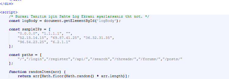
Ufak bir not geçmek istiyorum.Örnek kod çalışsın diye fake log sistemi çalışıyor şu an.
İşi bilenler kendince orayı düzeltir.
THT Waf Korunma / Tespit Ekranı / HTML Tasarım
Kod:
<!DOCTYPE html>
<html lang="tr">
<head>
<meta charset="UTF-8">
<title>WAF Koruma Aktif | THT </title>
<meta name="viewport" content="width=device-width, initial-scale=1.0">
<style>
/* GENEL ARKA PLAN */
* {
margin: 0;
padding: 0;
box-sizing: border-box;
}
body {
font-family: system-ui, -apple-system, BlinkMacSystemFont, "Segoe UI", sans-serif;
background: radial-gradient(circle at top, #0f172a 0, #020617 40%, #000 100%);
color: #e5e7eb;
height: 100vh;
display: flex;
align-items: center;
justify-content: center;
overflow: hidden;
}
.bg-grid {
position: fixed;
inset: 0;
background-image:
linear-gradient(rgba(148, 163, 184, 0.08) 1px, transparent 1px),
linear-gradient(90deg, rgba(148, 163, 184, 0.08) 1px, transparent 1px);
background-size: 40px 40px;
opacity: 0.4;
pointer-events: none;
}
.bg-scanline {
position: fixed;
inset: 0;
background: linear-gradient(
to bottom,
rgba(15, 23, 42, 0) 0%,
rgba(15, 23, 42, 0.8) 50%,
rgba(15, 23, 42, 0) 100%
);
mix-blend-mode: soft-light;
opacity: 0.5;
animation: scan 5s linear infinite;
pointer-events: none;
}
@keyframes scan {
0% { transform: translateY(-100%); }
100% { transform: translateY(100%); }
}
.particles {
position: fixed;
inset: 0;
pointer-events: none;
overflow: hidden;
}
.particle {
position: absolute;
width: 3px;
height: 3px;
border-radius: 999px;
background: rgba(96, 165, 250, 0.7);
filter: blur(1px);
animation: float 12s linear infinite;
}
@keyframes float {
0% {
transform: translate3d(0, 0, 0);
opacity: 0;
}
10% {
opacity: 1;
}
100% {
transform: translate3d(120px, -200vh, 0);
opacity: 0;
}
}
/* ANA KART */
.wrapper {
position: relative;
z-index: 10;
max-width: 900px;
width: 100%;
padding: 20px;
}
.card {
position: relative;
background: rgba(15, 23, 42, 0.88);
border-radius: 24px;
padding: 28px 26px;
border: 1px solid rgba(56, 189, 248, 0.5);
box-shadow:
0 0 30px rgba(56, 189, 248, 0.3),
0 0 80px rgba(59, 130, 246, 0.15);
backdrop-filter: blur(18px);
overflow: hidden;
}
.card::before {
content: "";
position: absolute;
inset: -120px;
background: conic-gradient(
from 180deg at 50% 50%,
rgba(59, 130, 246, 0.1),
rgba(56, 189, 248, 0.35),
rgba(45, 212, 191, 0.2),
rgba(129, 140, 248, 0.3),
rgba(59, 130, 246, 0.1)
);
opacity: 0.7;
filter: blur(40px);
z-index: -1;
animation: rotateGlow 18s linear infinite;
}
@keyframes rotateGlow {
0% { transform: rotate(0deg); }
100% { transform: rotate(360deg); }
}
.card-inner {
position: relative;
border-radius: 18px;
border: 1px solid rgba(15, 23, 42, 0.8);
padding: 22px 20px;
background: radial-gradient(circle at top left, rgba(56, 189, 248, 0.15), transparent 55%);
}
/* ÜST BÖLÜM: LOGO + DURUM */
.card-header {
display: flex;
align-items: center;
justify-content: space-between;
gap: 16px;
margin-bottom: 18px;
}
.brand {
display: flex;
align-items: center;
gap: 12px;
}
.brand-icon {
width: 36px;
height: 36px;
border-radius: 999px;
border: 2px solid rgba(56, 189, 248, 0.9);
display: flex;
align-items: center;
justify-content: center;
box-shadow: 0 0 25px rgba(56, 189, 248, 0.6);
position: relative;
overflow: hidden;
}
.brand-icon::before {
content: "";
position: absolute;
inset: -50%;
background: conic-gradient(
rgba(59, 130, 246, 0.2),
rgba(56, 189, 248, 0.6),
rgba(45, 212, 191, 0.3),
rgba(59, 130, 246, 0.2)
);
animation: spinner 8s linear infinite;
}
.brand-icon-inner {
position: relative;
width: 26px;
height: 26px;
border-radius: inherit;
background: radial-gradient(circle at 30% 30%, #e5e7eb, #38bdf8 60%, #0f172a 100%);
display: flex;
align-items: center;
justify-content: center;
font-size: 16px;
font-weight: 800;
color: #020617;
}
@keyframes spinner {
to { transform: rotate(360deg); }
}
.brand-text-main {
font-size: 14px;
font-weight: 600;
letter-spacing: 0.12em;
text-transform: uppercase;
color: #bae6fd;
}
.brand-text-sub {
font-size: 12px;
color: #9ca3af;
}
.status-pill {
padding: 6px 12px;
border-radius: 999px;
border: 1px solid rgba(248, 250, 252, 0.1);
display: inline-flex;
align-items: center;
gap: 8px;
font-size: 11px;
text-transform: uppercase;
letter-spacing: 0.12em;
background: radial-gradient(circle at top left, rgba(220, 38, 38, 0.25), transparent 70%);
}
.status-dot {
width: 8px;
height: 8px;
border-radius: 999px;
background: #f97316;
box-shadow:
0 0 8px #f97316,
0 0 20px #f97316;
animation: pulseDot 1s ease-out infinite;
}
@keyframes pulseDot {
0% { transform: scale(1); opacity: 1; }
60% { transform: scale(1.7); opacity: 0; }
100% { transform: scale(1.7); opacity: 0; }
}
/* ANA MESAJ + GLITCH BAŞLIK */
.main {
display: grid;
grid-template-columns: minmax(0, 3fr) minmax(0, 2.3fr);
gap: 18px;
}
@media (max-width: 800px) {
.main {
grid-template-columns: minmax(0, 1fr);
}
}
.alert-title {
font-size: 11px;
letter-spacing: 0.15em;
text-transform: uppercase;
color: #fca5a5;
margin-bottom: 6px;
}
.glitch {
position: relative;
font-size: clamp(22px, 3.2vw, 28px);
font-weight: 800;
text-transform: uppercase;
letter-spacing: 0.15em;
color: #fee2e2;
margin-bottom: 6px;
}
.glitch::before,
.glitch::after {
content: attr(data-text);
position: absolute;
inset: 0;
mix-blend-mode: screen;
opacity: 0.7;
}
.glitch::before {
left: 1px;
text-shadow: -1px 0 #fb7185;
animation: glitch1 2.2s infinite linear alternate-reverse;
}
.glitch::after {
left: -1px;
text-shadow: 1px 0 #22d3ee;
animation: glitch2 1.8s infinite linear alternate-reverse;
}
@keyframes glitch1 {
0% { clip-path: inset(0 0 0 0); }
20% { clip-path: inset(10% 0 70% 0); transform: translate(-1px,-1px); }
40% { clip-path: inset(80% 0 5% 0); transform: translate(1px,0); }
60% { clip-path: inset(40% 0 40% 0); transform: translate(-1px,1px); }
80% { clip-path: inset(20% 0 60% 0); transform: translate(1px,-1px); }
100% { clip-path: inset(0 0 0 0); }
}
@keyframes glitch2 {
0% { clip-path: inset(0 0 0 0); }
25% { clip-path: inset(60% 0 20% 0); transform: translate(1px,1px); }
50% { clip-path: inset(30% 0 50% 0); transform: translate(-1px,0); }
75% { clip-path: inset(80% 0 5% 0); transform: translate(0,-1px); }
100% { clip-path: inset(0 0 0 0); }
}
.subtitle {
font-size: 13px;
color: #cbd5f5;
margin-bottom: 6px;
}
.subtitle span {
color: #38bdf8;
font-weight: 600;
}
.small-note {
font-size: 11px;
color: #9ca3af;
margin-bottom: 10px;
}
.meta-row {
display: flex;
flex-wrap: wrap;
gap: 8px;
margin-bottom: 10px;
}
.meta-pill {
font-size: 11px;
padding: 4px 8px;
border-radius: 999px;
border: 1px solid rgba(148, 163, 184, 0.35);
background: radial-gradient(circle at top left, rgba(148, 163, 184, 0.25), transparent 70%);
}
/* İKON BÖLÜMÜ */
.shield-wrap {
position: relative;
display: flex;
align-items: center;
justify-content: center;
}
.shield {
width: 150px;
height: 150px;
border-radius: 40% 40% 48% 48%;
border: 2px solid rgba(96, 165, 250, 0.8);
box-shadow:
0 0 25px rgba(56, 189, 248, 0.6),
0 0 65px rgba(59, 130, 246, 0.7);
background:
radial-gradient(circle at 30% 10%, rgba(248, 250, 252, 0.9), transparent 55%),
radial-gradient(circle at 70% 80%, rgba(56, 189, 248, 0.7), transparent 60%),
radial-gradient(circle at 10% 80%, rgba(129, 140, 248, 0.6), transparent 55%),
radial-gradient(circle at 50% 40%, rgba(15, 23, 42, 0.9), #020617 80%);
position: relative;
overflow: hidden;
animation: shieldPulse 2.4s ease-in-out infinite;
}
@keyframes shieldPulse {
0%, 100% { transform: scale(1) translateY(0); }
50% { transform: scale(1.04) translateY(-4px); }
}
.shield-line {
position: absolute;
inset: 0;
background: repeating-linear-gradient(
135deg,
rgba(15, 23, 42, 0.1) 0px,
rgba(15, 23, 42, 0.1) 2px,
rgba(148, 163, 184, 0.12) 3px,
rgba(148, 163, 184, 0.12) 4px
);
mix-blend-mode: soft-light;
opacity: 0.7;
animation: slideLines 5s linear infinite;
}
@keyframes slideLines {
to { transform: translate3d(-30px, -40px, 0); }
}
.shield-center {
position: absolute;
inset: 24%;
border-radius: 30%;
border: 1px solid rgba(248, 250, 252, 0.4);
display: flex;
align-items: center;
justify-content: center;
background: radial-gradient(circle, rgba(15, 23, 42, 0.8), rgba(15, 23, 42, 0.95));
}
.shield-center span {
font-size: 20px;
font-weight: 700;
color: #f9fafb;
}
.ring {
position: absolute;
border-radius: 999px;
border: 1px dashed rgba(96, 165, 250, 0.7);
inset: -10px;
animation: rotateRing 14s linear infinite;
pointer-events: none;
}
.ring:nth-child(2) {
inset: -26px;
border-style: solid;
opacity: 0.4;
animation-duration: 20s;
animation-direction: reverse;
}
@keyframes rotateRing {
to { transform: rotate(360deg); }
}
/* LOG KISMI */
.log-panel {
margin-top: 16px;
border-radius: 14px;
border: 1px solid rgba(15, 23, 42, 0.9);
background: radial-gradient(circle at top, rgba(15, 23, 42, 0.8), rgba(15, 23, 42, 0.99));
overflow: hidden;
}
.log-header {
display: flex;
align-items: center;
justify-content: space-between;
padding: 6px 10px;
font-size: 11px;
color: #9ca3af;
border-bottom: 1px solid rgba(31, 41, 55, 0.9);
background: linear-gradient(to right, rgba(15, 23, 42, 0.9), rgba(15, 23, 42, 0.7));
}
.log-badges {
display: flex;
gap: 6px;
}
.log-badge {
padding: 2px 6px;
border-radius: 999px;
border: 1px solid rgba(55, 65, 81, 1);
}
.log-body {
font-family: "JetBrains Mono", "Fira Code", monospace;
font-size: 11px;
padding: 8px 10px;
height: 120px;
overflow: hidden;
color: #9ca3af;
}
.log-line {
white-space: nowrap;
overflow: hidden;
text-overflow: ellipsis;
}
.log-line span.tag {
color: #4ade80;
}
.log-line span.blocked {
color: #f97316;
}
.log-line span.ip {
color: #93c5fd;
}
footer {
margin-top: 8px;
font-size: 10px;
color: #6b7280;
text-align: right;
}
footer span {
color: #38bdf8;
}
</style>
</head>
<body>
<div class="bg-grid"></div>
<div class="bg-scanline"></div>
<div class="particles" id="particles"></div>
<div class="wrapper">
<div class="card">
<div class="card-inner">
<div class="card-header">
<div class="brand">
<div class="brand-icon">
<div class="brand-icon-inner">AF</div>
</div>
<div>
<div class="brand-text-main">THT™ WAF</div>
<div class="brand-text-sub">Layer 7 Attack Mitigation</div>
</div>
</div>
<div class="status-pill">
<div class="status-dot"></div>
<span>Protection Active</span>
</div>
</div>
<div class="main">
<!-- SOL TARAF METİN -->
<div>
<div class="alert-title">Anomali Tespit Edildi</div>
<div class="glitch" data-text="DDOS ATTACK DETECTED">
DDOS ATTACK DETECTED
</div>
<p class="subtitle">
İstekleriniz, <span>THT Firewall</span> tarafından geçici olarak sınırlandırıldı.
</p>
<p class="small-note">
Olağandışı derecede yüksek trafik tespit edildi. Bu oturum güvenliğiniz ve sistem
kararlılığı için WAF tarafından otomatik olarak koruma moduna alındı.
</p>
<div class="meta-row">
<div class="meta-pill">Status: 429 · Too Many Requests</div>
<div class="meta-pill">Rule Set: AF-L7-DDOS-CORE</div>
<div class="meta-pill">Mode: Active Mitigation</div>
</div>
<p class="small-note">
Eğer gerçek bir kullanıcı olduğunuzu düşünüyorsanız, birkaç dakika sonra tekrar denemeyi
veya sayfayı yenilemeyi deneyin.<br>
<strong>EN:</strong> If you believe this is an error, please retry your request in a few minutes.
</p>
</div>
<!-- SAĞ TARAF KALEKALKAN -->
<div class="shield-wrap">
<div class="shield">
<div class="shield-line"></div>
<div class="shield-center">
<span>WAF</span>
</div>
</div>
<div class="ring"></div>
<div class="ring"></div>
</div>
</div>
<!-- LOG PANELİ -->
<div class="log-panel">
<div class="log-header">
<span>Live WAF Event Stream</span>
<div class="log-badges">
<span class="log-badge">DDOS</span>
<span class="log-badge">Rate Limit</span>
<span class="log-badge">Layer 7</span>
</div>
</div>
<div class="log-body" id="logBody">
<!-- JavaScript ile satırlar doldurulacak -->
</div>
</div>
<footer>
Koruma katmanı: <span>ARWENDA</span> · WAF tarafından otomatik yanıt
</footer>
</div>
</div>
</div>
<script>
/* Burası Tanıtım için Sahte Log Ekranı ayarlarsanız tht not. */
const logBody = document.getElementById('logBody');
const sampleIPs = [
"0.0.0.0", "1.1.1.1", "",
"52.15.14.15", "69.87.41.25", "36.32.31.35",
"96.54.23.25", "6.2.1.1"
];
const paths = [
"/","/login","/register","/api/","/search","/threads/","/forums/","/posts/"
];
function randomItem(arr) {
return arr[Math.floor(Math.random() * arr.length)];
}
function randomInt(min,max) {
return Math.floor(Math.random() * (max - min + 1)) + min;
}
function addLogLine() {
const time = new Date().toISOString().split("T")[1].split(".")[0];
const ip = randomItem(sampleIPs);
const path = randomItem(paths);
const rps = randomInt(150, 4200);
const action = rps > 800 ? "BLOCK" : "CHALLENGE";
const line = document.createElement('div');
line.className = 'log-line';
line.innerHTML =
`[${time}] ` +
`<span class="tag">AF-L7-DDOS</span> ` +
`<span class="ip">${ip}</span> ` +
`→ "${path}" ` +
`RPS=${rps} ` +
`<span class="blocked">${action}</span>`;
logBody.appendChild(line);
// Maksimum ~12 satır kalsın
while (logBody.children.length > 12) {
logBody.removeChild(logBody.firstChild);
}
logBody.scrollTop = logBody.scrollHeight;
}
setInterval(addLogLine, 550);
for (let i = 0; i < 6; i++) addLogLine();
/* BASİT PARÇACIKLAR (ARKA PLAN YILDIZ/MS ECZANE) */
const particlesContainer = document.getElementById('particles');
function createParticle() {
const el = document.createElement('div');
el.className = 'particle';
el.style.left = Math.random() * 100 + '%';
el.style.bottom = '-10px';
el.style.animationDuration = (8 + Math.random() * 8) + 's';
el.style.opacity = Math.random() * 0.8 + 0.2;
particlesContainer.appendChild(el);
setTimeout(() => {
particlesContainer.removeChild(el);
}, 16000);
}
setInterval(createParticle, 400);
for (let i = 0; i < 20; i++) createParticle();
</script>
</body>
</html>
Son düzenleme:

") Kod editörü olarak notepad ++'mı kullanıyorsunuz? Kullanıyorsanız sizi yavaşlatıyormu? Notepad++ beni kendine çekiyorda oyüzden sordum.
Kod editörü olarak notepad ++'mı kullanıyorsunuz? Kullanıyorsanız sizi yavaşlatıyormu? Notepad++ beni kendine çekiyorda oyüzden sordum. Bir Kaptanı Deryadır.O Kadar diyim.