


Geçenlerde paylaşmış olduğun konunun ikincisini açalım ve biraz daha güzelleştirelim dedik. Emekleri geçen üç kişiyi konumuzda hemen yad edelim @ScopeX ve @RasperPascal @Çakır. 'a verdikleri emeklerden ayırdıkları vakitten dolayı teşekkürlerimi ve şükranlarımı iletiyorum. "Kullanıcı" yazan vb. yerleri kendi nickinize ve keyfinize göre düzenleyin kullanın. **** yerleri do cu ment olarak değiştirin. Sevgiler.
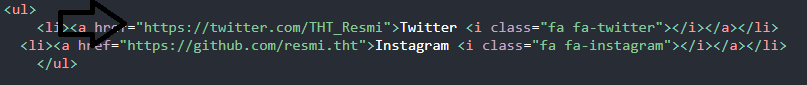
Sosyal Medya Hesabı Eklemek İsterseniz Örneği Biz Facebook Platformu Üzerinden Örnek Verelim Dedik ;
Ctrl + F kullanarak kodu aratabilirsiniz ve linki değiştirip kendi sosyal medya hesaplarınızı koyabilirsiniz. Eğer başka bir platformun logosunu eklemek istiyorsanız kodu kopyalayınız ve istediğiniz platformun adını yazınız.

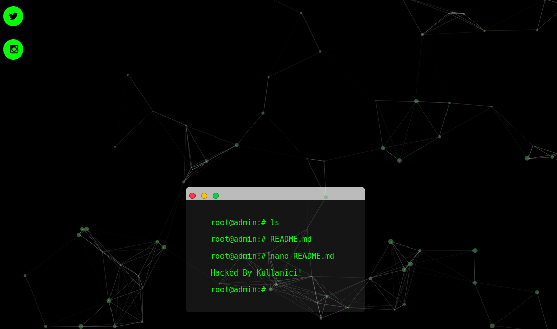
Ekran Görüntüsü ;
İndex Kodumuz ;
İndex Kodumuz ;
HTML:
<br><br><br><br><br><br><br><br><br><br><br><br><br><br><br><br><br><br><br><br><br><style type="text/css">
body { background-color: #272727; padding: 10px; } .fakeButtons { height: 10px; width: 10px; border-radius: 50%; border: 1px solid #000; position: relative; top: 6px; left: 6px; background-color: #ff3b47; border-color: #9d252b; display: inline-block; } .fakeMinimize { left: 11px; background-color: #ffc100; border-color: #9d802c; } .fakeZoom { left: 16px; background-color: #00d742; border-color: #049931; } .fakeMenu { width: 350px; box-sizing: border-box; height: 25px; background-color: #bbb; margin: 0 auto; border-top-right-radius: 5px; border-top-left-radius: 5px; } .fakeScreen { background-color: #151515; box-sizing: border-box; width: 350px; margin: 0 auto; padding: 20px; border-bottom-left-radius: 5px; border-bottom-right-radius: 5px; } p { position: relative; left: 50%; margin-left: -8.5em; text-align: left; font-size: 1.25em; font-family: monospace; white-space: nowrap; overflow: hidden; width: 0; } span { color: #fff; font-weight: bold; } .line1 { color: #00FF00; -webkit-animation: type .5s 1s steps(20, end) forwards; -moz-animation: type .5s 1s steps(20, end) forwards; -o-animation: type .5s 1s steps(20, end) forwards; animation: type .5s 1s steps(20, end) forwards; } .cursor1 { -webkit-animation: blink 1s 2s 2 forwards; -moz-animation: blink 1s 2s 2 forwards; -o-animation: blink 1s 2s 2 forwards; animation: blink 1s 2s 2 forwards; } .line2 { color: #00FF00; -webkit-animation: type .5s 4.25s steps(20, end) forwards; -moz-animation: type .5s 4.25s steps(20, end) forwards; -o-animation: type .5s 4.25s steps(20, end) forwards; animation: type .5s 4.25s steps(20, end) forwards; } .cursor2 { -webkit-animation: blink 1s 5.25s 2 forwards; -moz-animation: blink 1s 5.25s 2 forwards; -o-animation: blink 1s 5.25s 2 forwards; animation: blink 1s 5.25s 2 forwards; } .line3 { color: #00FF00; -webkit-animation: type .5s 7.5s steps(20, end) forwards; -moz-animation: type .5s 7.5s steps(20, end) forwards; -o-animation: type .5s 7.5s steps(20, end) forwards; animation: type .5s 7.5s steps(20, end) forwards; } .cursor3 { -webkit-animation: blink 1s 8.5s 2 forwards; -moz-animation: blink 1s 8.5s 2 forwards; -o-animation: blink 1s 8.5s 2 forwards; animation: blink 1s 8.5s 2 forwards; } .line4 { color: #00FF00; -webkit-animation: type .9s 10.75s steps(24, end) forwards; -moz-animation: type .9s 10.75s steps(24, end) forwards; -o-animation: type .9s 10.75s steps(24, end) forwards; animation: type .9s 10.75s steps(24, end) forwards; } .cursor4 { -webkit-animation: blink 1s 13.5s infinite; -moz-animation: blink 1s 11.5s infinite; -o-animation: blink 1s 11.5s infinite; animation: blink 1s 11.5s infinite; } .line5 { color: #00FF00; -webkit-animation: type .6s 10.75s steps(20, end) forwards; -moz-animation: type .6s 10.75s steps(20, end) forwards; -o-animation: type .6s 10.75s steps(20, end) forwards; animation: type .6s 10.75s steps(20, end) forwards; } .cursor5 { -webkit-animation: blink 1s 12.5s infinite; -moz-animation: blink 1s 9.5s infinite; -o-animation: blink 1s 9.5s infinite; animation: blink 1s 9.5s infinite; } @-webkit-keyframes blink { 0% { opacity: 0; } 40% { opacity: 0; } 50% { opacity: 1; } 90% { opacity: 1; } 100% { opacity: 0; } } @-moz-keyframes blink { 0% { opacity: 0; } 40% { opacity: 0; } 50% { opacity: 1; } 90% { opacity: 1; } 100% { opacity: 0; } } @-o-keyframes blink { 0% { opacity: 0; } 40% { opacity: 0; } 50% { opacity: 1; } 90% { opacity: 1; } 100% { opacity: 0; } } @keyframes blink { 0% { opacity: 0; } 40% { opacity: 0; } 50% { opacity: 1; } 90% { opacity: 1; } 100% { opacity: 0; } } @-webkit-keyframes type { to { width: 17em; } } @-moz-keyframes type { to { width: 17em; } } @-o-keyframes type { to { width: 17em; } } @keyframes type { to { width: 17em; } }
</style>
</head>
<body style="background-color: #000000">
<div class=fakeMenu>
<div class="fakeButtons fakeClose"></div>
<div class="fakeButtons fakeMinimize"></div>
<div class="fakeButtons fakeZoom"></div></div>
<div class="fakeScreen">
<p class="line1">root@admin:# ls <span class="cursor1">_</span></p>
<p class="line2">root@admin:# README.md <span class="cursor2"></span></p>
<p class="line3">root@admin:# nano README.md<span class="cursor3"></span></p>
<p class="line4">Hacked By Kullanici! <span class="cursor3"></span></p>
<p class="line5">root@admin:#<span class="cursor4">_</span></p></div>
<html><head>
<meta charset="utf-8">
<meta name="distribution" content="global"/><link href="http://fonts.googleapis.com/css?family=Rye" rel="stylesheet" type="text/css">
<meta charset="utf-8"> <meta name="viewport" content="width=device-width, initial-scale=1"> <script type="text/javascript" src="https://cdnjs.cloudflare.com/ajax/libs/howler/2.0.3/howler.min.js"></script> <link rel="stylesheet" type="text/css" href="css/bootstrap.css">
<link rel="stylesheet" type="text/css" href="css/bootstrap.min.css">
<script type="text/javascript" src="js/bootstrap.min.js"></script> <script type="text/javascript" src="js/jquery.js"></script> <script type="text/javascript" src="js/jquery-1.10.2.min.js.download"></script> <script src="https://ajax.googleapis.com/ajax/libs/jquery/3.1.1/jquery.min.js"></script> <script src="https://maxcdn.bootstrapcdn.com/bootstrap/3.3.7/js/bootstrap.min.js"></script>
<style type="text/css">
@import url('https://fonts.googleapis.com/css?family=Nunito');
@import url('https://fonts.googleapis.com/css?family=Poiret+One');
body, html {height: 100%;s}#particles-js{ width: 100%; height: 100%; background-position: 50% 50%; position: fixed; top: 0px;}
</style>
<link href="https://fonts.googleapis.com/css2?family=Bitter&display=swap" rel="stylesheet">
<link rel="stylesheet" href="https://fonts.googleapis.com/css?family=Kelly+Slab&display=swap">
<style>
body {
background: black;
color: white;
font-family: 'Kelly Slab';
}
</style></head>
<!--[if IE]>
<script src="http://html5shim.googlecode.com/svn/trunk/html5.js"></script>
<![endif]-->
</head>
<body>
<body onload="play()">
<center>
<body oncontextmenu='return false;' onkeydown='return false;' onmousedown='return false;'>
<div id='och' align="center">
<div id='ochh'>
<b><b> <div id="particles-js"><canvas class="particles-js-canvas-el" style="width: 100%; height: 100%;" width="1365" height="949"></canvas></div> <!--<script type="text/javascript" src="https://cdnjs.cloudflare.com/ajax/libs/particles.js/2.0.0/particles.min.js"></script>--> <script type="text/javascript">$.getScript("https://cdnjs.cloudflare.com/ajax/libs/particles.js/2.0.0/particles.min.js", function(){ particlesJS('particles-js', { "particles": { "number": { "value": 80, "density": { "enable": true, "value_area": 800 } }, "color": { "value": "#5aab61" }, "shape": { "type": "circle", "stroke": { "width": 0, "color": "#000000" }, "polygon": { "nb_sides": 5 }, "image": { "width": 100, "height": 100 } }, "opacity": { "value": 0.5, "random": false, "anim": { "enable": false, "speed": 1, "opacity_min": 0.1, "sync": false } }, "size": { "value": 5, "random": true, "anim": { "enable": false, "speed": 40, "size_min": 0.1, "sync": false } }, "line_linked": { "enable": true, "distance": 150, "color": "#ffffff", "opacity": 0.4, "width": 1 }, "move": { "enable": true, "speed": 6, "direction": "none", "random": false, "straight": false, "out_mode": "out", "attract": { "enable": false, "rotateX": 600, "rotateY": 1200 } } }, "interactivity": { "detect_on": "canvas", "events": { "onhosver": { "enable": true, "mode": "repulse" }, "onclick": { "enable": true, "mode": "push" }, "resize": true }, "modes": { "grab": { "distance": 400, "line_linked": { "opacity": 1 } }, "bubble": { "distance": 400, "size": 40, "duration": 2, "opacity": 8, "speed": 3 }, "repulse": { "distance": 200 }, "push": { "particles_nb": 4 }, "remove": { "particles_nb": 2 } } }, "retina_detect": true, "config_demo": { "hide_card": false, "background_color": "#b61924", "background_image": "", "background_position": "50% 50%", "background_repeat": "no-repeat", "background_size": "cover" } } );}); </script> <script> // This script and many more from// http://rainbow.arch.scriptmania.comif (document.getElementById){// Plenty of black gives a better sparkle effect.showerCol=new Array('#000000','#ff0000','#ffffff','#000000','#00ff00','#ff00ff','#ffffff','#ffa500','#000000','#fff000');launchCol=new Array('#ffff00','#ff00ff','#00ffff','#ffffff','#ff8000');runSpeed=70; //setTimeout speed.// *** DO NOT EDIT BELOW ***var yPos=200;var xPos=200;var explosionSize=200;var launchColour='#ffff80';var timer=null;var dims=8;var evn=360/14;firework=new Array();var ieType=(typeof window.innerWidth != 'number');var ieRef=((ieType) && (document.compatMode) && (document.compatMode.indexOf("CSS") != -1))?document.documentElement:document.body;thisStep=0;step=5;for (i=0; i < 14; i++){document.write(' <div id="sparks'+i+'" style="position:absolute;top:0px;left:0px;border-radius:50%;height:'+dims+'px;width:'+dims+';font-size:'+dims+';background-color:'+launchColour+'"> <\/div>'); firework=document.getElementById("sparks"+i).style; } function winDims(){ winH=(ieType)?ieRef.clientHeight:window.innerHeight; winW=(ieType)?ieRef.clientWidth:window.innerWidth; bestFit=(winW >= winH)?winH:winW; } winDims(); window.onresize=new Function("winDims()"); function Reset(){ var dsy=(ieType)?ieRef.scrollTop:window.pageYOffset; thisStep=-1; launchColour = launchCol[Math.floor(Math.random()*launchCol.length)]; explosionSize=Math.round(100+Math.random()*(bestFit/4)); yPos = explosionSize+Math.round(Math.random()*(winH-(explosionSize*2.2)))+dsy; xPos = explosionSize+Math.round(Math.random()*(winW-(explosionSize*2.2))); for (i=0; i < 14; i++){ firework.backgroundColor=launchColour; firework.width=dims+"px"; firework.height=dims+"px"; firework.fontSize=dims+"px"; } Fireworks(); } function Fireworks(){ thisStep+=step; timer=setTimeout("Fireworks()",runSpeed); for (i=0; i < 14; i++){ firework.top = yPos + explosionSize * Math.sin(i*evn*Math.PI/180)*Math.sin(thisStep/100)+"px"; firework.left= xPos + explosionSize * Math.cos(i*evn*Math.PI/180)*Math.sin(thisStep/100)+"px"; if (thisStep > 100){ var dims_change=(explosionSize < 150)?dims:Math.round(dims+Math.random()*2); firework.backgroundColor=showerCol[Math.floor(Math.random()*showerCol.length)]; firework.width=dims_change+"px"; firework.height=dims_change+"px"; firework.fontSize=dims_change+"px"; } } if (thisStep > 140){ clearTimeout(timer); Reset(); } } window.onload=Fireworks; } </div> </script></b></b><div align="center" class="a"><font color="white"></font></div><font color="white"><br><div align="center"></div><br> </font></body></html>
<link href="//netdna.bootstrapcdn.com/font-awesome/4.1.0/css/font-awesome.min.css" rel="stylesheet">
<nav class="social">
<ul>
<li><a href="https://twitter.com/THT_Resmi">Twitter <i class="fa fa-twitter"></i></a></li>
<li><a href="https://github.com/resmi.tht">Instagram <i class="fa fa-instagram"></i></a></li>
</ul>
<style>
a {
color: #00FF00;
text-decoration: none;
}
.me {
width: 400px;
margin: 90px auto;
}
.me p,
.me h1 {
letter-spacing: 3px;
text-align: center;
}
.me p {
font-weight: 200;
}
.me span {
font-weight: bold;
}
.social {
position: fixed;
top: 20px;
}
.social ul {
padding: 0px;
-webkit-transform: translate(-270px, 0);
-moz-transform: translate(-270px, 0);
-ms-transform: translate(-270px, 0);
-o-transform: translate(-270px, 0);
transform: translate(-270px, 0);
}
.social ul li {
display: block;
margin: 5px;
background: rgba(0, 0, 0, 0.36);
width: 300px;
text-align: right;
padding: 10px;
-webkit-border-radius: 0 30px 30px 0;
-moz-border-radius: 0 30px 30px 0;
border-radius: 0 30px 30px 0;
-webkit-transition: all 1s;
-moz-transition: all 1s;
-ms-transition: all 1s;
-o-transition: all 1s;
transition: all 1s;
}
.social ul li:hover {
-webkit-transform: translate(110px, 0);
-moz-transform: translate(110px, 0);
-ms-transform: translate(110px, 0);
-o-transform: translate(110px, 0);
transform: translate(110px, 0);
background: rgba(255, 255, 255, 0.4);
}
.social ul li:hover a {
color: #000;
}
.social ul li:hover i {
color: #fff;
background: rgba(0, 0, 0, 0.36);
-webkit-transform: rotate(360deg);
-moz-transform: rotate(360deg);
-ms-transform: rotate(360deg);
-o-transform: rotate(360deg);
transform: rotate(360deg);
-webkit-transition: all 1s;
-moz-transition: all 1s;
-ms-transition: all 1s;
-o-transition: all 1s;
transition: all 1s;
}
.social ul li i {
margin-left: 10px;
color: #000;
background: #fff;
padding: 10px;
-webkit-border-radius: 50%;
-moz-border-radius: 50%;
border-radius: 50%;
width: 20px;
height: 20px;
font-size: 20px;
background: #00FF00;
-webkit-transform: rotate(0deg);
-moz-transform: rotate(0deg);
-ms-transform: rotate(0deg);
-o-transform: rotate(0deg);
transform: rotate(0deg);
}
</style>Sosyal Medya Hesabı Eklemek İsterseniz Örneği Biz Facebook Platformu Üzerinden Örnek Verelim Dedik ;
Ctrl + F kullanarak kodu aratabilirsiniz ve linki değiştirip kendi sosyal medya hesaplarınızı koyabilirsiniz. Eğer başka bir platformun logosunu eklemek istiyorsanız kodu kopyalayınız ve istediğiniz platformun adını yazınız.
HTML:
<li><a href="Bağlantı Linkini Koyunuz">Facebook <i class="fa fa-facebook"></i></a></li>
Moderatör tarafında düzenlendi:
")

